ACY Securities
Design-system architecture in a high-regulation retail-finance
environment
Five product lines. One design system. 150 components governed to the
strictest jurisdictional standard, eight regulatory updates absorbed without structural rework,
100,000+ traders served across 40+ regulated markets. This page is the project itself — the
problem, the architectural decisions, the artefacts, the outcomes.
Looking for the story behind the work — the near-five-year arc, the chapters, the team
changes, the lessons? That lives on a separate page: Career
Journey: Nearly Five Years at ACY →
Modelled-vs-measured discipline: every figure carries its
instrument. The ~$1–2M/yr is a modelled aggregation of measured component metrics (returned engineering
capacity + captured LTV + avoided rebuild work), not a single measured ROI. Full disclosure — what is measured
vs not — in the executive summary and the four field notes below.
Executive summary · 60-second senior-PD read
A 150-component design system that absorbed eight regulatory rewrites without a
rebuild cycle, shipped at an ASIC-regulated broker (AFSL 403863) serving 100K+ traders across 40+
jurisdictions. The full disclosure of what is measured vs what isn't lives in the four field notes linked
below.
What's measured (externally citable)
ASIC AFSL 403863 active regulatory record — verifiable on asic.gov.au
Public Register
$2B+ daily volume attestable from ACY's published institutional disclosures, not my
internal claim
Zero ASIC findings tied to UX over 2+ years (Q1 2023 – Q1 2025), verifiable via ASIC
Connect public register
Not a certified WCAG 2.1 AA conformance claim — the system-level discipline is real,
certification is not commissioned; full disclosure at the accessibility audit note
Not an institutional-grade professional terminal — this is a regulated retail/CFD
platform with an institutional Connect API on top, a distinct register
Not a single-author claim — the 150 components passed through Ed's governance but the
team contributed; the "What that actually means" section unpacks scope
Not v1-then-forget — the post-launch iteration note documents what happened to one
surface over 18 months including one honest negative result on AUM
Status & honesty disclosure
Production shipped 2022–2024 across five surfaces — ACY platform, ACY Connect API,
Finlogix, LogixTrader, TradingCup
Where a number is on this page, it has either an externally citable source or a named
internal instrument (GA4, Hotjar, Jira); methodology limits disclosed in linked notes
Read time: ~22 min full · ~5 min if you stop after Measurable Outcomes
Post-launch evidence companion: this case study covers the design system as it shipped. For
an 18-month follow-up on what users actually did with one of its surfaces — the ASIC RG 268 cross-border
disclosure, three iteration cycles, the muscle-memory dismissal failure I had to discover the hard way, and
the metric I expected to lift that never did — read the Post-Launch Iteration field note.
The problem
5 product teams. 0 shared design language. Every regulatory update was a full
redesign.
Before
✕
5 disconnected codebases
ACY.com, Finlogix, LogixTrader, ACY Connect, LogixPanel each had independent UI
patterns — zero shared components.
✕
40+ day regulatory update cycles
Each jurisdiction update (ASIC leverage caps, ESMA inducement bans) required
individual redesigns across every platform.
✕
Compliance handled ad-hoc
No systematic approach to ASIC/FCA/FINRA/ESMA disclosure hierarchy — risk warnings
placed inconsistently, prominence rules violated.
✕
The 14-day ASIC order
A compliance directive arrived requiring platform-wide UI changes in 14 days. With
fragmented systems, this was architecturally impossible.
After — design-system architecture
✓
150 shared components, 5 product lines
Single token hierarchy and component governance — engineering teams could
implement autonomously without a design bottleneck.
✓
8 regulatory updates. Zero structural reworks.
Compliance components are modular primitives — a new ASIC leverage cap slots into
the Risk Warning component and propagates across all 5 platforms at once.
✓
2+ years, zero regulatory UI violations
ASIC 12px minimum font size, SEC prominence rules, ESMA disclosure hierarchy — all
encoded as component constraints, not reviewer checklists.
✓
ASIC 14-day order — shipped in time
Modular architecture meant the change touched 1 component and propagated to all
affected surfaces across 5 platforms.
Design principle
Regulatory requirements aren't legal hurdles — they're design specifications. The architecture
question wasn't "how do we handle compliance?" but "how do we make compliance components so modular that new
regulations cost one component update, not a platform redesign?"
Interactive · the thesis, made tangible
One component change. Five platforms. Fourteen days.
When an ASIC leverage-cap directive lands, the naïve unit of work is "40+ screens." The
architecture makes the real unit "one primitive." Fire the regulatory change and watch the Risk-Warning
token propagate everywhere it is used.
ASIC directive · leverage cap 30:1 → 20:1One edit · propagates to every surface using the primitive
SOURCE · component RiskWarning.leverage
Max leverage 30:1
Trading on margin carries risk. Losses can exceed deposits.
These aren't the decisions that were obvious in hindsight. They're the ones where the
alternative was equally valid — until the constraints forced a choice.
Decision 01 — Compliance architecture
Encode compliance at the token level — not per product
What I tried first: Product-level overrides. Each platform
maintained its own compliance variant of each component — an ASIC version of a button for ACY.com, an FCA
version for the EU-facing product.
Why it changed
The ASIC leverage-cap update in early 2022 required updating the same disclosure
component in 5 separate places. What should have been one change took 3 days and still produced
inconsistencies.
The fix: compliance requirements become constraints on the primitive, not
variants of a component. The Risk Warning component doesn't have an ASIC variant — it is the ASIC
requirement. When the regulation changes, one component updates, and it propagates everywhere that
component is used.
Decision 02 — System boundary
Decouple compliance components from visual components entirely
Alternative I considered: Fold compliance into visual components.
Every button, every input field carries its own compliance-variant logic baked in.
Why I separated them
Visual language and regulatory language evolve at completely different rates. In nearly five
years at ACY, the brand refreshed twice. Regulations updated 8 times. If compliance logic is embedded in
visual components, every brand refresh becomes a compliance-audit risk — you're touching
regulatory-sensitive code for aesthetic reasons.
Separating them means: redesign the button, never touch the Risk Warning. Regulatory
components form their own class. Legal signs off once; visual evolves independently.
Decision 03 — The 14-day ASIC order
Treat a regulatory directive as an architecture stress test, not a sprint
What my first instinct was: Scope the affected screens. I listed
40+ screens across 5 platforms that displayed leverage information.
What the architecture revealed
Mapping 40 screens was the wrong unit. The real question was: how many
components carry leverage-display logic? The answer was one — the Leverage Indicator primitive.
Everything else was rendering that primitive.
Updating one component propagated the change to all 40 screens simultaneously. We
shipped within the deadline with zero downstream inconsistencies. The 14-day order became the proof that
the architecture worked — and the architecture that made it possible had been built for exactly this.
Decision 04 — Typography & tokens
Rebuild the type system before touching a single screen
What I inherited: Poppins, set as the company-wide standard in
2021, before I joined. It photographed beautifully in decks. It also had no support for the non-Latin
scripts the platform needed, and it lost legibility the moment it hit a dense data table.
Why it changed
By late 2022, when I formally took ownership of the design system, the design team
had consolidated to one person — me — with no AI tooling yet, desktop and mobile running on separate
frontend stacks that each had to be migrated by hand, and an international expansion already underway
that the font couldn't support.
Migrating the whole product line to a script that actually worked took the better
part of six months, and it wasn't just the typeface — colour and rule tokens needed the same rework.
That's the origin of every principle in this system: it has to survive a platform it wasn't designed
for, it can never be hostage to one technology choice, and it has to be maintainable by the smallest
team possible — because I'd already lived what happens when it isn't.
The complete ecosystem · 5 platforms, 1 design vision
One corporate tree. Fourteen brands. One governance discipline.
Over nearly five years I set the design direction and governed the system across a complete trading ecosystem serving 100K+ traders
across 40+ regulated jurisdictions — and roughly 90% of the marks on the group organisation chart. Explore
the tree: each surface names its regulatory posture and audience.
ACYLogix Pty Ltd · corporate architecture
ACYLogix Pty Ltd
ACY Group · consumer-facing financial
Zerologix · technology products
The architectural decision the brand book is anchored on: ACYLogix Pty Ltd
runs two coordinated divisions, not one master brand — ACY Group for the consumer-facing
financial brands and Zerologix for the technology products underneath. Two divisions, two
regulatory postures, two audiences. The customer never sees the parent mark on a product surface — only the
leaf brand speaks. That rule alone forced fourteen sub-brand wordmarks instead of fourteen co-locked variants
of one master.
Governance · what the number is backed by
150 components — what that actually means
"150 components" appears on my resumé and in several case studies. A finance-sector
reviewer should ask: what governance backed it? Here is what the design system actually consisted of and how
it was maintained.
Component categories
Foundations: colour tokens, typography scale, spacing system (18 tokens)
Design-to-dev handoff: ~3 days/screen → ~1.5 days/screen (tracked across ~40 screens, Oct
2022–Oct 2023)
Compliance component reuse: legal-approved patterns propagated to all 5 products from a
single Figma master — reducing compliance re-review from 5× to 1× per regulatory change
New-designer onboarding: 2-week ramp to first independent design contribution
Figma workspace with a live component library available for review during
interviews.
Platform served 100K+ users across 40+ countries with localized compliance.
8
Regulatory updates
Design system absorbed 8 regulatory changes (FCA, ESMA, FINRA) — each shipped in 3–5
days vs. the 3–4 week industry norm. Missing a deadline means suspension of client-facing services.
AA
WCAG 2.1 discipline
Trading flows built to WCAG 2.1 AA — system-level discipline, not a commissioned
conformance letter. Full limits at the accessibility
disclosure.
KYC completion
Sign-up completions went from 27% to 55% after I redesigned the 47-field KYC flow —
progressive disclosure, inline validation, one section at a time. In a CFD broker, every completed KYC is
a potential funded account. That improvement is direct revenue pipeline, not a UX metric. (GA4
funnel, Q2→Q3 2022)
Session depth
+40% session duration (8.2 → 11.5 min) on Finlogix after introducing the modular
widget system. 67% of active users built custom layouts within 3 months — a proxy for product stickiness,
not just engagement. (Hotjar, n=1,200)
Engineering velocity
Design-to-dev handoff: ~3 days/screen → ~1.5 days/screen. Component implementation
30–40% faster. When the team is under 10 engineers serving 5 product lines and 40+ compliance markets,
cutting handoff time in half is the difference between shipping and not shipping. (Jira sprint
history, n=30 sprints, Q3 2022 – Q4 2023)
Interactive · the funnel that funds accounts
47 fields, one wall — versus one section at a time
The redesign didn't shorten the regulatory form; ASIC's suitability obligations set the
fields. It changed the shape of the ask. Scroll the funnel into view and watch completion recover, stage by
stage.
Before · 47-field single wall
One long form. All fields at equal weight.
27%
Start
Identity
Suitability
Submit
After · progressive disclosure
One section at a time. Inline validation. Clear progress.
27%
Start
Identity
Suitability
Submit
Same regulatory surface, doubled throughput. The field count didn't
drop — ASIC's client-suitability obligations set it. Progressive disclosure, inline validation, and a
persistent progress indicator moved completion 27% → 55%. In a CFD broker, that is funded-account pipeline.
(GA4 funnel, Q2→Q3 2022 — internally instrumented, not externally audited.)
Design-system evolution & key interfaces
The system, as it shipped
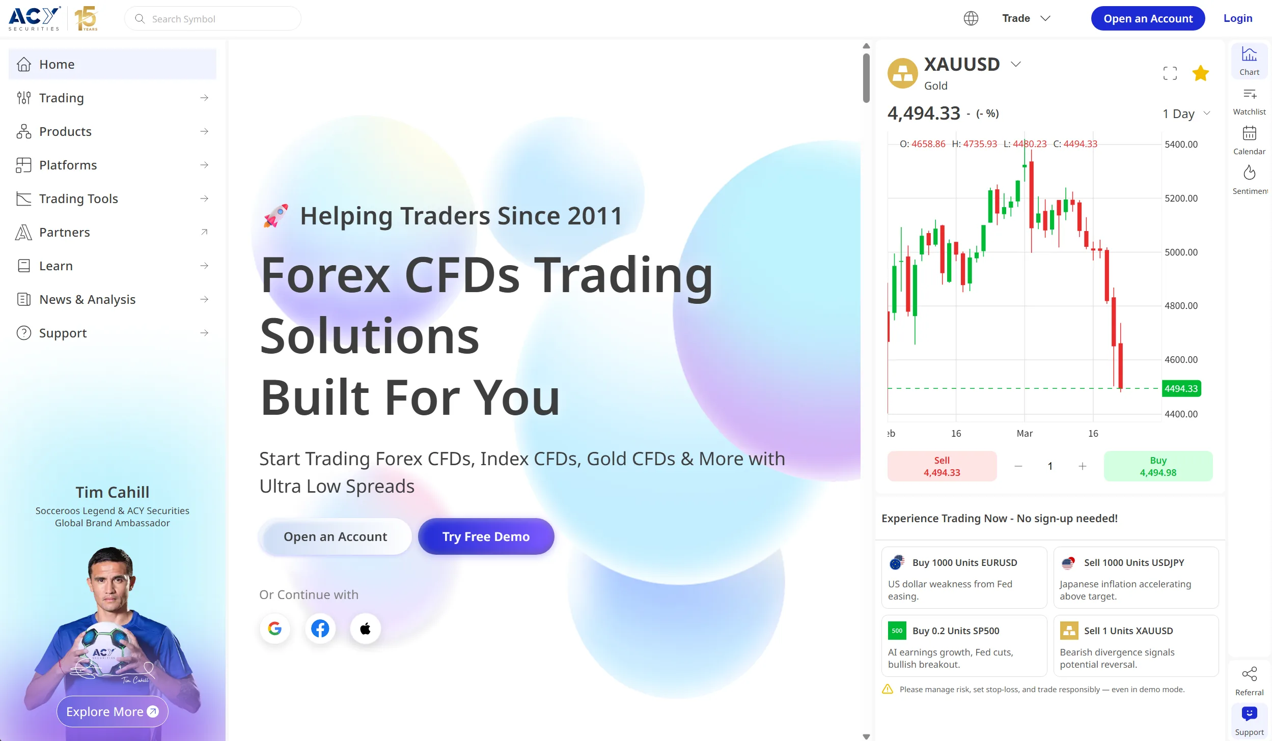
Visual evidence of the design-system foundation and platform interfaces built over 4
years.
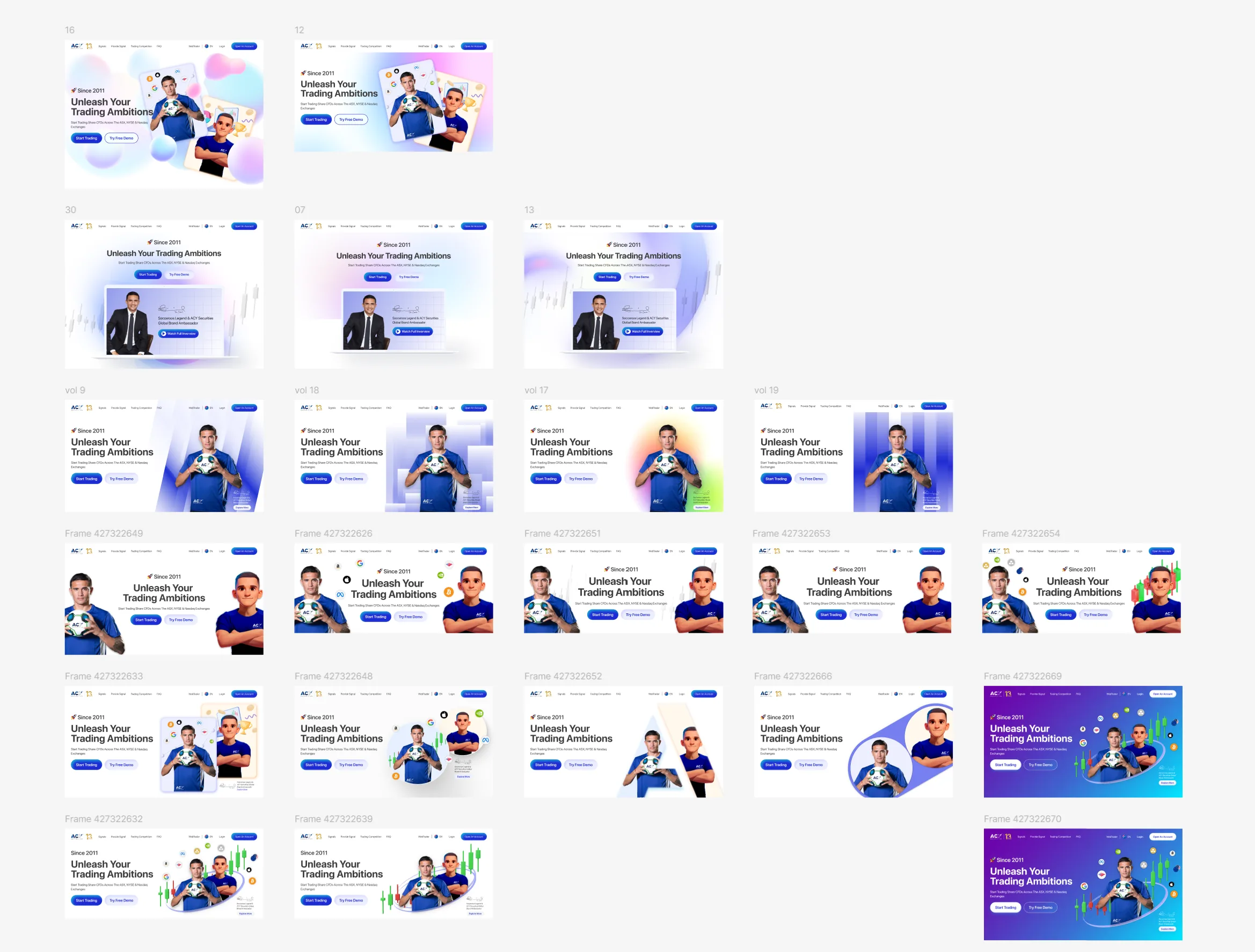
Concept exploration range (2023–2024): how design direction evolved as the system
matured — from exploratory layouts to locked, reusable patterns.
Interactive · drag to compareTrading Panel redesign
Before · legacyAfter · modular
Legacy layout put every data element at equal visual priority — day traders and swing
traders saw identical screens. The modular widget system lets traders build their own workspace.
Card-sorting data (n=15) revealed 5 distinct archetypes; each layout serves the mental model that emerged.
Time-to-insight: 4.2s → 2.5s (−40%). Critical task errors: 40% → under 5% (n=15 usability
sessions, paired within-subjects; remaining errors were non-blocking label misreads, not workflow failures).
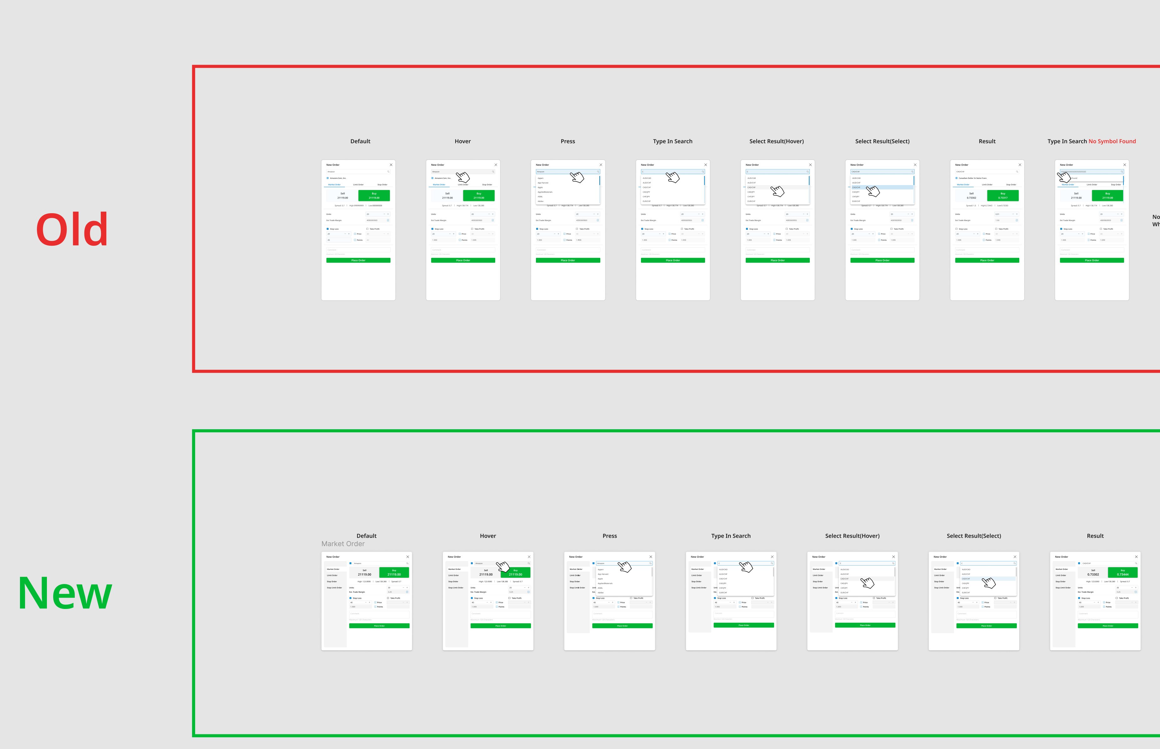
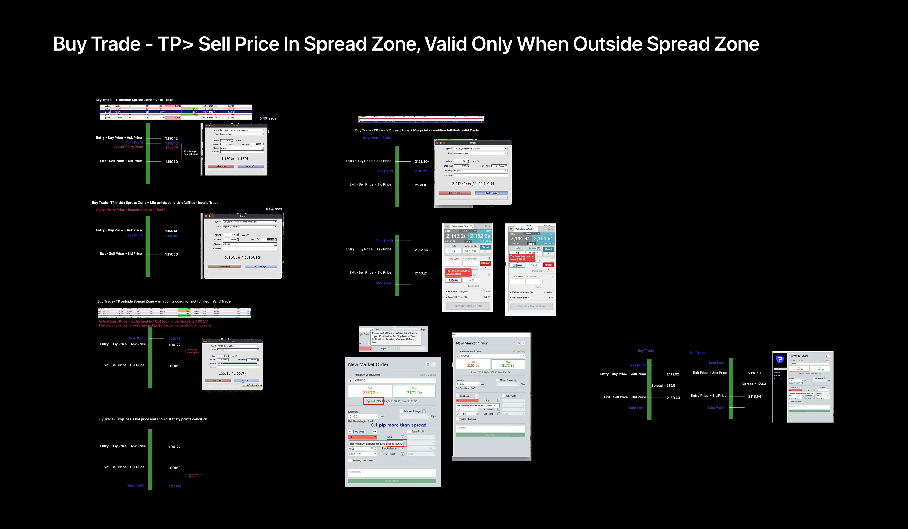
Buy-trade order flow: compliance controls embedded at every decision point.
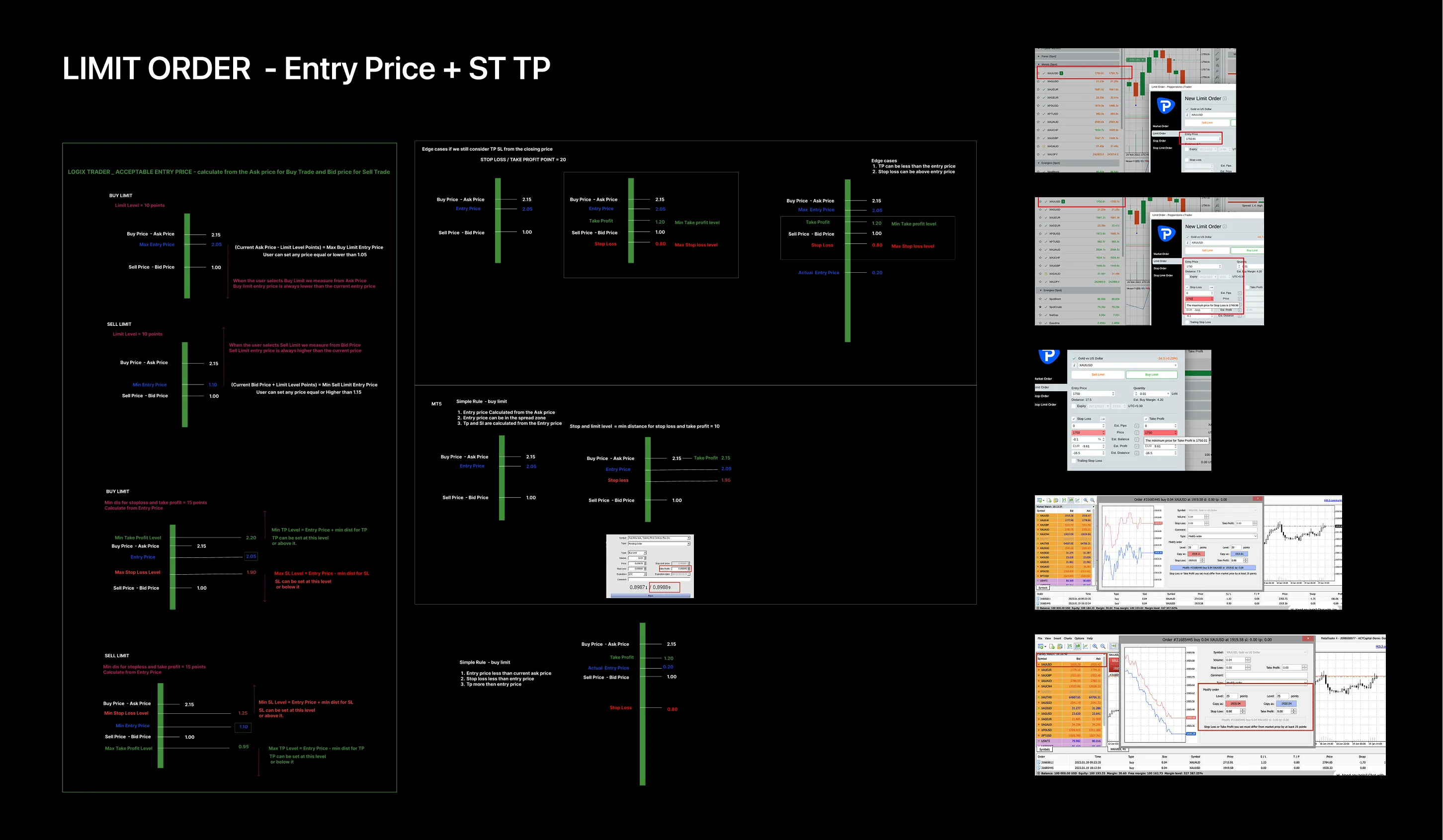
Limit-order placement: precision trading controls.
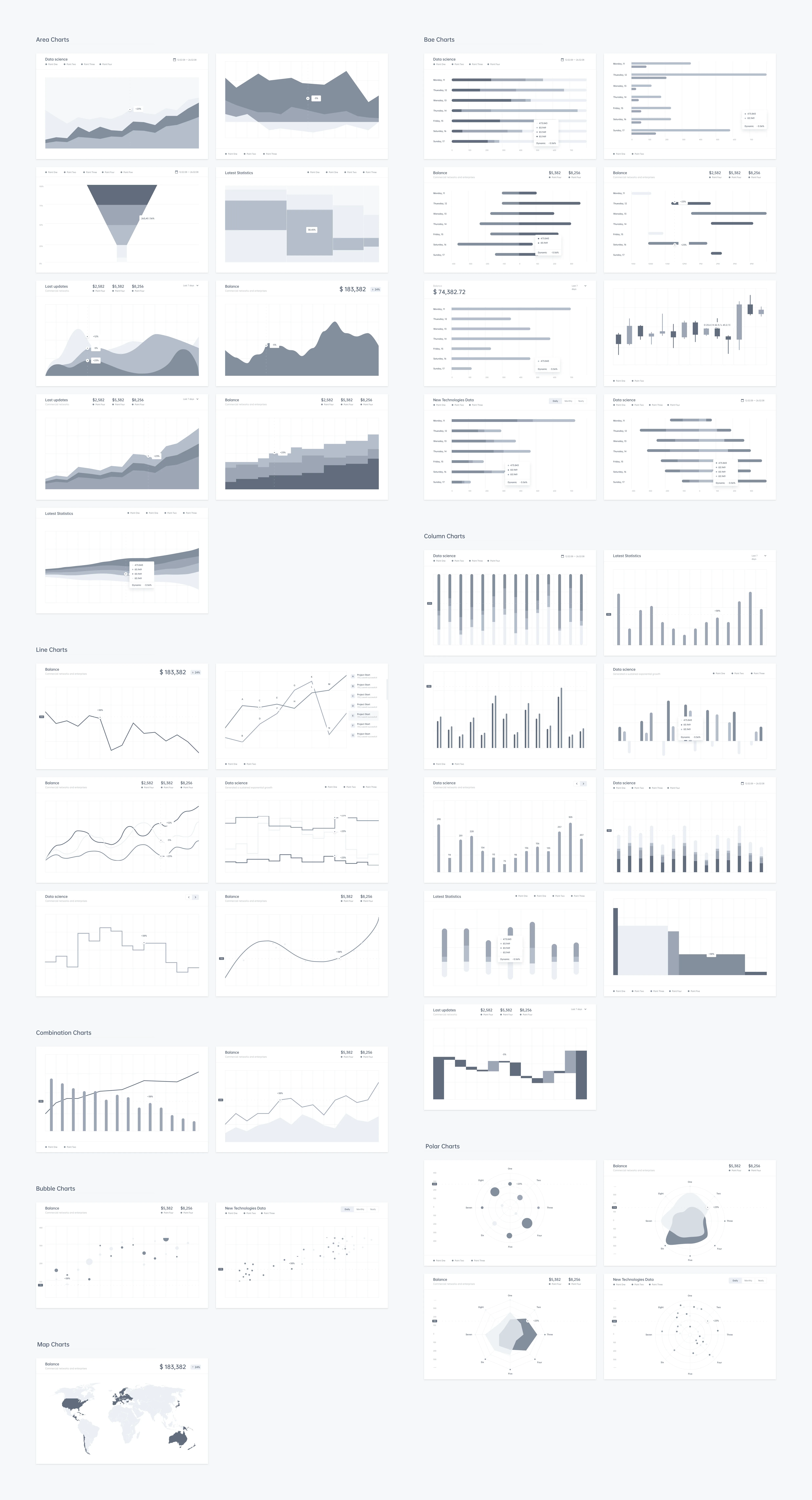
Advanced charting interface: data-visualization density, done with restraint.
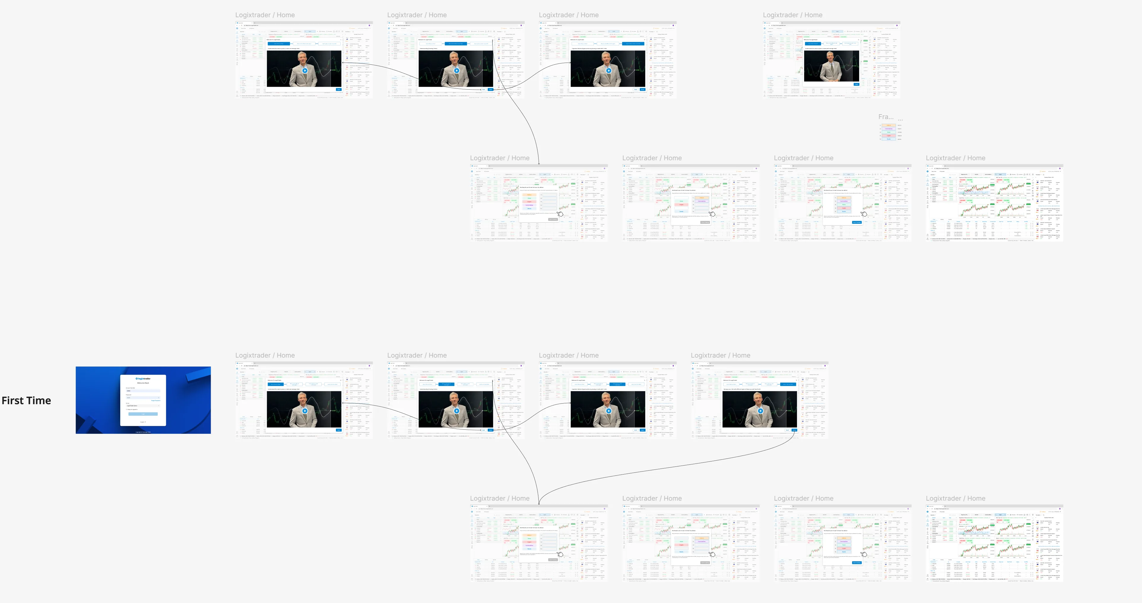
First-time user onboarding: compliance education without friction.
Iteration evidence · 4 iterations
Real-time data API: from error state to production
When the WebSocket price-feed integration produced incorrect data states during
high-volatility events, I documented each iteration of the fix — not just the solution. These four screens
show how I diagnosed, proposed, tested, and validated the corrected API-response handling, collaborating
with the backend team across a 2-day sprint.
Iteration 1 — error state identified
Iteration 2 — root cause mapped
Iteration 3 — fix proposed & tested
Iteration 4 — validated & shipped
I document the iteration process — not just the final state — because the
reasoning behind each fix matters more than the pixel-perfect end result.
Technical implementation: code prototypes
Beyond Figma mockups, I built interactive HTML/CSS/JavaScript prototypes to validate
technical feasibility and accelerate engineering handoff — button systems, 3D visualizations, and
financial simulators that demonstrate design-to-code fluency.
I used Hotjar behavioral analytics (170+ sessions) to validate design decisions with
quantitative evidence — the data that convinced Legal and Engineering the choices were data-driven.
Compliance-warning engagement — 170+ sessions across AU/SG/UK.
Users spent 15–90 seconds reading warnings (3/5 engagement, 0/5 frustration). High-regulation-market users
(UAE, Kuwait) spent 32% more time on disclosures than low-regulation markets.
Key behavioral insight
Design decision: made disclosures progressive rather than
hidden — a layered hierarchy with the summary visible and details expandable. Users wanted clarity, not
brevity.
Stakeholder impact: when Legal questioned visual indicators
vs. written disclosures, the Hotjar heatmap (170+ sessions) showed visual warnings achieved an 85%
interaction rate vs. 12% for text-only. Having that data made the conversation with Legal much easier
than defending an opinion.
Privacy note: all Hotjar sessions were collected with
explicit user consent. Data anonymized per GDPR and ASIC standards.
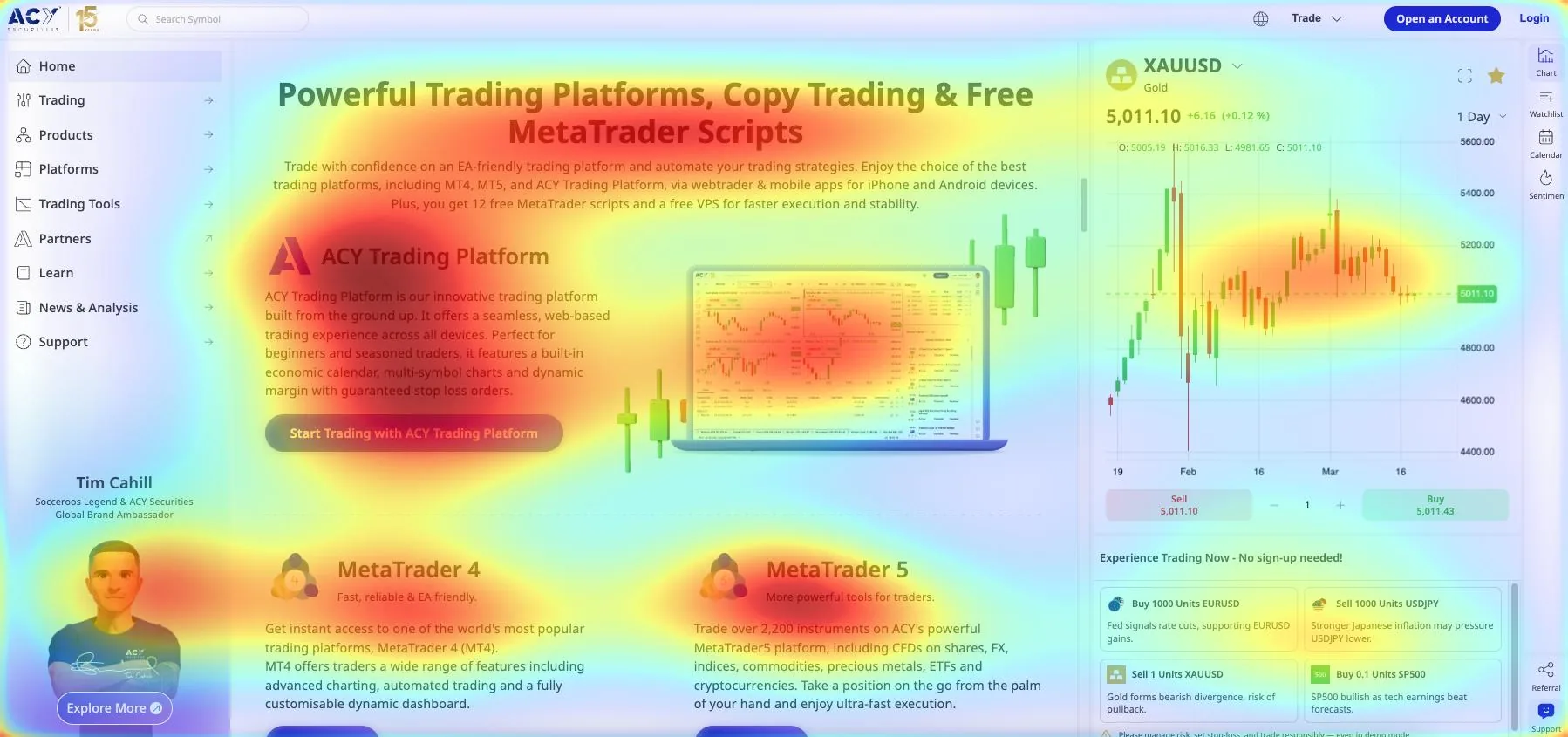
CTA performance — the primary CTA ("Start Trading") reached an
85/100 visibility score vs. competing elements at 50/100. Cross-device consistency: desktop (515 sessions)
vs mobile (571 sessions) showed similar interaction patterns, validating the responsive design-system
approach.
Beyond the metrics: real traders, real stories
Meet the personas behind my design decisions — qualitative research methodology,
user-journey maps, and the human stories driving 40% workflow improvements.
Designing the live account-registration flow required navigating ASIC's AFSL obligations
directly — PDS, FSG, TMD, and suitability assessment aren't optional checkboxes, they're legal requirements
with specific disclosure rules. Every screen was reviewed against ASIC RG 244 and coordinated with the
compliance team before development.
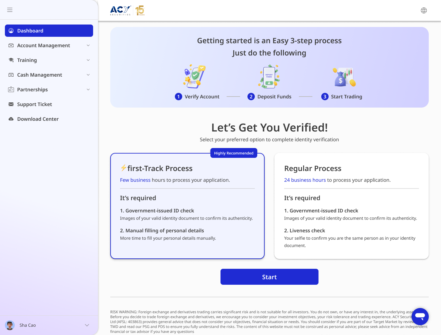
Two-track ID verification: Fast-Track (a few business hours, manual document
review) vs Regular Process (24 hours, liveness check). Reducing friction while satisfying ASIC
ID-verification requirements.
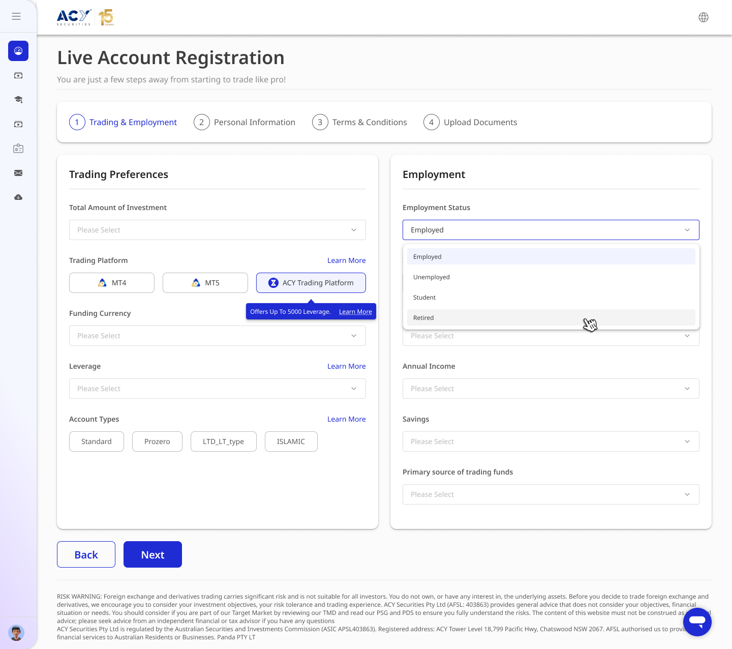
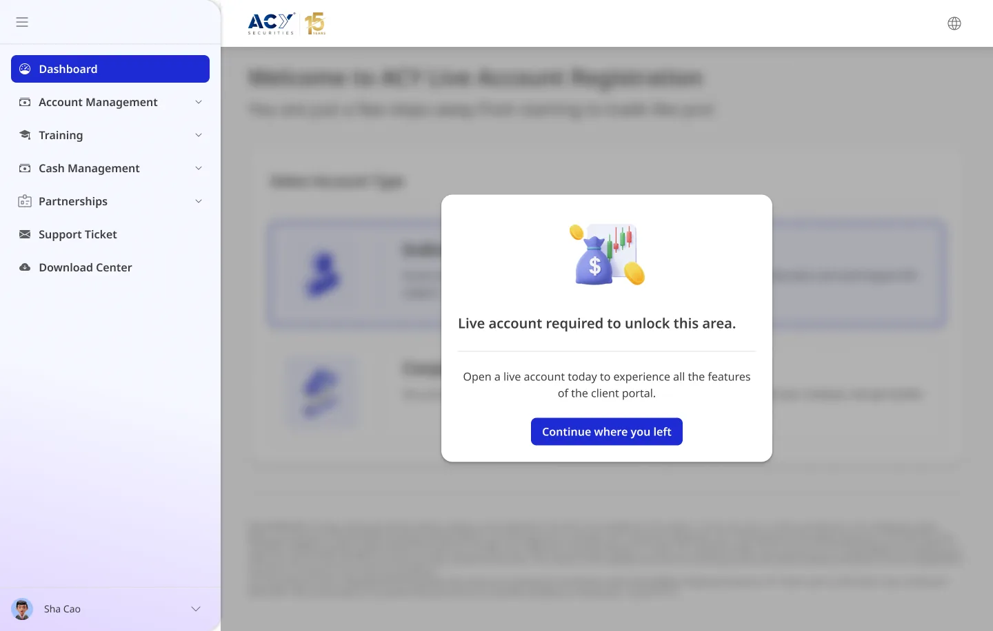
Step 1: ASIC suitability profiling — trading-platform
selection, leverage, employment status, annual income, account type (Standard / Prozero / Islamic).
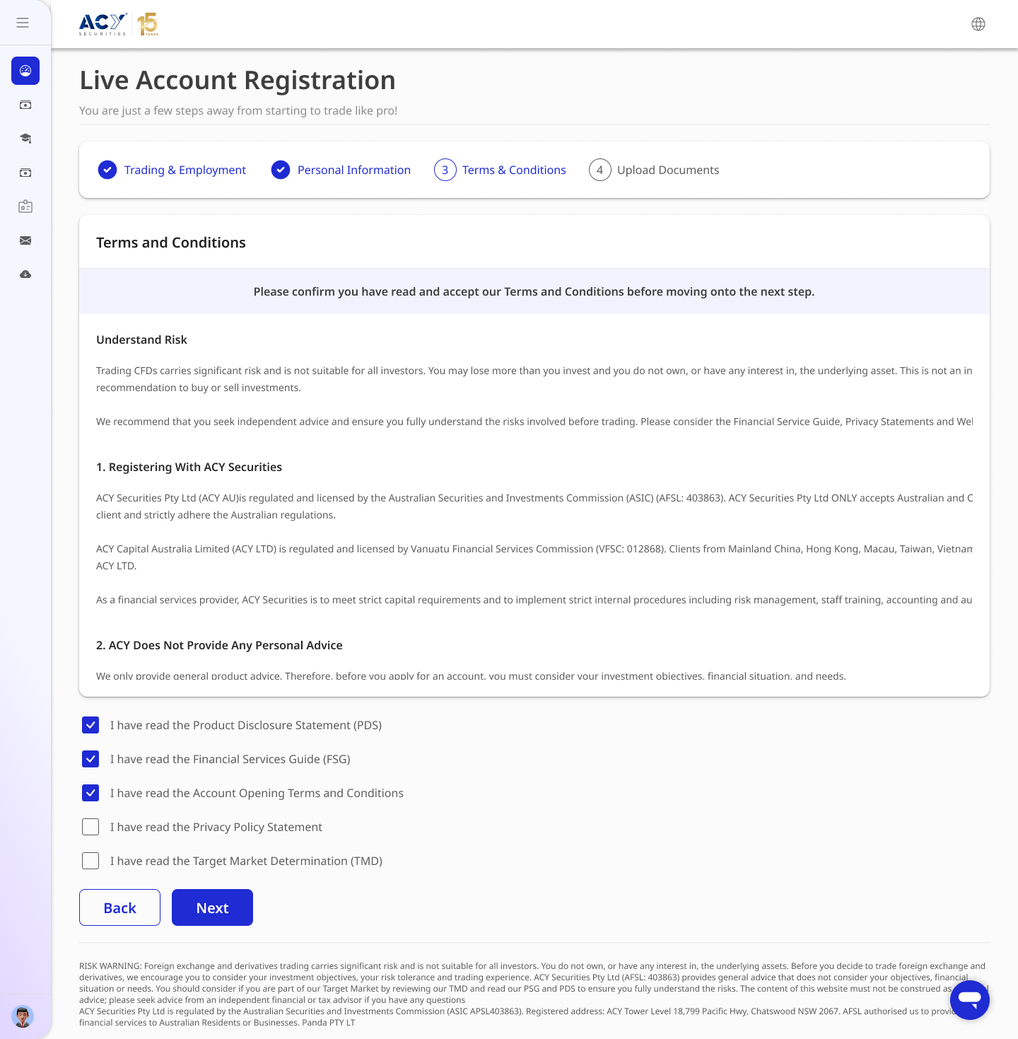
Required under ASIC's client-suitability obligations.Terms & conditions — explicit consent checkboxes for PDS,
FSG, Account Opening Terms, Privacy Policy, and TMD. Each disclosure document is individually acknowledged
per AFSL requirements.
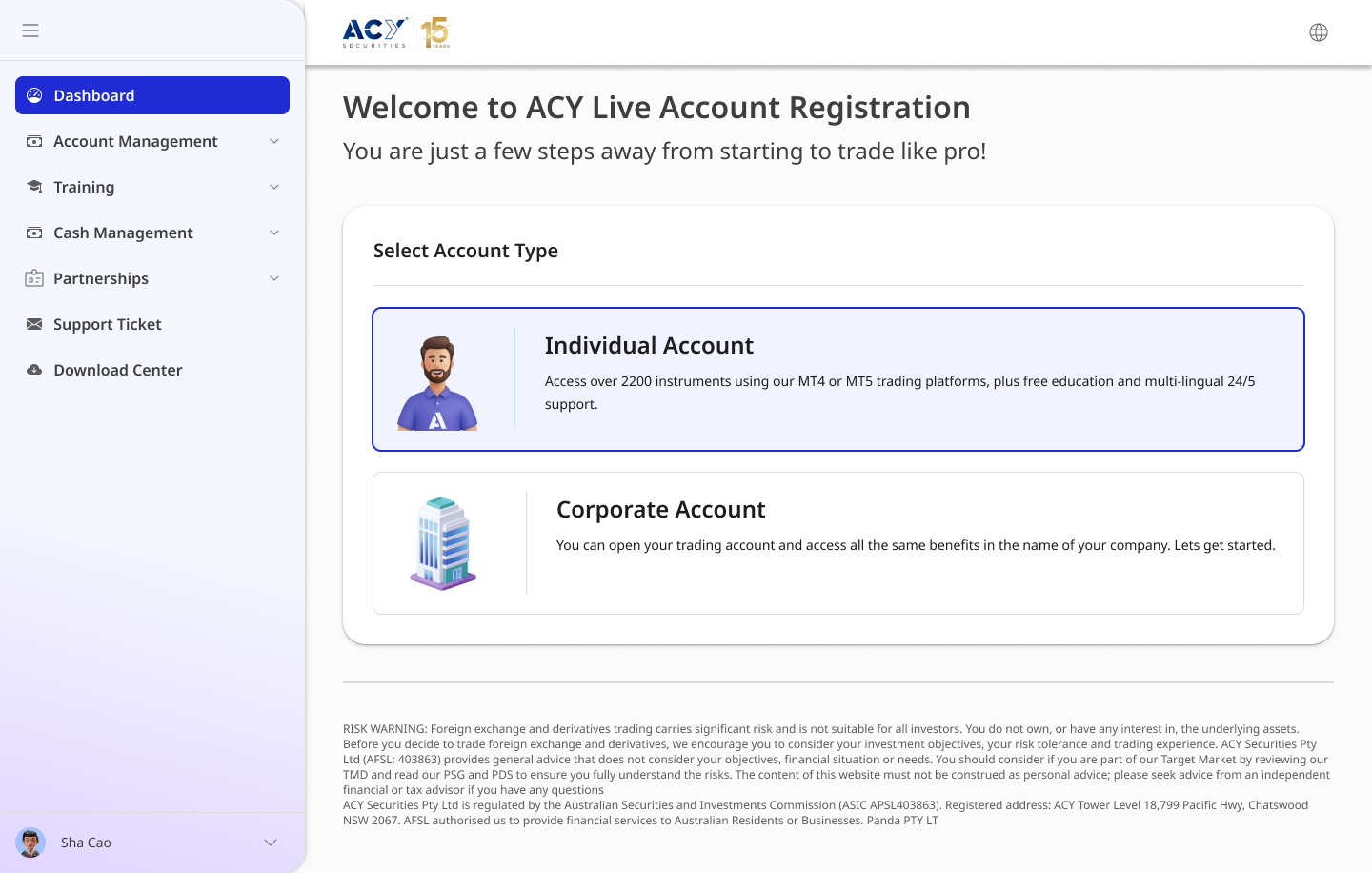
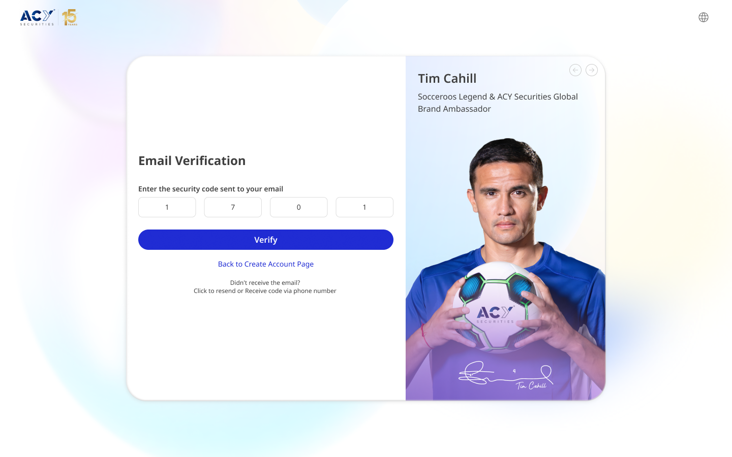
Account-type gate — Individual vs Corporate, with the ASIC
risk-disclosure footer present on every registration screen.Email OTP verification — split layout integrating the
brand-ambassador campaign to reduce drop-off anxiety at the identity-confirmation step.
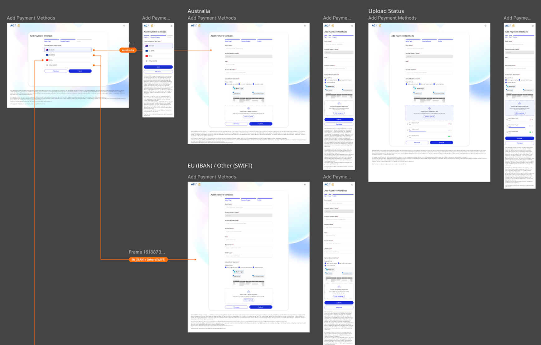
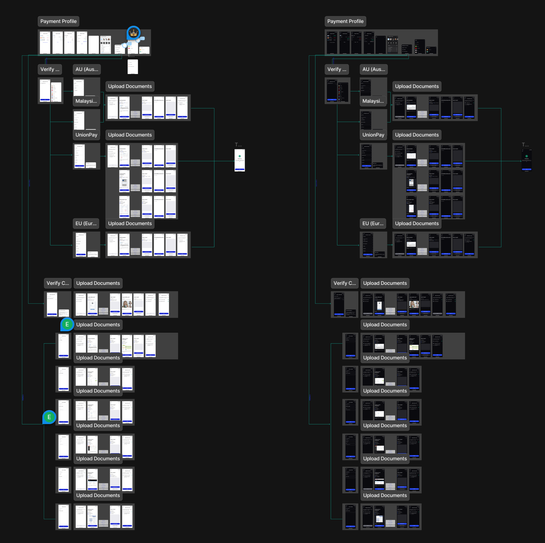
Payment-method architecture across jurisdictions — Australian BSB/Account, EU
IBAN, and SWIFT flows mapped as a system, handling upload-status states and jurisdiction-specific validation
rules.
ACY mobile app · 2023–2025
From first download to first trade
Led the full design of a consumer trading app serving 100K+ users across 12
countries. 80% of ACY's user base is mobile-first — many are first-time traders who've never used a desktop
terminal. The goal wasn't to shrink a professional tool onto a phone. It was to design an experience where
someone downloading a trading app for the first time could go from sign-up to their first trade in under 10
minutes — in their own language.
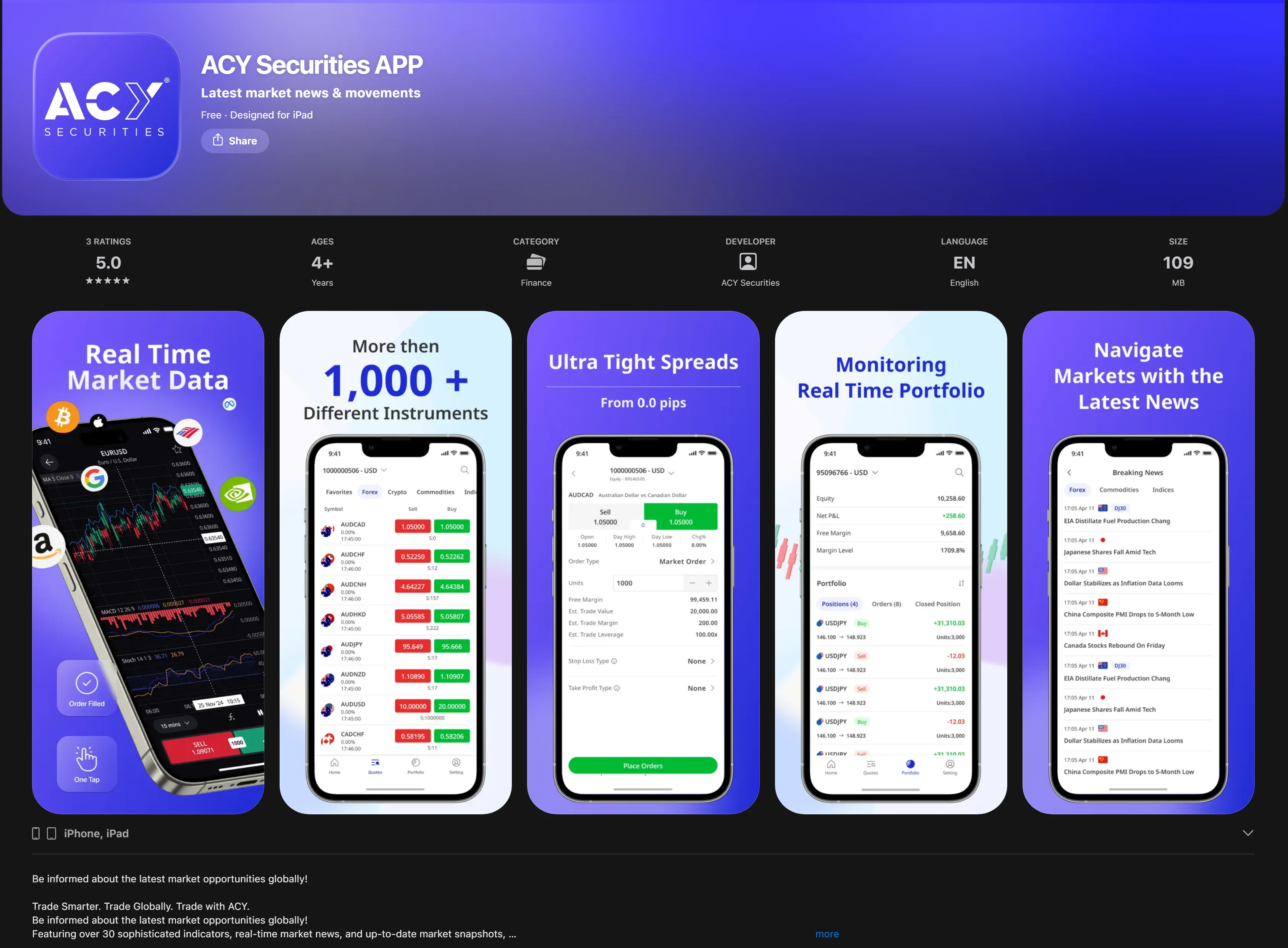
5.0★ on the App Store (2,000+ reviews) — consumer satisfaction,
not just a metric. Users call out ease of use and multilingual support in top reviews.Cross-platform launch: iOS and Android, serving users from Sydney to Dubai to Ho
Chi Minh City.
The consumer challenge: who is the mobile user?
ACY's desktop platform serves professional traders who want 6+ charts and 50+
instruments on screen. The mobile user is different: a 28-year-old in Dubai opening a trading app for the
first time, a Vietnamese student exploring forex during a lunch break, an Australian retiree checking gold
prices. The question wasn't "how do we fit the desktop on a phone?" — it was "how do we make someone
who's never traded feel confident enough to place their first order?"
Progressive disclosure
New users see 3 core actions: check a price, place an order, review their position.
Advanced features (multi-chart layouts, custom indicators, order types) reveal as users grow. No one sees
a 50-field screen on day one.
Multilingual-first design
Full RTL Arabic support, Vietnamese, Thai, English — not just translated strings, but
layouts that adapt: text expansion, culturally appropriate iconography, locale-specific number formatting
(1,234.56 vs 1.234,56).
Trust before transaction
First-time traders are nervous about money. Face ID / Touch ID positioned as security (87%
adoption in 90 days, per platform analytics). Every destructive action has a confirmation step. The
emotional state of the user — not just the technical state of the system — drives the interaction design.
Consumer-focused features
First-time user onboarding: a guided walkthrough from account creation
through KYC verification to first deposit — designed to reduce the "I don't know what to do next" drop-off
that kills most fintech funnels.
Biometric login: Face ID / Touch ID as the default fast path — 87%
adoption within 90 days (per platform analytics), reducing login friction for daily active users.
Contextual notifications: price alerts show where the price is relative
to the user's position — informative without being anxiety-inducing. "Gold dropped 2%" without context is
a relationship risk; with context ("still 4% above your entry") it's reassurance.
Offline portfolio: cached portfolio and trade history available without
connectivity — critical for users on inconsistent mobile networks across APAC/MENA markets.
Gesture navigation: swipe between charts, pull-to-refresh, long-press
for order modification — patterns users already know from consumer apps.
The consumer onboarding flow
Financial onboarding is where most consumer fintech apps lose users. ACY's mobile
KYC needed to satisfy regulators in 5+ jurisdictions (ASIC, FCA, CySEC) while keeping a first-time user
engaged through multi-step identity verification. I designed the flow to feel like a conversation, not a
compliance form.
Step 1: Personal info — clear progress indicator at the top.
One section at a time. Users always know how far they are and how much is left.Step 2: Financial background — smart defaults and
plain-language labels. "Annual Income," not "Declared Gross Revenue." Designed for someone filling this
out on a bus, not at a desk.Step 3: Experience assessment — a regulatory requirement turned
into a helpful moment. Honest answers route users to appropriate risk levels and educational content.
Step 4: ID verification — a camera-guidance overlay ensures
document captures are clean on the first attempt, reducing re-submission rates and support tickets.
Step 5: Review & submit — a full summary before submission,
with editable sections so users don't have to restart, and a confirmation screen with clear next-step
expectations.
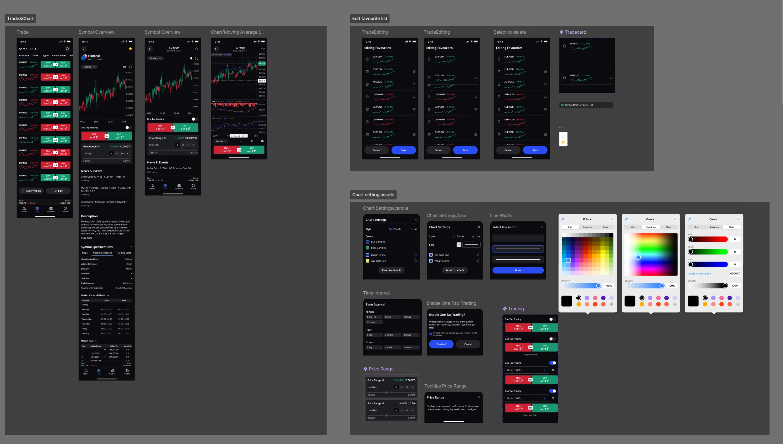
Design evolution: from exploration to production
V1 exploration (June 2023) — early layout directions for
Dashboard, Favourites, and Chart views. Testing which information hierarchy felt right for first-time
users vs. experienced traders.Full user-journey map — every screen and transition from app
download through KYC, first deposit, and first trade. This became the single source of truth for
engineering handoff and QA across 3 platforms.Payment IA — the user sees "Add funds." Behind that button:
branching logic across AU BSB, Malaysian bank transfer, UnionPay, EU IBAN, and SWIFT — each with
jurisdiction-specific document requirements. Complexity hidden from the consumer, visible to the system.
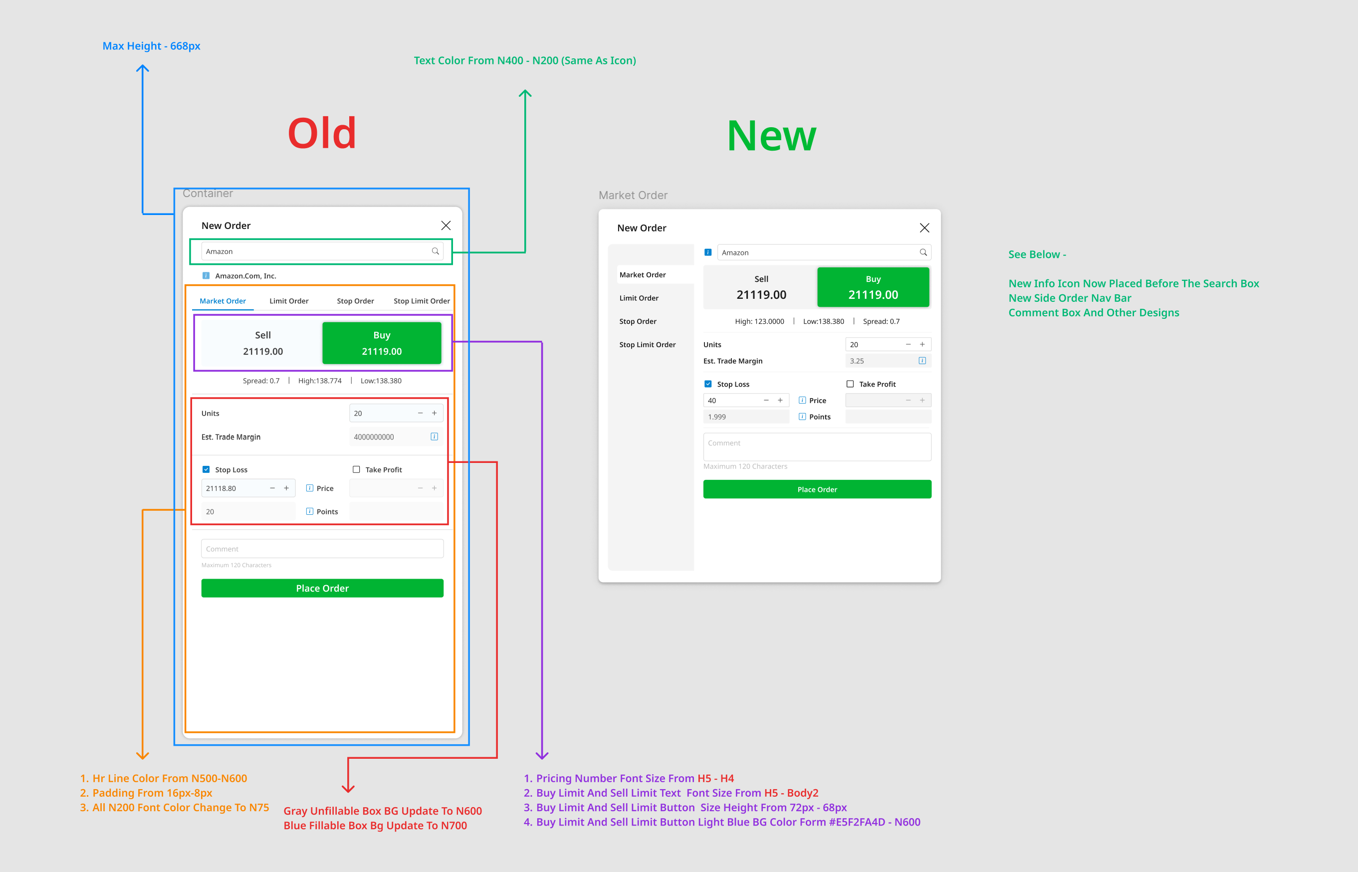
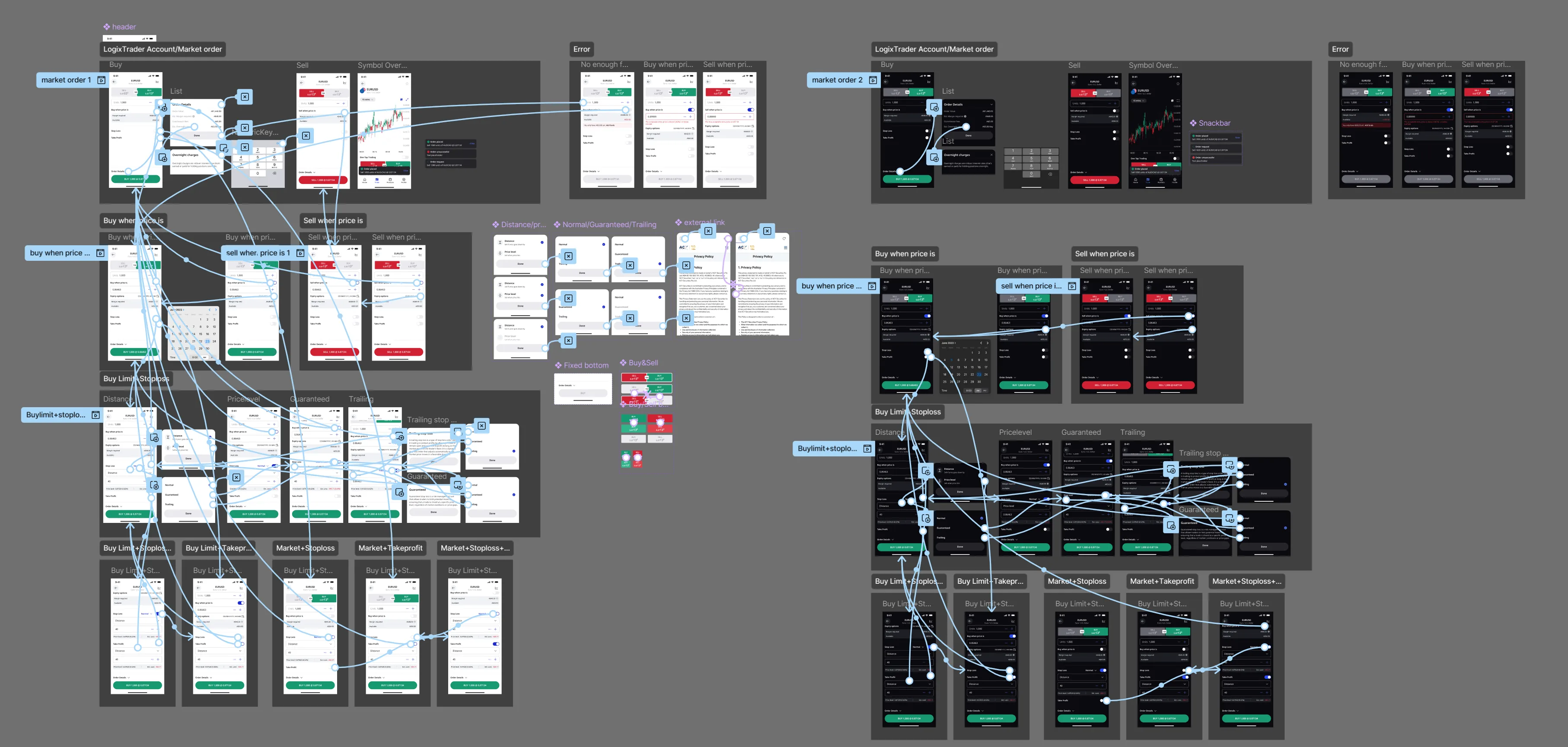
Engineering handoff — redline annotations for the Journal
Summary (Trades), covering Market Order execution variants. Precise specs reduce engineering
interpretation and keep the consumer experience consistent across builds.
ACY Mobile is a consumer product built under institutional constraints. 100K+ users across 12
countries, 5+ regulatory jurisdictions, 4 languages including full RTL Arabic — and a 5.0★ rating that says
the complexity stays invisible to the person using it.
Want the story behind the work?
This page is the project — architecture, artefacts, outcomes. The near-five-year narrative
— chapters, mistakes, team changes, lessons learned — lives on a separate page so the case study stays
focused.
Zero design-related compliance violations — 2+ years
Every public-facing design had Legal sign-off before shipping. Every ASIC, FCA, and
ESMA requirement was encoded into the design system, not retrofitted after the fact. Over 2+ years (Q1 2023
– Q1 2025): zero design-related regulatory violations. Verifiable via the ASIC Connect Public Register (asic.gov.au) and
available to confirm during interview.
What the design system did
Risk warnings and disclosure UI patterns designed with Legal sign-off before production
Consent-flow architecture validated against ASIC RG 227 requirements
Multi-jurisdiction disclosure templates covering FCA, CySEC, FSCA simultaneously —
built to the strictest standard, compliant everywhere
8 regulatory updates (ASIC leverage caps, ESMA inducement bans, FCA SCA) shipped in
3–5 days each through component variants, not redesigns
Compliance as a design discipline. In regulated financial
environments, a single disclosure error can result in material regulatory penalties. Working within ASIC/FCA
frameworks over 2+ years — with compliance-team sign-off on every public-facing design — builds the
discipline of treating legal constraints as design inputs, not post-launch revisions.
Brand architecture & governance
The same governance discipline, applied to identity
The platform work above is one half of the ACY mandate. The other half is the brand system
that speaks for those platforms across 40+ jurisdictions. I designed and built the ACYLogix Brand Guidelines
from the ground up — corporate architecture, master mark, 14 sub-brand lockups, colour scale, typography,
voice, regional flexibility rules. HTML, CSS, JS, SVG export pipeline, type and colour system — all mine.
It was built to remove a cost, not to look tidy. Five designers across four
countries produce group material and none of them report to me; once a year all of it converges on one desk
to be assembled. The field note
A Mandate Is Not Adoption is the account of what that
assembly cost, what I asked the CEO and the COO for, and the part that did not work — roughly half the
group builds to the spec today.
What this case study evidences · and what it doesn't
For a Senior PD or Design Lead interview panel
This case study evidences nearly five years of shipped production design at a regulated ASIC
broker. The record: a 150-component system across five product surfaces; eight regulatory rewrites absorbed at
the token layer; $2B+ daily volume and 100K+ traders; KYC completion 27% → 55%; engineering velocity 3 → 1.5
days per screen across thirty Jira sprints; fourteen sub-brand lockups rebuilt for a multi-jurisdiction
parent. Every load-bearing number carries its instrument — GA4, Hotjar, Jira, or an externally
citable register — inline or one click away in the field notes.
What this case study deliberately does not claim.
No external accessibility audit — the certified WCAG 2.1 AA letter has not been
commissioned; the accessibility disclosure names
six limits and a replication plan.
The Finlogix 40% number is a controlled within-subjects study, n = 15 — not a
population-scale claim; full design and limits at the methodology disclosure.
The ASIC RG 268 surface took three iterations over eighteen months, including a v1 failure
mode and one projection that never materialised — the post-launch note keeps the honest negative result.
FIX onboarding met one IT director who did not want to migrate — the political-skill note records his three
objections and what earned adoption.
The disclosure register. The four field notes are not appendices —
they are the evidence layer, where the engineering, compliance, and accessibility scepticism a hiring panel
brings is met head-on rather than left to chance.
Every problem we solve for clients has multiple valid approaches — different costs,
different ROI, different risk profiles. These threads show how the approach on this page compares to others
in the portfolio.
Thread
Regulatory Routing & Disclosure
How upstream regulation and macro prints become downstream product defaults
and Legal-safe disclosure.
How we prove design claims with data — GA4 funnel, n=15 paired within-subjects, named instruments, and
the rigor behind every number quoted on this site.