Turning 1,000+ data points a session into a single next move.
The first product I built end-to-end at ACY — a real-time market-analytics platform
for professional traders, from the brand and design system to every indicator. Then I maintained and evolved
it for years. This is how density became clarity — and how one wrong turn, caught by data, made it right.
Pro — full depth, every indicator, keyboard-first. Same product, dialled up.
The real product
Not a mockup. This is what shipped.
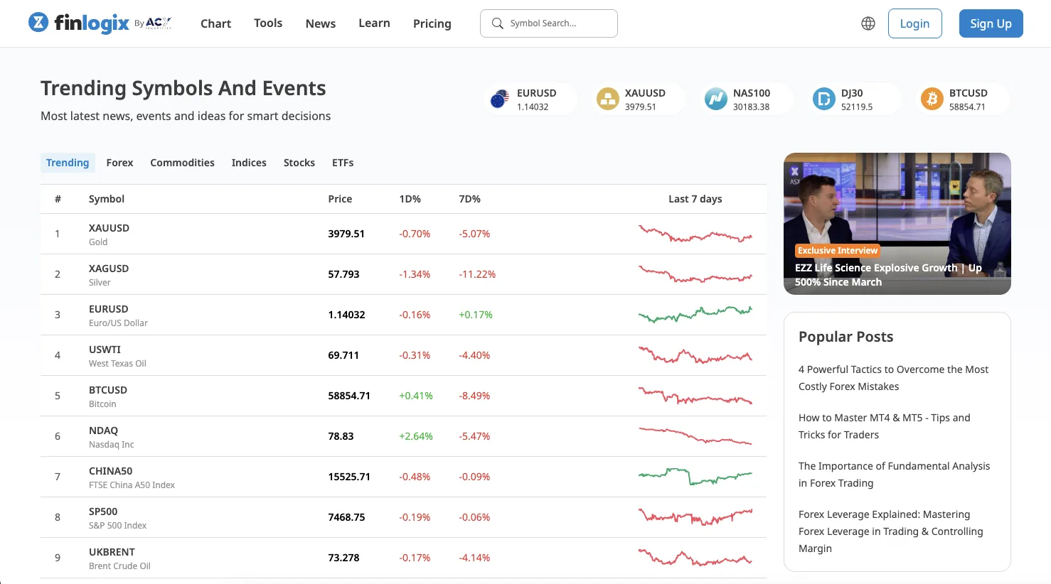
Finlogix is live in production at finlogix.com — the home surface alone carries trending
symbols, a live movers table, curated research and an events rail, all ranked so the one thing worth acting on
surfaces first.
Home · trending & moversSymbol · technical analysisSentiment · long / shortCalendars · economic & earningsWidgets · embeddable suite
The problem
Everything, all at once.
A professional trader processes 1,000+ data points a session — prices,
spreads, economic events, sentiment, indicators. The original Finlogix layout showed all of it, everywhere,
with equal weight. Every pixel shouted. Nothing pointed.
The job wasn't to remove data — professionals need it. It was to make the
signal pre-attentive: the one thing you need next, findable in a glance.
The answer, surface by surface
Every screen earns its density.
The rebuild wasn't one hero page — it was a system of surfaces, each one solving a
different job for the same trader. Here's how the hierarchy plays out where it matters.
01 · Decide
Technical analysis that reaches a verdict.
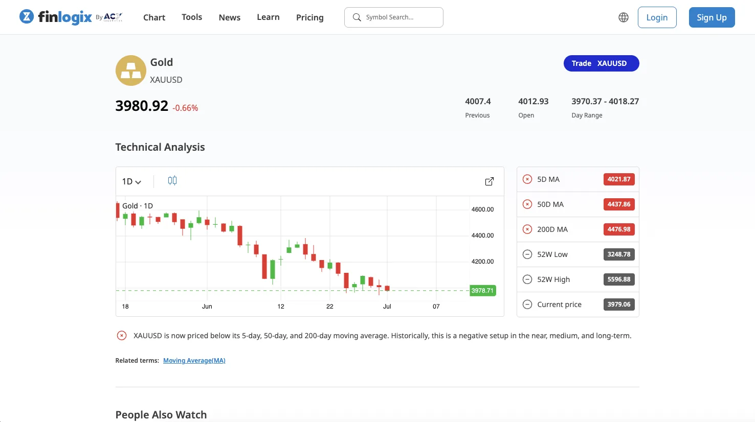
A symbol page doesn't just plot a chart — it collapses a moving-average stack, day range and 52-week
context into a plain-language read: priced below its 5-, 50- and 200-day averages. The judgement
is the interface; the data backs it up, one scroll down.
MA stack 5 / 50 / 200DDay range52W hi /
loPlain-language read
finlogix.com/chart/XAUUSD
Symbol · technical analysis
02 · Anticipate
Two calendars, one glance at what's coming.
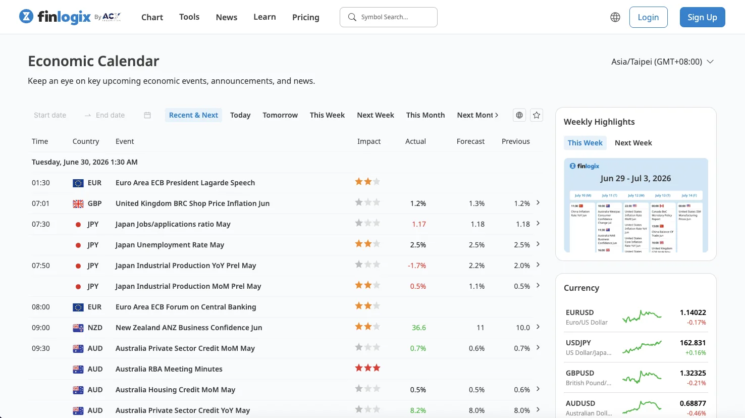
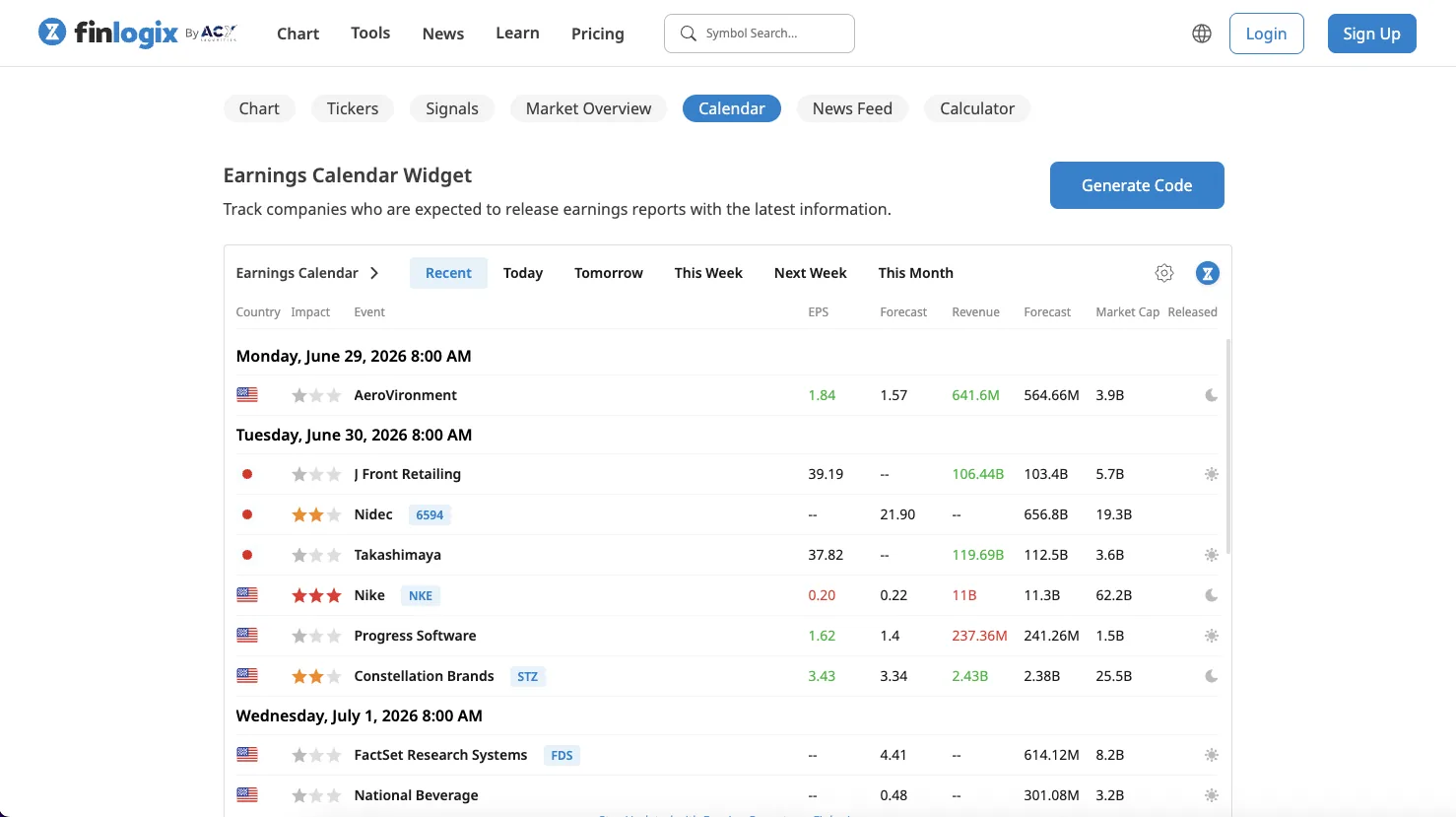
An impact-ranked economic calendar and a companion earnings calendar answer the trader's real question —
what could move my position, and when? Colour-coded surprises (actual vs. forecast), star-rated
impact, and a weekly-highlights rail keep the noise filtered to the markets you actually hold.
Impact ★ rankingActual vs forecastWeekly
highlightsEarnings · EPS & revenue
finlogix.com/economic-calendar
Economic calendar
Signal at a glance
The whole market's positioning, in one read.
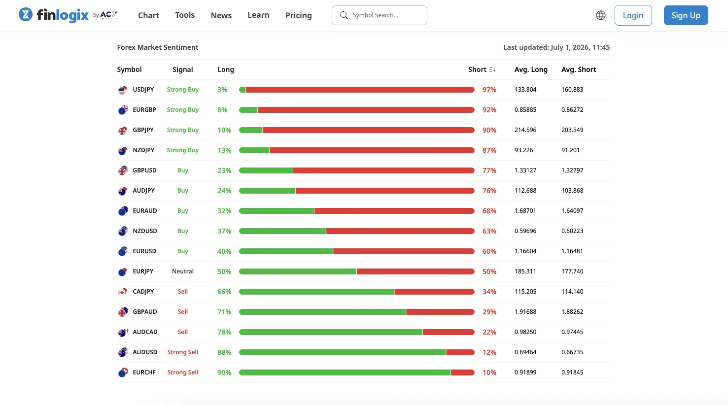
This is the thesis made literal. Forex sentiment is fifteen currency pairs of crowd
positioning — and a table of percentages would bury it. Instead, a single long/short bar per row lets the
eye find the extremes pre-attentively: the deepest reds and greens jump before you read a
number.
Long %Green mass = crowd leaning long. Sorted so the strongest conviction sits at the
poles.
Short %Red mass = crowd leaning short — 97% on USDJPY reads instantly, no
column-scanning.
Signal labelStrong Buy → Strong Sell, derived from positioning — the verdict, spelled
out.
finlogix.com/sentiment
The move
A workspace that matches how you think.
I rebuilt Finlogix as a modular widget system — economic calendar, symbol
data, sentiment, charts, indicators — that each trader arranges to match their own mental model. And because
every widget is self-contained, the same surfaces ship as embeddable code any partner site can drop in.
Toggle the demo, then see the real generator.
Chart 2.0
Candles + indicators
MACD, RSI, Williams %R, Triple EMA — configurable per pane.
Calendar
Economic events
Impact-ranked, filtered to the markets you actually trade.
Sentiment
Market heatmap
Long/short positioning at a pre-attentive glance.
Indicators
Signal library
Oscillators & overlays with saveable templates.
Watchlist
Your symbols
Custom groups, inline sparklines, quick-jump.
News
Live feed
Source-tagged, symbol-linked, noise-filtered.
finlogix.com/tools/widgets
Real widget generator · “Generate Code”
67% of users built a custom layout within three
months of launch (platform analytics, Q4 2023).
The honest part
My first instinct was wrong. The data said so.
Simplify, right? My first redesign stripped the density hard. It looked calmer —
and it tested worse. This is the part most portfolios hide.
01 · The instinct
“Less is more.”
I cut the density aggressively — fewer numbers, more whitespace. Cleaner to look at.
−31%
task confidence — traders felt they'd lost the data they rely on.
02 · The correction
Let the data drive.
Usability testing caught it early. For experts, density is the value — the fix wasn't less
information, it was better hierarchy. I reversed the direction.
03 · The shipped answer
Progressive complexity.
Segmented modes (novice → pro), progressive disclosure, WCAG 2.1 AA typography for dense numerals. Signal
first; full depth on demand.
40% faster
to first insight, once the direction was right.
Measured, not asserted
The numbers, with their limits stated.
A controlled within-subjects usability study (n=15 active traders, paired t-test
t(14)=8.92, p<0.001) on the time-to-insight task — identify the top-3 risk holdings.
4.2s→2.5s
Time-to-insight — top-3 risk holdings
Measured · n=15 paired t(14)=8.92 · the d=2.47 study
d=2.47
Cohen's d on time-to-insight only — a very large effect (>0.8 is already “large”)
Measured · TTI paired difference · CI [1.4s, 2.0s] · not the order-placement study
8.2s→2.9s
Order-placement flow completion — separate lab study
Measured · companion lab · no t-stat · not d=2.47
67%
Users who built a custom layout
Measured · platform analytics · Q4 2023
Before
4.2s
After redesign
2.5s
Modelled-vs-measured. Cohen's d = 2.47 belongs only to time-to-insight
(4.2s → 2.5s, n=15 paired). The order-placement 8.2s → 2.9s is a separate lab study with no t-statistic.
TTI is statistically decisive on the task measured and explicitly scoped: small
sample, single-task, no pre-registration, no blinding. Full methodology with seven named limits and a public
correction record at note-finlogix-methodology.html.
End to end
I owned the brand, the tokens, and the indicator suite.
This wasn't a screen refresh. I owned Finlogix end to end as its product designer — the brand system, the
light/dark token architecture, and the full Chart 2.0 indicator suite with its configuration surfaces. Click
any board to enlarge.
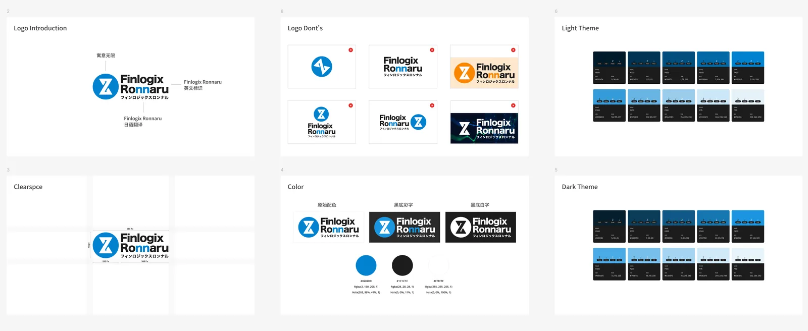
Finlogix brand systemLogo · color · light/dark theme
Brand mark, clearspace, the #0282D0 blue system, and full light/dark
theme scales — designed from scratch.
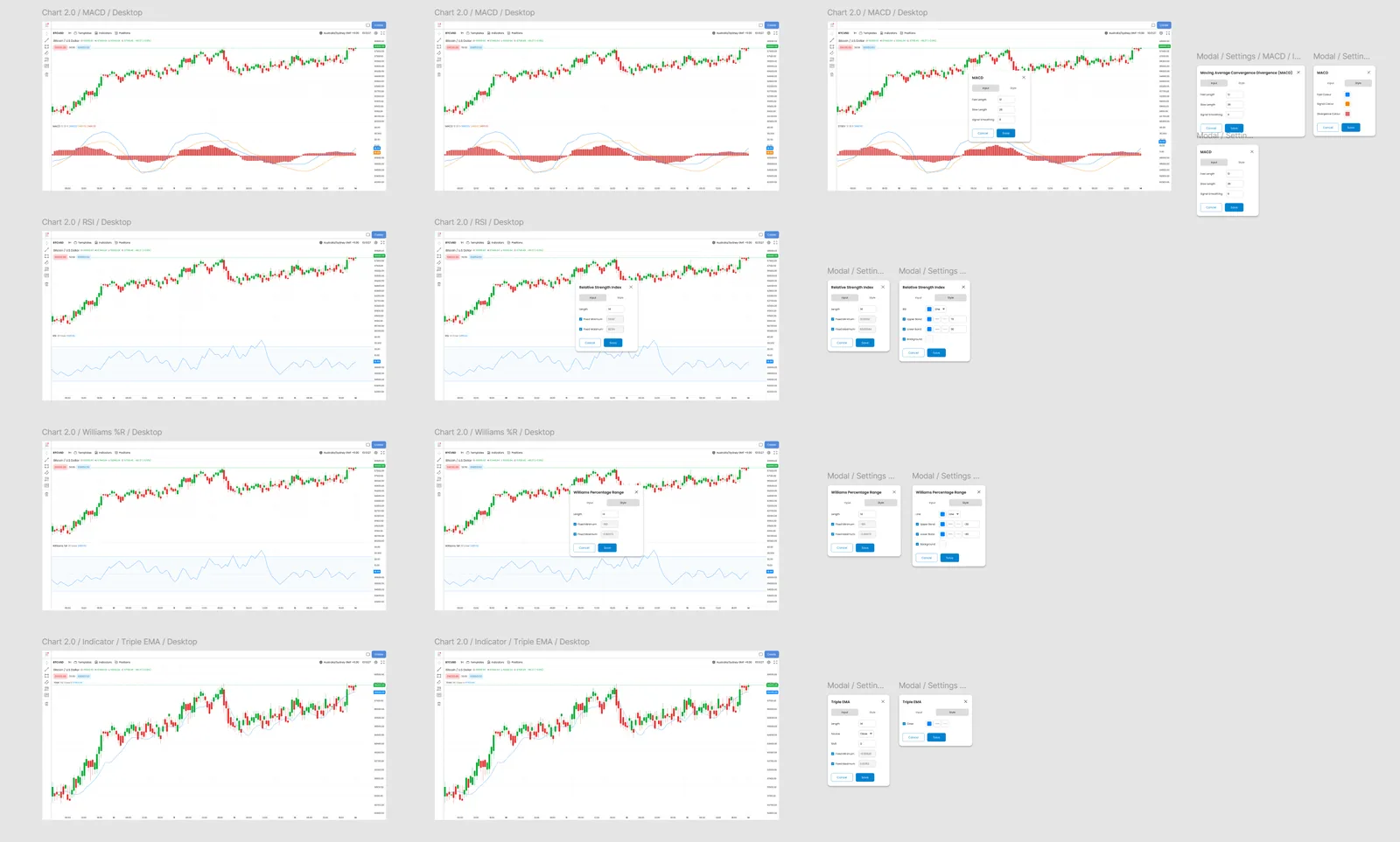
Chart 2.0 · indicator suiteMACD · RSI · Williams %R · Triple EMA
Every oscillator and its input/style configuration modal — states,
defaults, and edge cases specified.
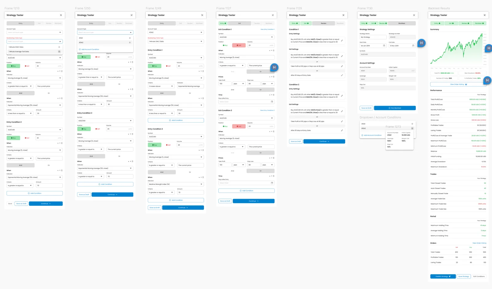
Strategy testerBacktesting UX
Backtesting made legible — parameters, run, and results in a flow a
trader can actually reason about.
Not a mockup
Shipped. Distributed. Maintained for years.
Finlogix went live at finlogix.com and shipped as an embeddable widget suite and a Chrome
extension. It's one of five production surfaces governed by the 150-component design system I built at ACY —
the same token architecture that absorbed eight regulatory rewrites without a rebuild.
Live
at finlogix.com — in production, not a concept
Chrome
shipped as a Web Store extension + embeddable widgets
1 of 5
production surfaces on the 150-component design system
Years
owned, maintained, and evolved since 2023
For experts, density is the value — the craft is making the signal
find you first.
Every problem we solve for clients has multiple valid approaches — different costs, different ROI, different risk profiles. These threads show how the approach on this page compares to others in the portfolio.
Thread
Retail → Institutional Translation
Taking consumer-grade UX expectations into regulated/professional contexts — or reverse-porting institutional discipline back to retail.
Finlogix · Market AnalyticsProfessional trader education & densityLow eng cost · n=15 paired TTI · Cohen's d 2.47 on time-to-insight only