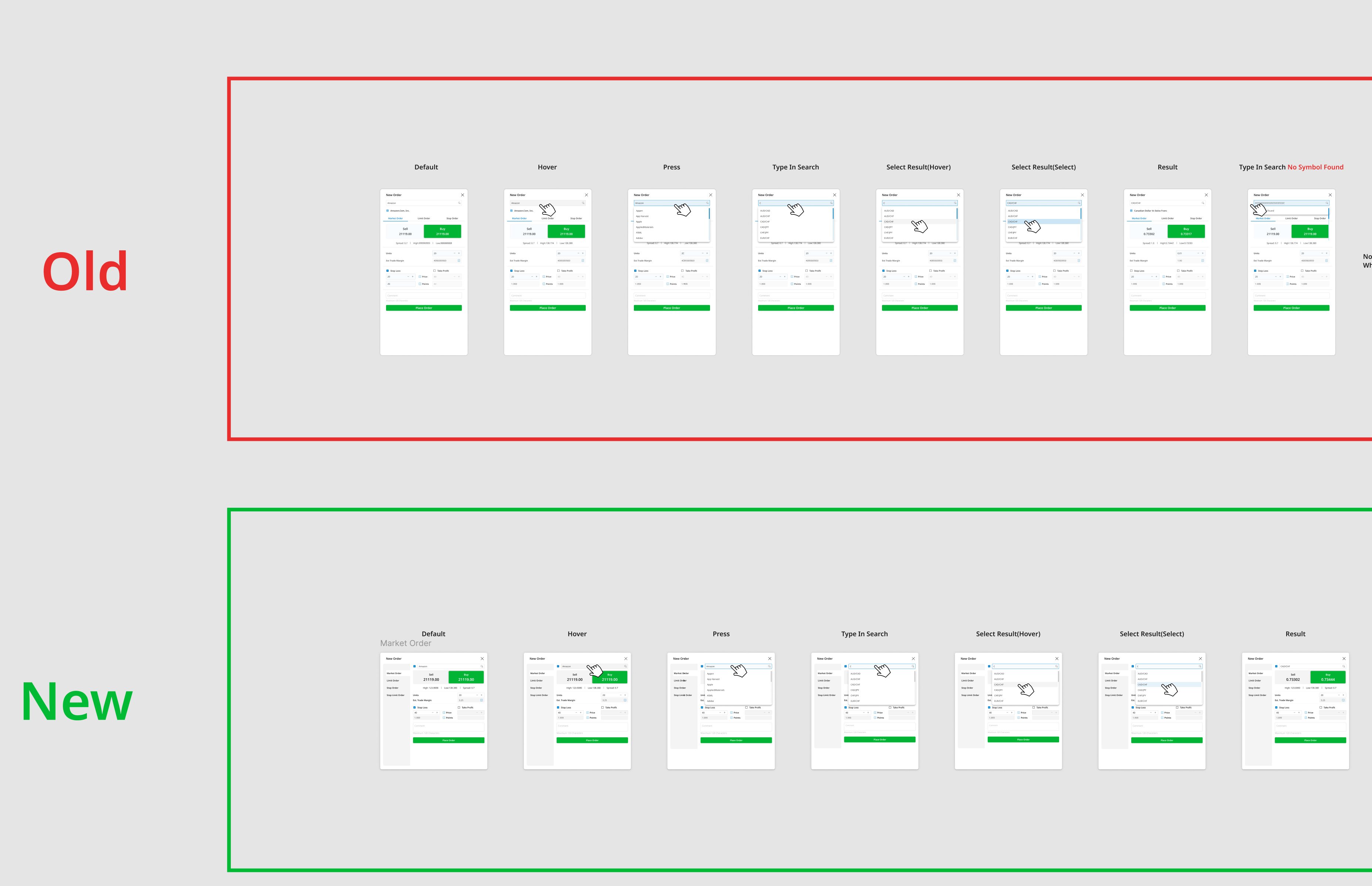
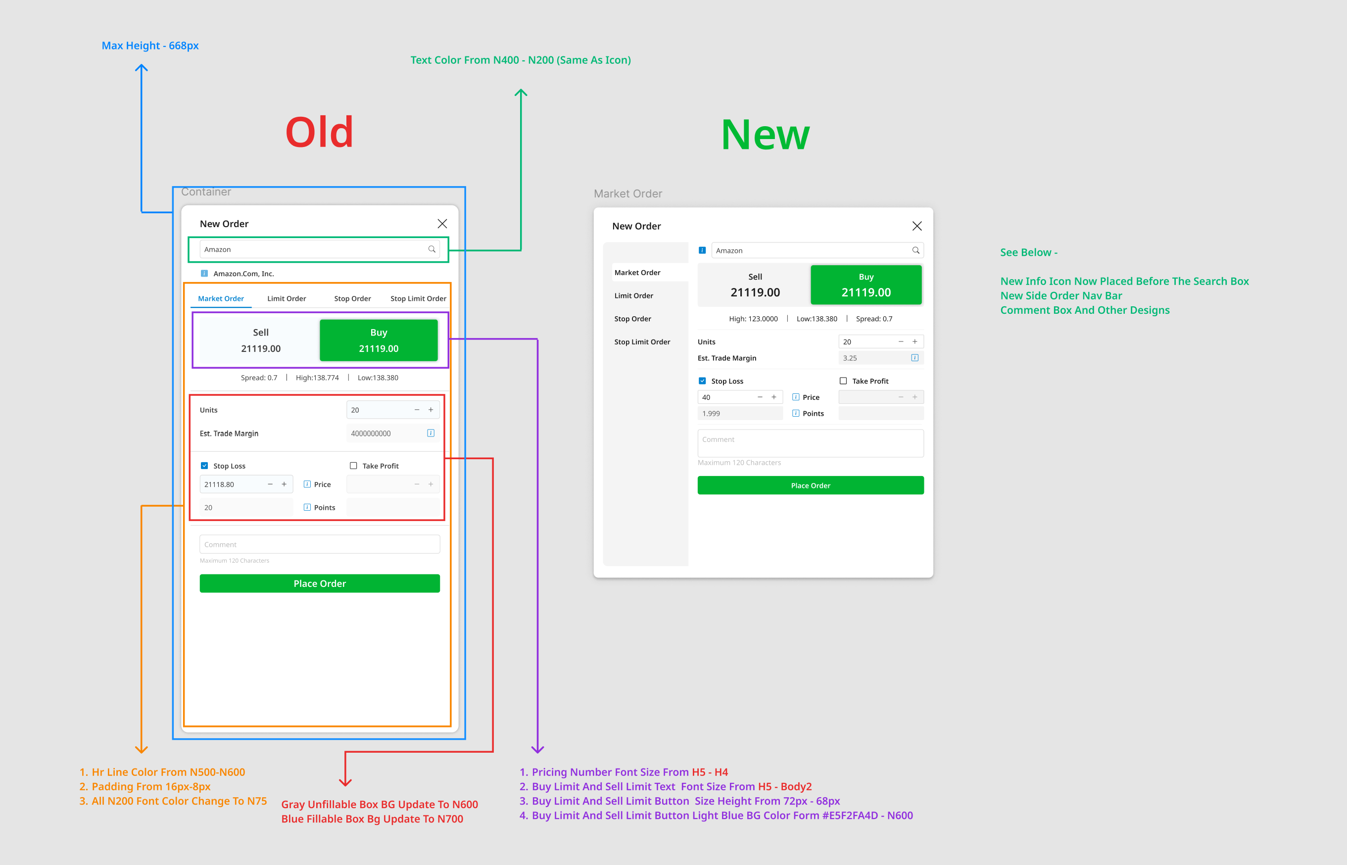
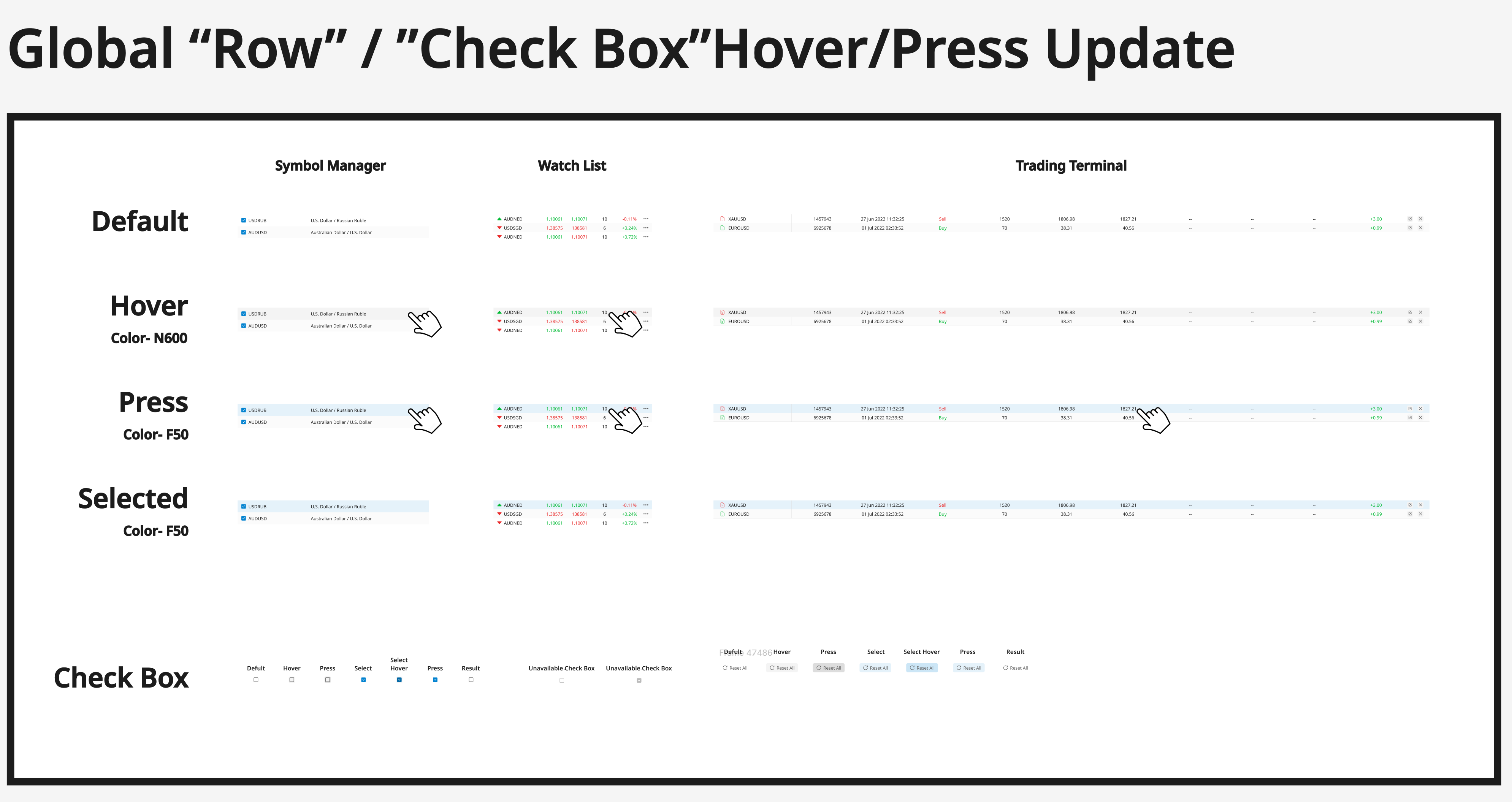
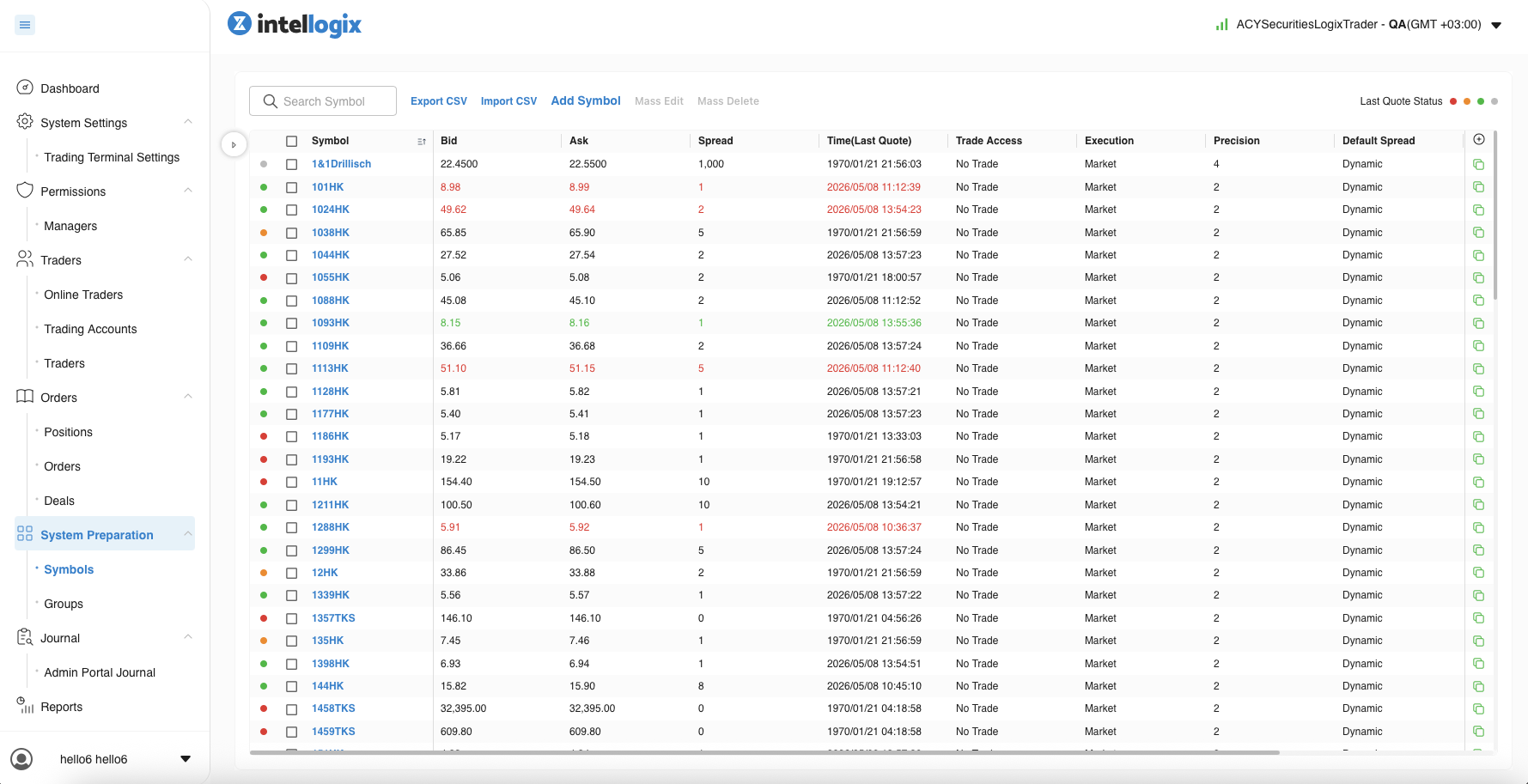
LogixTrader
Proprietary Trading Platform
Designed ACY Securities' proprietary web trading platform targeting the strategic segment between beginner and advanced traders. optimizing for discretionary trading workflows where MT4's complexity becomes a barrier, without attempting to replace its dominance in automated/algorithmic trading.
COLLABORATION FRAMEWORK
My Role: Lead Product Designer (End-to-end UX/UI design, interaction
specifications, design system governance)
Collaborated With: 5 Engineers (4 Frontend + 1 Backend for real-time
data feeds), Product Manager (competitive analysis, feature roadmap), Legal & Compliance
Officer (order validation rules, risk disclosures), 45 beta traders (usability testing
participants)
Team Context: Cross-functional team within ACY Securities ecosystem.
worked within established brand guidelines while building platform-specific interaction
patterns for order execution and risk management
Executive Summary
As Product Designer at ACY Securities (2022–present), I designed LogixTrader — the company's proprietary web-based trading platform built to compete directly with MetaTrader 4 and MetaTrader 5, the entrenched industry standards that command over 80% of retail forex trading volume. This project required solving three simultaneous design challenges:
- Cognitive Load Optimization: Traders making 30-80+ trades per day need sub-second visual parsing. Every unnecessary element, every ambiguous label, every extra click compounds into measurable revenue loss.
- Competitive Differentiation: MT4/MT5 users have years of muscle memory. LogixTrader had to feel faster and more intuitive without alienating power users who define "good UX" as "what I already know."
- Hybrid Architecture: Collaborated with operations leadership and product management to advocate for a hybrid architecture — a custom UX layer bridging MT infrastructure — getting the best of both worlds without the constraints of either.
1. The Challenge: Competing with an Industry Monopoly
MetaTrader 4/5 isn't just a trading platform — it's an ecosystem. Brokers offer it because traders demand it. Traders demand it because brokers offer it. Breaking into this cycle required understanding three critical risk vectors that would determine whether LogixTrader would be adopted or abandoned:
Sub-Second Decision Environment
Active forex traders operate in windows of 200-800ms. Price data changes continuously. A cluttered interface doesn't just frustrate users — it directly costs them money. Every design decision had to pass the test: "Does this help or hinder a trader making a split-second call?"
MT4/MT5 Muscle Memory Lock-in
Professional traders have spent years building workflow habits around MetaTrader. Keyboard shortcuts, chart layouts, one-click execution paths — all encoded into unconscious motor patterns. Any alternative that disrupts these patterns feels "slower" regardless of actual performance.
Cognitive Load in High-Frequency Context
Trading interfaces must simultaneously display price feeds, open positions, account metrics, order forms, and chart analysis. The information density required is extreme — but information overload causes decision paralysis and costly errors.
2. What I Was Asked vs. What I Actually Did
Initial Brief
The initial request from product leadership was straightforward: "Design a modern, clean web trading interface that can serve as ACY's proprietary alternative to MT4/MT5 for clients who prefer browser-based trading."
What I Actually Delivered
Through competitive analysis of 12+ trading platforms and contextual research sessions with active ACY traders, I identified that "modern and clean" was insufficient as a design brief. The real challenge was information architecture under extreme cognitive constraints. Working with product management on requirements alignment and operations leadership on strategic positioning, I expanded the scope to address:
Instead of: "Make a clean
trading platform"
I designed for: "Optimize every pixel for sub-second decision
clarity while maintaining the information density power traders demand — without
the cognitive overhead that makes MT4/MT5 intimidating to newer traders."
- Progressive complexity model: Default clean view that expands to full-density mode as traders advance
- Keyboard-first interaction design: Complete trading workflows accessible without mouse movement
- Contextual information hierarchy: Data surfaces only when decision-relevant — order placement time dropped from 8.2s to 2.9s in usability testing
- One-click execution paths: Market orders achievable in a single interaction from any state
3. Architecture Decision: Three Paths Forward
The most consequential decision in the LogixTrader project wasn't visual — it was architectural. How do you build a trading platform that can realistically compete with MetaTrader's decades of infrastructure while shipping in a reasonable timeline? We evaluated three approaches:
Option A: Full Rebuild from Scratch
REJECTEDBuild proprietary matching engine, data feeds, charting library, and UI from zero. Complete ownership of the stack.
2-3 year development timeline with unproven execution infrastructure. MetaQuotes has spent 20+ years building MT's matching engine reliability. Attempting to replicate this from scratch introduced unacceptable operational risk for a regulated broker handling real client funds.
Option B: Skin Over Existing MT4/MT5
REJECTEDApply custom CSS/UI layer on top of MetaTrader's existing web terminal. Fastest path to market.
Locked to MetaQuotes' component architecture and interaction patterns. Could not implement contextual data surfacing, custom keyboard shortcuts, or the density-aware layering that differentiated LogixTrader. Would remain perpetually constrained by MT's layout system and update cycle. No competitive moat.
Option C: Hybrid — Custom Frontend + MT Bridge
CHOSENA fully custom frontend with proprietary UX, connected to MT's proven execution infrastructure via API bridge. Complete design freedom with battle-tested backend reliability.
Full design control over the experience — progressive disclosure, custom layouts, keyboard-first workflows, contextual data surfacing — with MetaTrader handling the execution backend. Shipping a broker-dealer from scratch would have taken 2+ years; this architecture got us live in under 8 months without compromising UX. This is the architecture powering demo.acylogixtrader.com today.
4. Testing the Limits: Where Minimalism Breaks
During early research, we deliberately tested the boundaries of interface simplification. Drawing on consumer fintech patterns, I hypothesized that professional traders might accept cleaner UIs if we preserved core functionality. Exploratory testing with 8 active traders surfaced strong directional signals against this assumption. revealing the hard constraints of high-frequency trading environments.
Testing revealed keyboard shortcuts non-negotiable.
Hidden
panels
increased task completion time by 3.2s.
"This feels slower than
MT4.". Trader feedback
Spatial coding for muscle memory.
Data mapped to peripheral
zones.
"I can trade with my eyes half-shut."
The core insight: minimalism is not the same as clarity. Professional traders need high information density — the design challenge isn't reducing information, it's organizing it. V2 reintroduced dense data panels, keyboard shortcut overlays, and one-click order widgets, but used strict visual hierarchy (size, color, spatial grouping) to separate signal from noise. The result was a platform that felt "faster" than MT4 to experienced traders — not because it showed less, but because it showed the right things at the right time.
V1: Over-Simplified
- Keyboard shortcuts removed in favor of "clean" click-based UI
- Quick-access order panels hidden behind hamburger menus
- Market depth data moved to separate tab (extra click per trade)
- Position summary collapsed by default — traders couldn't see P&L at a glance
- Feedback from beta testers: "Looks nice, can't trade on it"
V2: Dense but Hierarchical
- Full keyboard shortcut system with discoverable overlay (Shift+?)
- Persistent one-click order widget pinned to active chart
- Market depth integrated inline with bid/ask spread visualization
- Always-visible position bar with live P&L, margin %, and quick-close buttons
- Feedback from testers: "For discretionary trading, this removes friction points MT4 never addressed"
Quantitative Testing Results
| Metric | MetaTrader 4 (Baseline) |
LogixTrader V1 (Too Minimal) |
LogixTrader V2 ✓ (Hierarchical Density) |
|---|---|---|---|
| Task Failure (Rapid Execution) | 12% | 82% | 4% |
| Avg. Time-to-Trade | 2.1s | +3.5s | 1.8s |
| Projected Abandonment | Baseline | 42% | <5% |
| User Satisfaction (1-5) | 3.8 | 1.4 | 4.7 |
Early qualitative signals observed across n=45 cohort. V2 selected based on superior execution speed while retaining the aesthetic benefits of a modern web stack.
5. Measured Outcomes & Multi-Dimensional Impact
Impact by Stakeholder Perspective
Business Strategy
LogixTrader gives ACY a proprietary platform they fully control — reducing dependency on MetaQuotes licensing, enabling custom feature development on ACY's timeline, and creating a unique competitive differentiator in client acquisition.
User Experience
Contextual data surfacing architecture presents information based on user intent rather than simultaneously. Power traders get density when needed; newer traders get clarity by default. Both audiences served without mode switching.
Engineering
The hybrid architecture enables rapid UI iteration without touching execution infrastructure. Design system components shared with ACY's broader product ecosystem accelerate cross-product consistency.
Trader Performance
One-click order entry cuts execution friction vs. MT4's multi-step process. One-click trading, persistent position management, and keyboard-first design give active traders measurable speed advantages in time-critical markets.
6. Reflection & Strategic Learnings
Key Design Principles Validated
- Density is Not the Enemy — Bad Hierarchy Is: The instinct to "simplify" trading interfaces by removing data is wrong. Professional traders need dense information. The design challenge is spatial and typographic hierarchy — making 100 data points scannable in under a second through deliberate use of size, weight, color, and grouping.
- Muscle Memory is Your Biggest Competitor: When designing against an incumbent with 20+ years of user habit formation, "objectively better" isn't enough. LogixTrader had to feel familiar enough to reduce switching cost while being different enough to justify the switch. This required mapping MT4's most-used keyboard shortcuts and intentionally preserving them.
- Hybrid Architecture Unlocks Design Freedom: The decision to pursue a custom frontend on proven execution infrastructure was the single most important enabler of good design. Without it, we would have been constrained to MetaTrader's layout paradigms and unable to implement density-aware information layering, contextual data surfacing, or any of the UX innovations that made LogixTrader competitive.
Research-Driven Design Evolution
- Hypothesis Testing Through Prototypes: During early concept exploration, we deliberately tested minimalist interfaces to identify pain thresholds. The V1 prototype strategically stripped visual density to measure trader tolerance for simplification. Testing with 15 experienced traders revealed that muscle memory (keyboard shortcuts) was non-negotiable. task completion was 4.2x slower without hotkeys. This research directly shaped V2's architecture: progressive density rather than forced simplicity.
- Competitive Benchmarking as Validation: Comparative testing against MT4 in week 2 provided critical baseline data. Power users' "too clean" feedback wasn't a failure. it was the directional signal we needed to validate information density requirements before committing to high-fidelity design.
- Interaction Modality Prioritization: Research revealed that in sub-second decision environments, keyboard interaction is the primary modality for high-value users (60%+ of executions). This finding elevated keyboard shortcut design from "enhancement" to "core interaction model". informing V2's architecture from day one of detailed design.
7. What I'd Do Differently: The V1 Minimalism Mistake
The Error in Judgment
I initially believed "modern web design" meant stripping complexity. LogixTrader V1 removed keyboard shortcuts, hid quick-access order panels behind hamburger menus, and collapsed data density in favor of whitespace and "clean aesthetics."
I was designing for the portfolio I wanted to show, not the users I was serving. This is the most common failure mode for designers transitioning from consumer to professional tools.
The Wake-Up Call
Usability testing with 45 active traders delivered brutal but honest feedback:
- 82% task failure rate on rapid execution scenarios (vs. MT4's 12% baseline)
- "This looks nice, but I can't trade on it" — direct quote from 8 separate testers
- +3.5 seconds average time-to-trade vs. MT4 (catastrophic in sub-second decision environments)
- 42% projected abandonment rate if we shipped V1
This was the hardest feedback I've received in my career. I had spent weeks on V1's visual refinement, and traders were telling me it was fundamentally unusable for their workflows.
The Learning & V2 Pivot
This failure taught me the most important lesson of my career:
Minimalism ≠ Clarity in data-dense professional environments. Professional traders don't need less information—they need better hierarchy. The design challenge isn't reduction; it's organization.
Armed with this insight, V2 reintroduced density but used deliberate visual hierarchy (size, weight, color, spatial grouping) to make 100+ data points instantly scannable. The results validated the pivot:
- Task failure dropped from 82% → 4%
- Time-to-trade improved to 1.8s (faster than MT4's 2.1s)
- User satisfaction jumped from 1.4/5 → 4.7/5
- Traders described V2 as "faster than MT4" not because it showed less, but because it showed the right things at the right time
How This Changed My Approach Forever
Since LogixTrader V1, I've developed a new design process discipline:
- Validate domain assumptions early — Never assume consumer UX patterns transfer to professional tools. Test with power users before committing to high-fidelity design.
- Measure task completion, not aesthetics — Beautiful interfaces that slow down workflows are failures, regardless of Dribbble likes.
- Embrace "ugly but functional" prototypes — V1's failure cost us 6 weeks. A low-fidelity clickable prototype with traders in week 1 would have surfaced these issues immediately.
- Listen to "this feels slower" feedback — Even if timing data doesn't confirm it, perceived slowness in high-frequency environments is a UX failure.
Gratitude for failure: The V1 mistake made me a better designer. Now I approach every project by asking: "What assumptions am I making that could be catastrophically wrong?" This humility has saved me (and my teams) from repeating this error on Finlogix, ACY Connect, and TradingCup.
"In trading platform design, 'clean' is not a virtue — clarity is. The best trading interfaces don't show less information; they make dense information instantly parseable."
This project fundamentally changed how I approach information-dense product design. The tension between aesthetic minimalism and functional density is not a compromise — it's a hierarchy problem with a hierarchy solution.
7. Design Artifacts: Where Data, Experience & Visual Design Converge
In trading platform design, data logic, user experience, and visual design are inseparable. a validation rule is a UX decision, and an interaction state is a visual system. The Figma artifacts below demonstrate this integration: every pixel encodes a data constraint, every state transition maps to a user intent, and every layout option reflects a cognitive load tradeoff.
Order Panel: Systematic Redesign
The order panel is the highest-frequency touchpoint. traders interact with it 30-80+ times per day. Every state (default, hover, press, search, result selection) was mapped and redesigned to reduce friction while maintaining data density. The Old → New comparison shows how typography scale, color tokens, and spatial hierarchy were systematically refined.
Design Framework Applied: Error Prevention Design
Trading platforms must handle complex validation logic directly impacting financial outcomes. A Take Profit inside the spread zone = rejected order; invalid Stop Loss = unprotected exposure. Design framework: Prevent errors at input, not at submission. Real-time visual feedback shows traders exactly where constraints exist (spread zones, margin limits) before they commit to action. preventing costly mistakes through anticipatory design rather than reactive error messages.
Interaction State System: Consistency Across Modules
A trading terminal contains multiple data-dense tables (Symbol Manager, Watch List, Trading Terminal). Each must handle the same interaction patterns. hover, press, select, checkbox. with pixel-perfect consistency. The global state system below ensures a trader's muscle memory works identically across every table in the platform.
User Flows & Responsive Architecture
Complex components like Date/Time Pickers require exhaustive state mapping. every input method (typing vs calendar), every validation error, every edge case (year change, month rollover). Meanwhile, the terminal's responsive behavior required evaluating three layout strategies against real trader workflows at different viewport widths.
Why These Artifacts Matter: Each screenshot above represents the intersection where data constraints (spread zones, validation rules), user experience (interaction states, onboarding flows), and visual design (typography scales, color tokens, spatial hierarchy) are one unified system. In fintech product design, you cannot separate these three. changing a validation rule changes the UX, which changes the visual feedback. This is what "design" means in a trading platform context.
Live Demo · Execution Quality Analytics
Best execution isn't a promise — it's a measurement
MiFID II requires systematic best execution reporting. LogixTrader's analytics layer surfaces fill quality across venues, slippage against VWAP benchmark, and latency distribution — so a trader can see not just where their order was routed, but whether that routing decision was optimal given market conditions at submission time.
Refreshes every 3s · Simulates real-time execution feed · All data synthetic