INSTITUTIONAL
FINTECH · CONCEPT DESIGN◆
CONCEPT · NOT SHIPPED
TradeX Hedge Fund Portfolio Management Interface
What would a hedge fund terminal look like if you rebuilt it from scratch around the three cognitive modes a PM moves through in a trading day — rapid scan, deep investigation, execution decision — instead of inheriting Bloomberg's data-density premise?
Built from unstructured conversations with L/S equity fund managers (n=3, not a formal study).
Production bridge: ACY
Connect — FIX 4.4 institutional platform, live prime brokerage clients.
See also: TradeX
Institutional Terminal (terminal execution layer).
DESIGN
RESEARCH EXPLORATION◆
CONCEPT · NOT SHIPPEDSpeculative
prototype — no real fund data
This started from real conversations — not desk research. Over lunches with L/S equity fund
managers,
I kept hearing the same friction: terminals surface everything, but a PM's actual morning moves
through three distinct phases — rapid scan, deep investigation, then execution decision. No tool was
designed around that cognitive sequence.
TradeX is my attempt to design for that workflow. I'm not a quant. But I understand the problem from
the people who live it.
Primary Research
3 PM
interviews at L/S equity funds ($200M–$2B AUM). Topics: morning workflow, signal digestion,
position-sizing triggers.
Competitive Analysis
Bloomberg
Terminal, Refinitiv Eikon, FactSet, Palantir Foundry — evaluated for IA, workflow patterns,
and cognitive load before any screens were designed.
Design Hypothesis
A PM's morning
has 3 cognitive modes: scan → investigate → decide. Terminal should adapt to each mode, not
front-load everything simultaneously.
Scope Limits
Not a proof of
regulatory compliance, eng. feasibility, or prod. reliability. Directional artefact — read
alongside shipped ACY Connect work.
The contribution · at a glance
Product designer — TradeX Hedge Fund Manager Platform (PM-cognition concept)
A trading platform designed around the portfolio manager’s cognition — the three mental states a PM moves through, not a wall of widgets.
11
Canonical screens designed
Concept · design scope
3
PM cognitive states modelled
Scan → Investigate → Execute
4
Unmet practitioner demands
Sourced from practitioner research
5
Screen KYC & AML flow
Concept · compliance scope
n=3
Practitioner research
Informal practitioner conversations
4-tier
AI autonomy framework
Agents observe/propose · human decides
Hedge fund PMPortfolio cognitionKYC/AMLAI autonomy tiers
Concept · design study
Concept design study — figures are design scope (screens, modelled cognitive states, the KYC flow). The practitioner research is n=3 informal conversations, not a formal study; no shipped outcomes are claimed.
The full case study
The PM cognition model, the 11 screens, and the AI autonomy tiers — read in full, or stop at the summary above.
The Paradox3 Cognitive States11 Screens — Failure → DecisionKYC & ComplianceThe Hardest AI QuestionVisual LanguageBody of Work
11
Screens Designed
4
Failure Modes Mapped
3
Cognitive States Modelled
$1T+
AUM Segment Addressed
The Paradox of the Modern Institutional Terminal
A hedge fund manager in 2026 has access to Bloomberg,
FactSet, a proprietary quant stack, and six monitors. They have more data than any
trader in history. And yet — when a Taiwanese semiconductor announcement at 2am begins
rippling through their carry trade positions, neither Bloomberg nor FactSet can show
them the causal chain. Only the price move. After the damage is done.
The institutional terminal market has reached a strange
equilibrium: everything is on-screen; nothing tells you what matters right now. Bloomberg gives you the data — the synthesis, the ranking, the "what to ignore during a crisis" is left to the user. TradeX is a concept
exploration of what breaking out of that equilibrium looks like — not through
incremental feature additions, but through a fundamentally different architectural
premise.
3 cognitive states framework — Scan → Investigate → Execute
4 unmet demand categories sourced from ACY's institutional network
5-screen KYC + compliance verification flow
Visual language system — density tiers, semantic colour, keyboard-first interaction
Deliberately Not Built
Live market data — all numbers are simulated
Real FIX execution path — referenced from ACY Connect production, not rebuilt here
Validated quant models — HHI / VaR / regime classification are visualisation primitives, not statistically calibrated
User testing with named PMs — directional informal conversations only (n=3)
Regulatory certification — informed by, not audited against, MiFID II Art. 27 + SEC 17a-4
Status & Honesty
Concept design exploration · Not in production · Speculative prototype. Built from production-grade adjacent work (ACY Connect FIX 4.4, public Bloomberg architecture analysis, 3 informal practitioner conversations) — original IP, no client overlap.
Read as a research artefact, not a shipped product. Every claim is qualified by what was studied vs. what was extrapolated.
Four documented evidence sources — what was studied, not just what was concluded.
ACY Connect Production Work
Direct exposure to FIX 4.4 protocol, institutional order states
(ExecutionReport 35=8, Snapshot 35=W), and prime-broker integration on ACY's
live institutional product. Informed the execution flow design.
Bloomberg Terminal Analysis
Extended analysis of Bloomberg's publicly documented information architecture,
keyboard-command system, and panel layout — via developer docs and trial access.
Informed density and keyboard-first principles.
Informal Practitioner Conversations
Directional conversations (n=3, not structured interviews) with a PM, quant
analyst, and buy-side risk officer in ACY's institutional network, 2024.
Shaped the 3 cognitive states framework + 4 unmet demand categories.
Published Research
CFA Institute on portfolio decision-making under uncertainty · Kahneman (2011)
+ Lo & Repin (2002) on crisis-mode cognition · Visible Alpha + Coalition Greenwich
on Bloomberg/FactSet architectural limits · TauricResearch TradingAgents
(arXiv:2412.20138, 2024) on multi-agent LLM committees · Fincept Terminal v4
(37 AI agents in production) confirming committee architecture is deployable.
Honest caveat: Concept informed by research, not empirically validated.
The "4 failure modes" + "3 structural barriers" are documented patterns from these
sources, not primary-research findings.
Design Thesis
A hedge fund terminal should adapt to the manager's cognitive state — not force the manager to adapt to the terminal's data model.
01 — DECISION
Conclusions before evidence
Surface what the system concluded first. Present the supporting data second. Managers should challenge synthesis — not perform it.
02 — DECISION
Explainability over efficiency
Every AI signal shows its reasoning chain. At no AUM level is "the model said so" an acceptable answer — especially at the execution boundary.
03 — DECISION
Decision and action in one space
Context-switching between analysis and execution is where alpha leaks. Every view connects directly to the execution pathway it naturally leads to.
1. What Hedge Fund Managers Actually Want
Current platforms give managers data. What they want is intelligence that maps
causation, not just correlation. These four gaps came up consistently across
the PM conversations that shaped this project — not from literature reviews:
"Bloomberg tells me what happened. It doesn't tell me what to do about it." — paraphrased
from a fund manager conversation, 2024
⚡
Causal Transmission Maps
When a geopolitical event fires, show
how it propagates through supply chains, FX, and CDS spreads into specific portfolio
positions — in real time, before the price moves. Managers need causation: "Oil
spike → EM currency stress → long carry unwind" on-screen while they can
still act on it.
Liquidity Stress Visualization
"If I unwind 5% of this position right
now, what's the market impact cost?" Modern markets collapse to zero liquidity in
milliseconds during stress events. Historical ADV calculations fail entirely in
crisis conditions. Managers need forward-looking slippage simulation, not
backward-looking averages.
Real-time Alpha Attribution
One button: how much of today's P&L
is market beta, how much is factor exposure (AI thematic, rate sensitivity), and how
much is genuine manager alpha? LP pressure on fees has made attributable skill vs.
luck the central accountability metric — and no current platform surfaces this in
real time.
GenAI Shadow Portfolio Stress Test
Simulate 10,000 extreme but
plausible scenarios — "AI capex collapses 50% by year end," "Taiwan Strait
crisis, 72-hour duration" — and receive position-specific hedge recommendations. The
key word is plausible: not random noise, but scenarios a thoughtful CIO would
actually convene a meeting to discuss.
2. One User, Three Cognitive States
This framework didn't come from a UX textbook — it emerged from a pattern that surfaced
in every PM conversation: managers described not one morning workflow but three distinct
mental modes in a single trading day, each requiring completely different information and
interaction primitives. The terminal was ignoring that entirely.
State 01 · Pre-Market
Strategic Mode
6:30 – 9:30am
Calm,
deliberate. The manager reviews overnight developments, reads research briefs,
calibrates the day's positioning. Attention is broad and exploratory — they want
to understand the portfolio's shape before engaging any individual position.
UX implication: Portfolio overview
first. Macro signals relevant to the day's thesis. No individual position noise
until the manager chooses to drill down.
State 02 · Live Event
Crisis Mode
Event-triggered,
seconds matter
An announcement
breaks. A position moves 4% in 90 seconds. Cognitive tunnel vision narrows to a
single question: what is my exposure and how do I act? The manager
cannot process narrative or discovery — they need impact visibility and an
execution pathway with zero context-switching.
UX implication: One prioritized signal,
maximum visibility. Risk exposure for affected positions. Direct path from
analysis to execution — no navigation required.
State 03 · LP Reporting
Narrative Mode
Monthly / quarterly
cycle
The manager
must reconstruct the period's story — not just P&L, but why. How
much return was genuine alpha vs. beta vs. factor exposure? LPs under fee
pressure demand this answered clearly. The same interface that worked for crisis
must now support retrospective narrative construction.
UX implication: Attribution clarity.
Period performance decomposed into alpha / beta / factor split. Exportable
narrative framing, not raw data tables.
Most institutional
terminals are designed for State 01 — calm,
expert browsing. They fail in State 02 because
they were never designed around crisis-response psychology. They provide almost no
support for State 03 because attribution data
lives in a separate system. TradeX's five views are each anchored to one of these
cognitive states.
3. Why Nobody Has Built This Yet
The gap isn't imagination or ambition. It's three structural barriers that have resisted the
entire industry's attempts — and each one has a design implication that cannot be ignored:
A. The Data Silo Problem
Macro data lives in one system.
Alternative data — satellite imagery, credit card flows, shipping manifests — lives
in another. Internal research notes are in PDFs. Building real-time causal
relationships across these requires enormous compute and data-cleaning
infrastructure. Incumbent platforms were architected before cloud-native pipelines
existed; rebuilding them is harder than starting over.
Design implication: the interface must
surface data source confidence alongside every insight. A signal derived from three
independent data streams is not equivalent to one derived from a single API. The UI
must show where the signal came from. A signal derived from three independent data streams carries a different weight than one from a single API. Each signal in TradeX surfaces its source (proprietary edge, market data, third-party), its refresh latency, and model agreement — the user sees the reasoning, not just the conclusion.
B. The Black Box Paradox
Quant models are by definition
opaque. But when a fund is down 8% and a manager needs to explain it to LPs by end
of day, "the model said so" is not an answer. Finance has zero tolerance for AI
hallucination — which means every AI-powered recommendation must carry an
explainability layer before any institutional player will trust it with live
capital.
Design implication: this is the same
problem addressed in Nova, at institutional scale. The explainability UI pattern —
showing reasoning chains, not just conclusions — is non-negotiable regardless of the
sophistication of the underlying model.
C. The Proprietary Data Wall
A fund's edge lives in its
proprietary signals — internal alpha research, exclusive data partnerships, bespoke
factor models. No fund will integrate these into a third-party SaaS platform where
the data could leak, be used to train competitor models, or expose methodology. This
means any platform that aggregates the full intelligence stack must offer on-premise
deployment with air-gapped data architecture — which eliminates most modern SaaS
economics.
Design implication: the UI must make data
provenance visible at every level — what is proprietary, what is market data, what
is third-party alternative data. The manager needs to know which parts of the system
see their edge and which parts don't.
4. Where Current Tools Fall Short
Understanding the landscape reveals why the gap persists — and which parts of the problem
TradeX's design specifically addresses:
Platform Type
Examples
Core UX Limitation
Legacy
Terminal
Bloomberg,
FactSet
Data-complete
but intelligence-absent. Architecture predates cloud-native AI pipelines by
two decades. Steep learning curve designed for specialists. Modern UX is
bolted on, not native.
Modern
Web Platform
Koyfin,
TradingView
Strong equity
UI, insufficient depth for derivatives, fixed income, and structured
products. Not built for the multi-strategy complexity of hedge fund
operations. Strong for retail, insufficient for institutional.
AI-Driven Search
AlphaSense,
Finchat
Excellent at
text-based research synthesis and document analysis. Not designed for
real-time portfolio monitoring, position management, or execution workflow
integration. Answers questions; doesn't support live decisions.
"Managers don't need more data. They need a system that connects their internal research
notes, external market data, and live risk models into a single reasoning layer — an
agentic workflow that thinks alongside them, not one they have to query."
5. The Screen System — Design Decisions Behind Each View
Each view in TradeX is built around a specific failure mode in current institutional
interfaces. The design decisions aren't aesthetic — they are structural responses to
documented workflow breakdowns under real market conditions.
11 Screens · Failure → Decision at a glanceScan first, deep-read selectively below
#
Screen
Failure mode it solves
Core design move
01
Live Markets
Equal visual weight collapses signal-to-noise during volatility
AI-selected single focus chart + portfolio-relevant watchlist
02
Portfolio Management
Position table forces mental reconstruction of structural exposure
Vertical allocation lead, position table as supporting evidence
03
Portfolio Analytics
Risk + exposure + compliance live in three separate tools
Single view with synchronised risk · exposure · compliance lenses
04
Market News & Insights
News flood with no relevance filter to current book
Position-aware filtering, surface impact-on-book first
05
Trading Desk
Execution UX taxes cognition right when stakes are highest
Compliance checks are out-of-band, after-the-fact, blame-assigning
Pre-trade compliance overlay rendered inline with the trade ticket
07
Fund Performance & Risk
Period-over-period diffs scattered across exports + slide decks
Comparative intelligence in one view — book-level + strategy-level rolled up
08
Institutional Dashboard
Alpha attribution lives in quarterly reports, not in the trading day
AI-driven attribution + hedge fund signal flow surfaced at session open
09
Institutional Screener
Single-panel screening forces tab-switching for cross-asset views
Multi-panel screener with synchronised cross-asset filters
10
Factor Analysis
Factor decomposition is post-hoc, recomputed in spreadsheets
Live factor decomposition across asset classes, recalculated on filter change
11
Factor Exposure & Concentration
Concentration breaches surface only after the audit, not in the moment
Real-time HHI & factor exposure with pre-breach amber alerts
Each row below expands the row above with the failure mode, the design decision, the outcome it produces, and the tradeoff accepted. Click any anchor to jump.
SCREEN
01
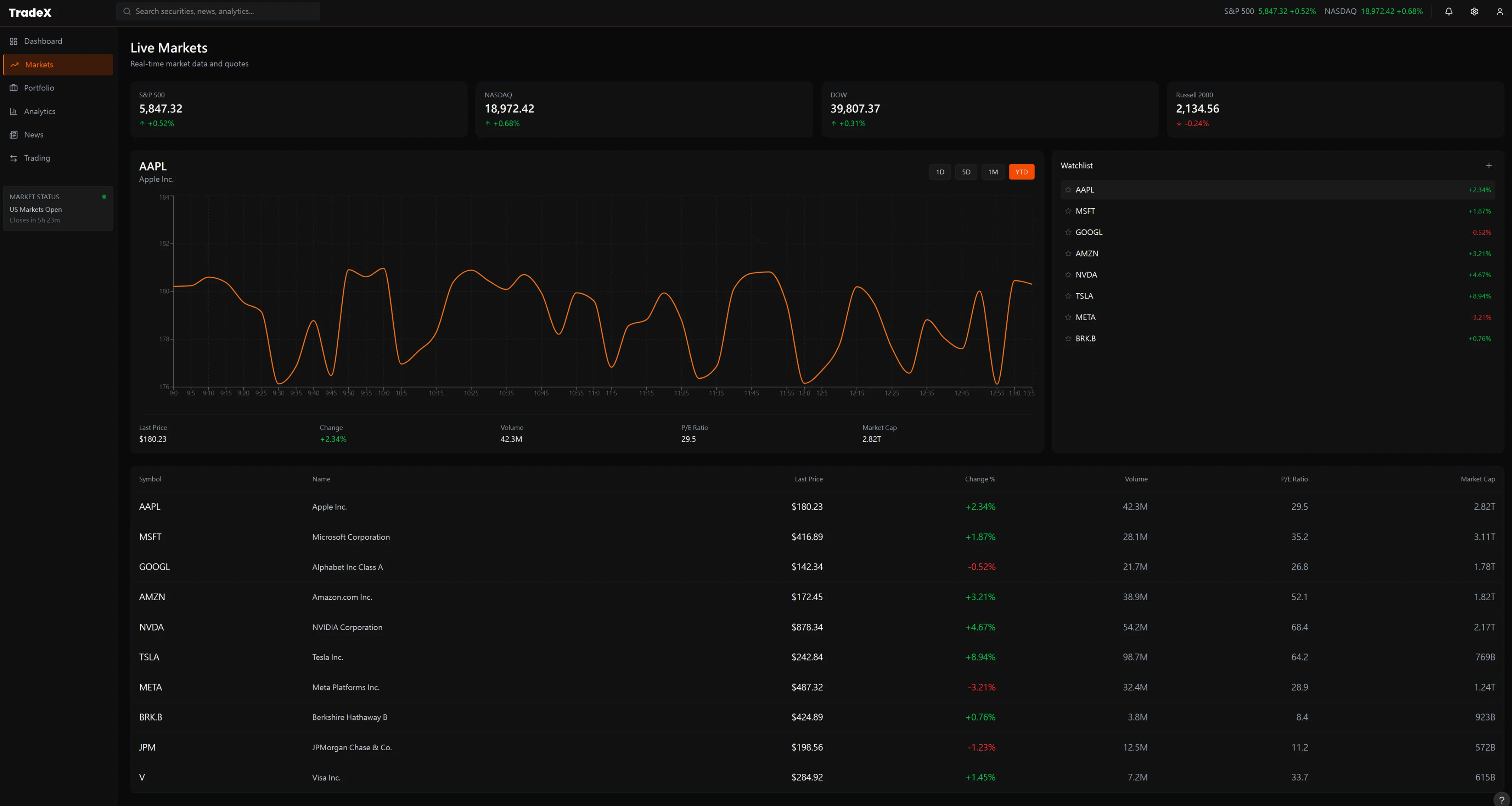
Live Markets — Information at
Institutional Speed
The Failure Mode
Legacy terminals present every
asset simultaneously at equal visual weight. During volatility, signal-to-noise
collapses — everything is urgent, so nothing is urgent. The manager's attention
is not directed; it is simply overwhelmed.
The Design Decision
TradeX anchors on a single
AI-selected focus chart with a portfolio-relevant watchlist. This provides
Cognitively Ergonomic Expert Density — surfacing the highest
monitoring priority at that moment rather than overwhelming with raw breadth.
Context-first, market-second.
Outcome → Cognitive triage shifts from the manager to the system. During volatility the PM arrives at the single highest-priority signal — not a full board requiring manual prioritisation under time pressure.
Tradeoff accepted: Sacrifices breadth for depth of attention on entry. Assumes the AI's priority model is trustworthy enough to delegate the first-pass triage — a hypothesis that needs live validation with real fund data.
SCREEN
02
Portfolio Management — From AUM
to Position Clarity
The Failure Mode
Most portfolio views lead with a
position table — a flat list of tickers and numbers that requires the manager to
mentally reconstruct concentration, correlation, and structural exposure. This
is cognitive assembly work the interface should do.
The Design Decision
TradeX leads with vertical
allocation
analysis and monthly performance — structural signals before positional
detail. The design applies Cognitively Ergonomic Expert Density
by making the position table the evidence that supports the visual
conclusion, not the starting point. At $10M+ AUM, the fund's shape matters more
than any single ticker.
Outcome → The manager understands portfolio shape before engaging any individual position — compressing the time from "terminal opens" to "I know what I need to act on today."
Tradeoff accepted: Visual hierarchy imposes an opinionated reading order. A PM who wants to start from an individual ticker must navigate one level down — a deliberate friction that protects against confirmation-bias-driven position sizing.
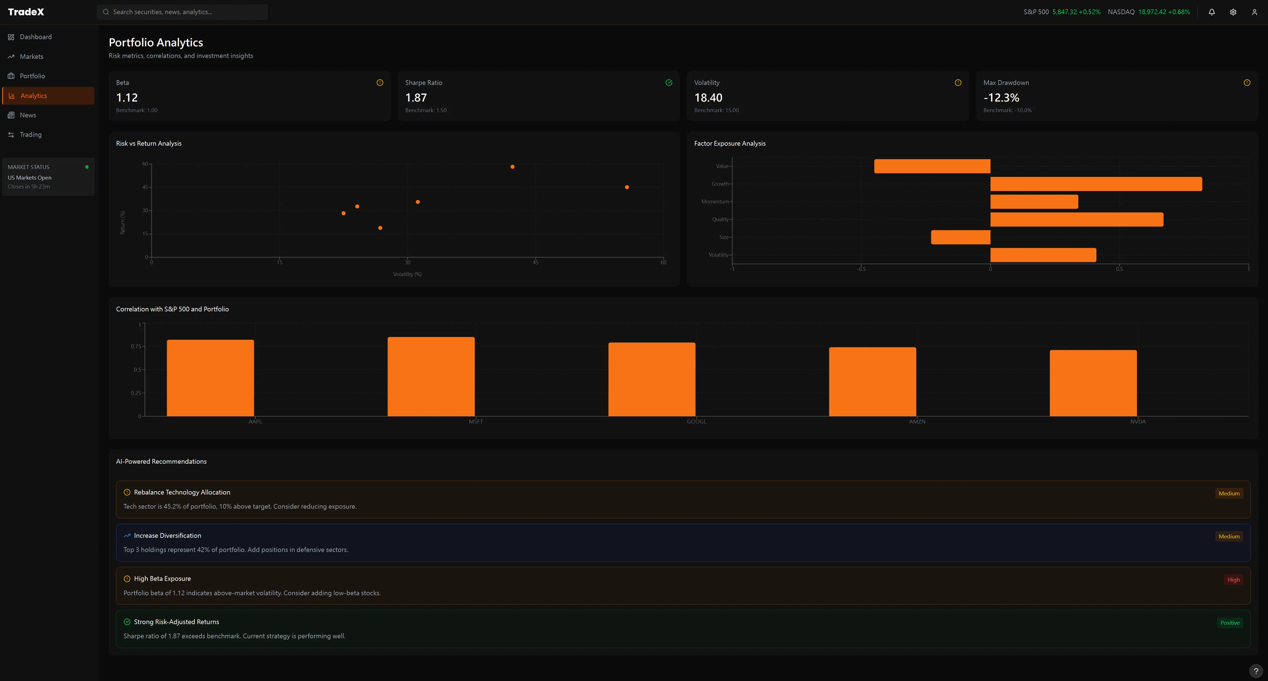
SCREEN
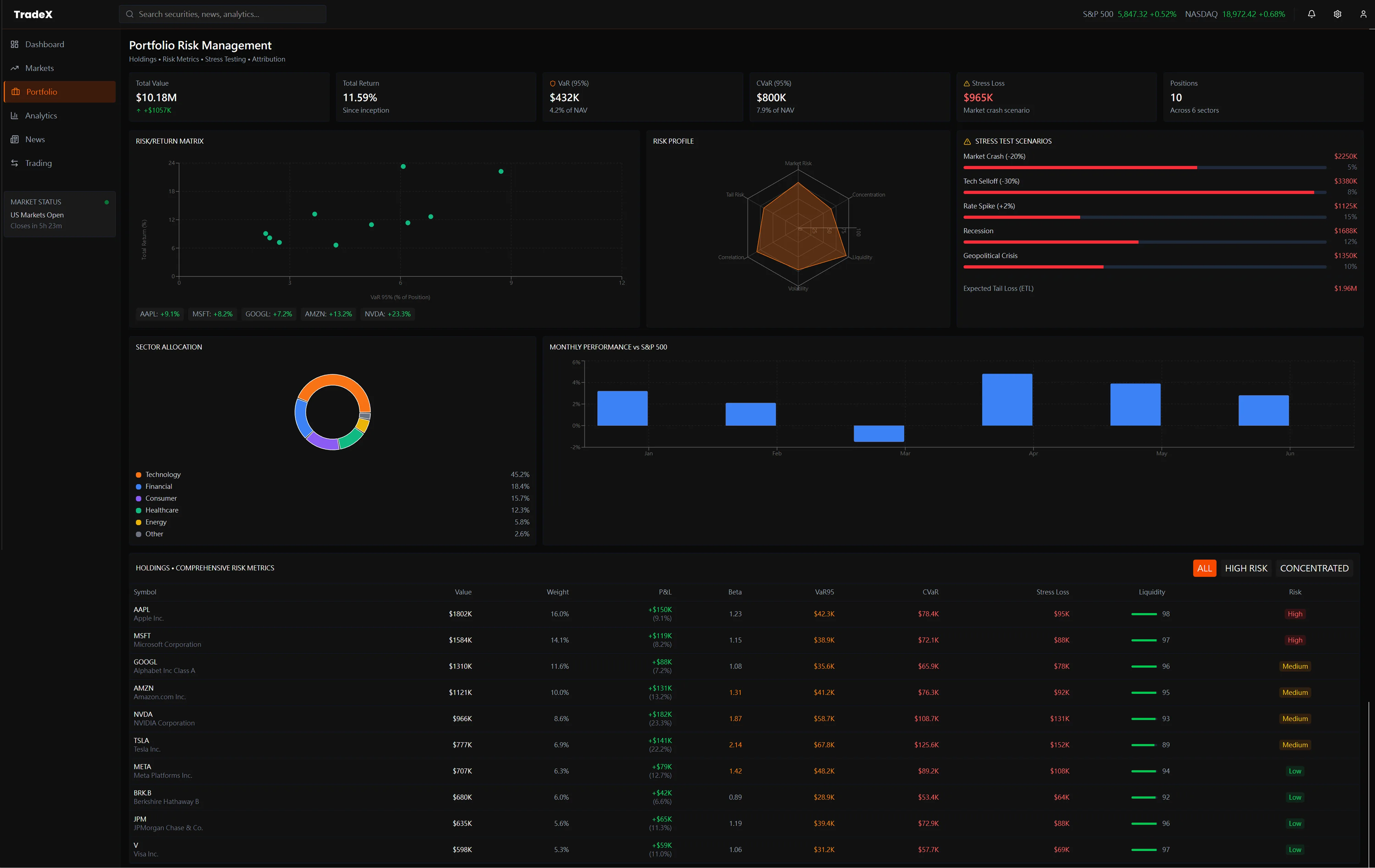
03
Portfolio Analytics — Risk,
Exposure, and Compliance in One View
The Failure Mode
Risk metrics (beta, Sharpe,
drawdown), options Greeks exposure, and compliance tracking live in completely
separate modules — often separate tabs or windows. Monitoring all three
simultaneously requires constant context-switching that destroys the manager's
ability to see the relationship between them.
The Design Decision
The analytics view treats
risk/return, options exposure, and compliance as a unified panel — each is a
lens on the same portfolio state. AI recommendations at the bottom surface
anomalies the system has already identified across all three dimensions, so the
manager reviews conclusions rather than assembling them from fragments.
Outcome → A VaR breach is immediately contextualised against options exposure and compliance status in the same glance — eliminating three separate system lookups and the manual reconciliation between them.
Tradeoff accepted: Unified density requires a larger display and higher cognitive investment to read the full panel. Appropriate for the institutional context; would be hostile UX on a retail or mobile surface.
SCREEN
04
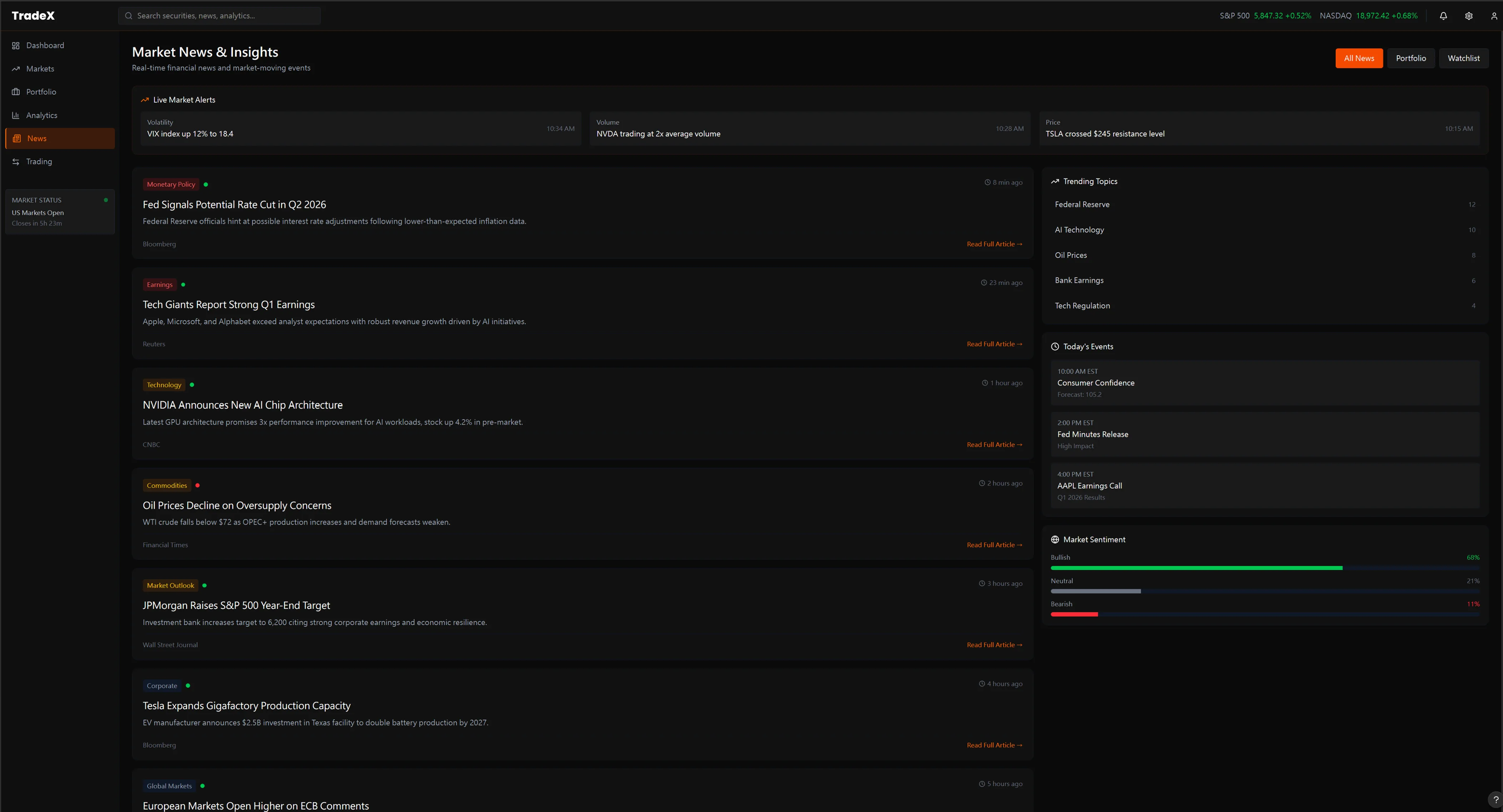
Market News & Insights —
Signal vs. Noise at Scale
The Failure Mode
A hedge fund manager receives
hundreds of news items per hour. Chronological feeds with categorical tags
require the manager to personally assess relevance to their specific book — a
task that consumes hours of attention and produces both false positives (noise
treated as signal) and false negatives (real signals buried in the feed).
The Design Decision
TradeX's news view features
real-time thematic sentiment analysis on the right panel — market mood by theme,
not just by asset class. News items are pre-filtered for portfolio relevance.
The manager's attention is directed toward articles the system has already
mapped to open positions, not the full firehose.
Outcome → News consumption shifts from scanning a full feed for personal relevance to reviewing a curated shortlist already mapped to open positions. The manager reads 20 articles with 90% relevance instead of 200 with 9%.
Tradeoff accepted: Portfolio-mapped filtering creates confirmation bias risk — the system may amplify information that reinforces current positions over information that challenges them. A contrarian override mode would be needed in a production build.
SCREEN
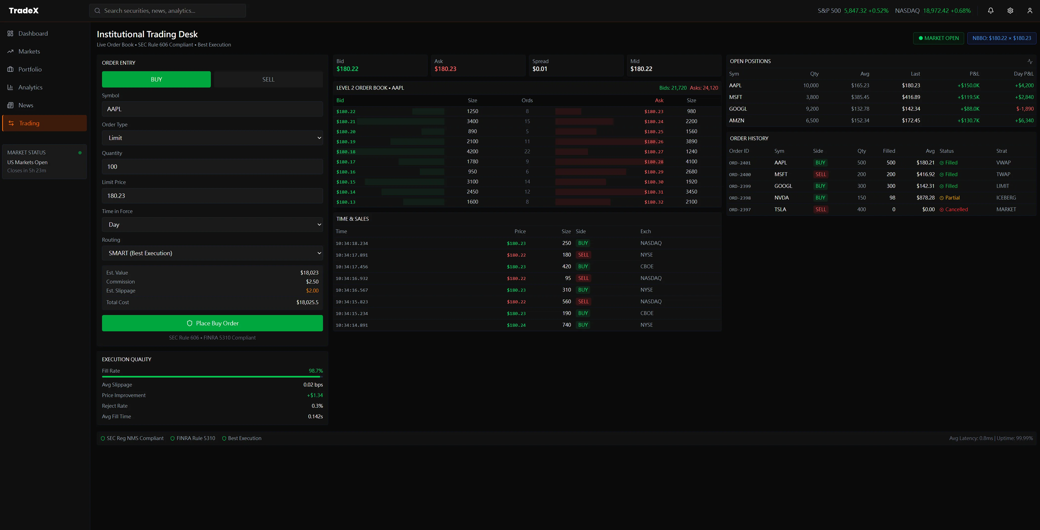
05
Trading Desk — Execution Without
Cognitive Cost
The Failure Mode
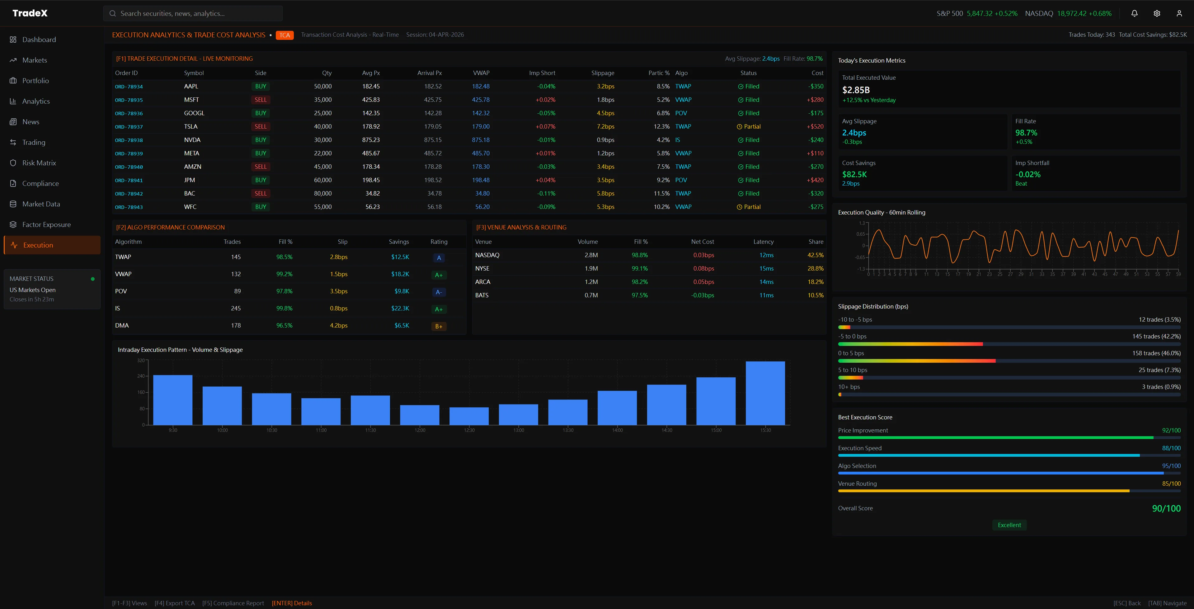
Execution interfaces are typically
separate from analytics. A manager who decides to adjust a position must leave
the analytics view, open the execution module, re-enter the position context,
confirm ticker and sizing — while the market continues to move. Friction at the
decision-to-action boundary is where alpha leaks invisibly.
The Design Decision
The trading desk is directly
connected to open positions — clicking any portfolio position pre-populates the
order panel. A portfolio impact preview shows estimated post-trade allocation
before execution confirms. Decision and action occupy the same cognitive space,
minimizing the latency between conviction and execution.
Outcome → Decision-to-execution latency drops because the order panel is pre-populated from the position the PM was already analyzing — no context re-entry, no ticker lookup, no cognitive reset mid-trade.
Tradeoff accepted: Tight analytics-execution coupling means any error in position state propagates directly into the order panel. The design trusts the portfolio data layer — which requires a real-time, authoritative position feed to be reliable.
SCREEN
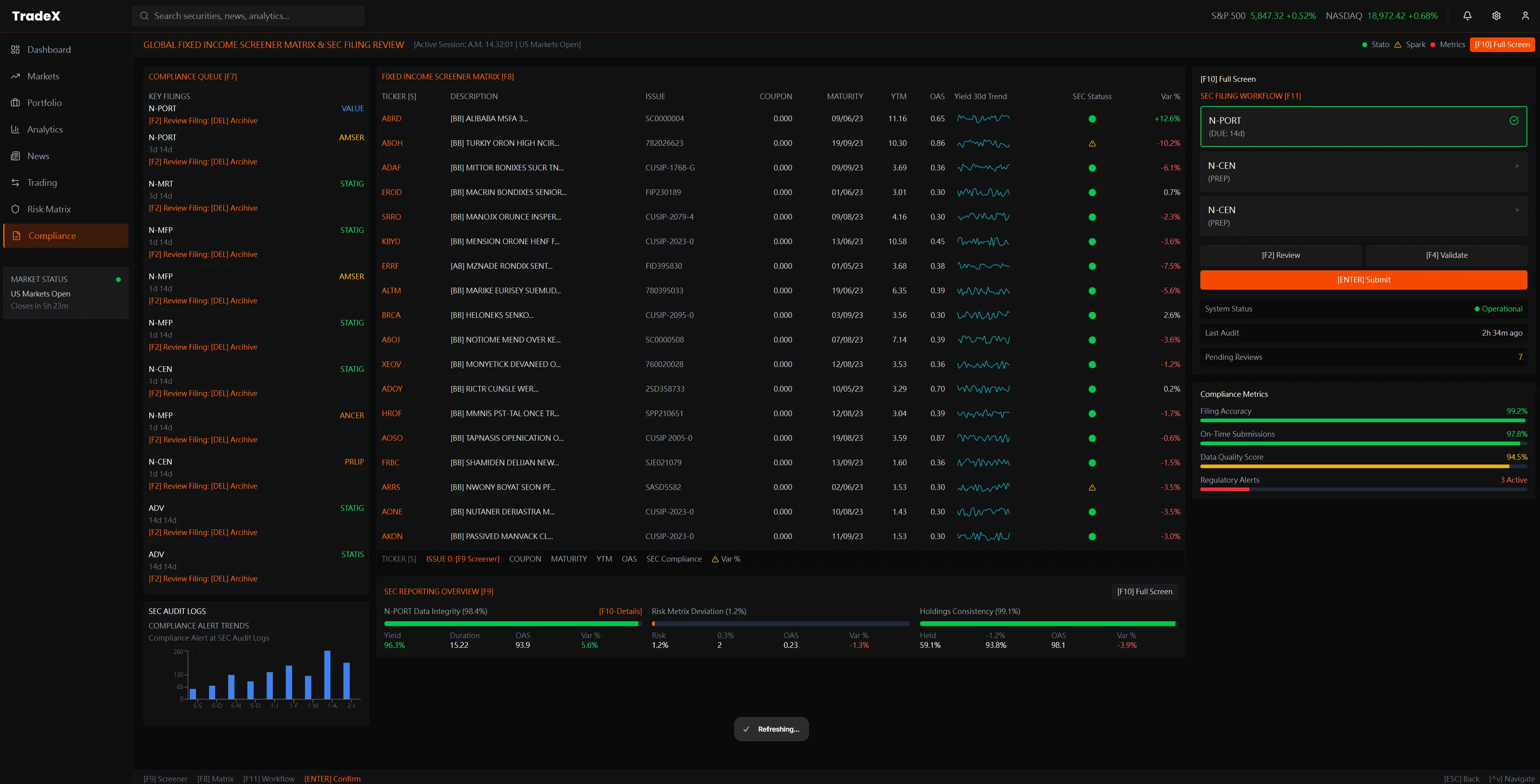
06
Compliance Screener — Regulatory
Intelligence in the Trading Layer
The Failure Mode
Compliance screening lives in a
separate back-office system. Fund managers and compliance officers must
context-switch between trading terminal and regulatory tools — often with a
24-hour data lag. Violations surface after the position is taken, not before. At
LP reporting time, reconstructing the compliance audit trail requires hours of
manual assembly from siloed systems.
The Design Decision
TradeX embeds a live compliance
screener directly in the terminal: a filterable matrix covering 60+ screening
criteria, position-level regulatory status, and SEC filing health — all updated
in real time alongside live price data. The right-panel filter system lets
compliance officers apply multi-criteria screens without leaving trading
context. Data provenance (which feeds are proprietary vs. market data) is
visible at every row.
Outcome → Compliance runs pre-trade, not post-settlement. Orders that breach concentration limits or disclosure windows don't execute — the violation blocks the order in milliseconds. No discovering breaches three weeks later in the audit.
Tradeoff accepted: Real-time compliance requires the data feed to be both accurate and low-latency. Stale compliance data is worse than none — it creates false confidence. This design only works if the underlying feed is production-grade.
SCREEN
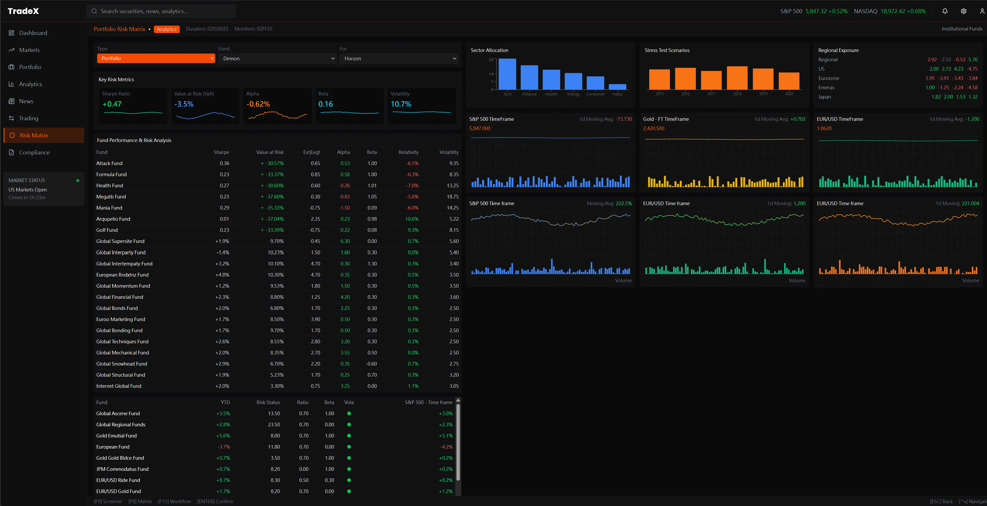
07
Fund Performance & Risk Analytics
— Comparative Intelligence Across the Book
The Failure Mode
Comparative analytics across a
multi-strategy book require custom Excel models or back-office reporting cycles.
By the time a fund manager sees the cross-fund Sharpe comparison or the
stress-scenario performance matrix, the market conditions that generated those
numbers have already changed. There is no live view of how all funds in the book
relate to each other simultaneously.
The Design Decision
This view surfaces 30+ funds
side-by-side with live performance metrics (Return, Alpha, Beta, Sharpe) in a
scannable density matrix — the left panel. The right panel runs in parallel:
Sector Allocation bar chart, Stress Test scenarios (Stress / Crisis / Montreal),
Regional Exposure concentration, S&P 500 correlation, and EUR/USD sensitivity.
Each panel updates live. The manager sees the book's shape and its macro
exposures at the same glance.
Cross-Project Connection: This view is the
intelligence-first evolution of the Portfolio Risk Matrix in
TradeX
Institutional Terminal
— where 960 data points (80 funds × 12 metrics) are organized for sub-second
scanning. The institutional terminal establishes the density architecture; the hedge
fund screen adds live macro correlation panels that update as conditions shift.
Outcome → Cross-fund comparative intelligence — Sharpe, Alpha, Beta, stress scenarios, regional exposure — becomes a live view rather than a monthly Excel exercise. The PM sees the book's shape and its macro exposures simultaneously.
Tradeoff accepted: Displaying 30+ funds in a density matrix requires strict visual discipline — any additional data column degrades scanability. The design deliberately excludes several metrics available in back-office systems to protect the scan speed.
SCREEN
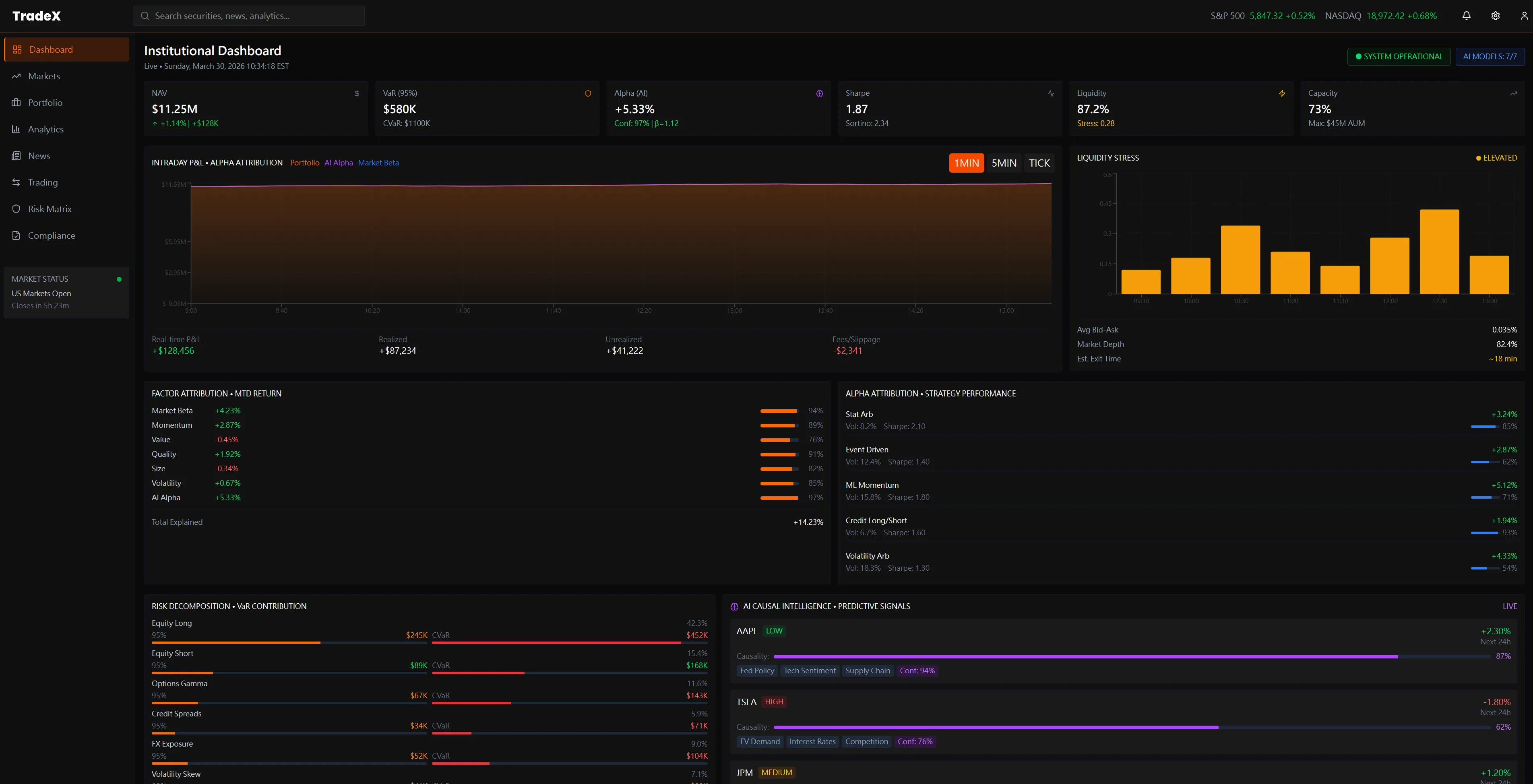
08
Institutional Dashboard — Alpha
Attribution & AI-Driven Hedge Fund Signals
The Failure Mode
Alpha attribution — the LP's core
question of "how much of this return is genuine manager skill vs. beta vs.
factor exposure?" — currently requires a multi-step monthly process. No current
terminal shows intraday attribution live. Managers face LP pressure on fees with
no real-time tool to demonstrate skill, only backward-looking monthly
decompositions assembled from multiple systems after market close.
The Design Decision
The Institutional Dashboard is the
State 03 (LP Reporting) view built for State 02 (live market) refresh rates.
Intraday P&L ($11.2M) is decomposed live into its attribution curve. The Alpha
Attribution panel shows constrained dynamic analysis in real time. At the
bottom, the AI-Driven Intelligence module surfaces hedge fund signals — AMS and
TPOE streams — giving the manager both the performance number and the
intelligence layer that explains it, simultaneously.
$11.2M
Total PnL Live
87.2%
Attribution Clarity
AI
Signal Intelligence
Outcome → Alpha attribution — the LP's core accountability question — becomes a live intraday view rather than a backward-looking monthly decomposition. Managers can demonstrate skill in real time, not just retrospectively.
Tradeoff accepted: Live attribution requires a real-time factor model with sub-minute refresh. The complexity of implementing this correctly is significant — the design sets the UX target, but the data engineering required to deliver it is non-trivial.
SCREEN
09
Institutional Screener —
Multi-Panel Market Intelligence in One View
The Failure Mode
Institutional managers currently
switch between 3–4 separate terminal windows to cross-reference equity
positions, factor exposure, trading performance, and sector allocation. No
unified screener exists that surfaces all four simultaneously —
cross-referencing requires manual cognitive assembly across disconnected panels,
introducing both latency and error.
The Design Decision
TradeX's Screener consolidates
Equity Type Media (full long/short position analytics), Factor Type Media
(factor exposure by position), Trading Performance (concentration metrics:
$2,858 total, 66.7% attribution), and Sector Allocation into one coherent
multi-panel layout. Cross-referencing equity vs. factor vs. sector becomes a
single-screen read — a 4-window task collapsed to zero switching cost.
SCREEN
10
Factor Analysis — Live
Decomposition Across Asset Classes
The Failure Mode
Factor attribution in current
terminals is a post-trade construct — PMs see factor exposure in morning reports
generated after market close, not during live market hours when it could
influence execution decisions. By the time a factor tilt is visible, the
position is already built and partially or fully filled.
The Design Decision
Live factor decomposition across
Prime Type Media equity positions, Factor Type Media (long/short split), and
Transaction Type cross-referenced simultaneously. The PM sees factor tilts as
positions are being built — not as a retrospective audit. Rebalancing becomes a
real-time decision, not a corrective morning action.
SCREEN
11
Factor Exposure & Concentration
Risk — Before the Breach, Not After
The Failure Mode
Concentration risk alerts in
current systems are threshold-triggered — the flag fires after the position has
been built and the exposure already exists. Risk managers receive alerts when
the problem has materialized, not while there's still room to adjust
construction. The 90-day trend that would have predicted the breach is never
surfaced proactively.
The Design Decision
Three visualisations working
together: the Factor Balance radar chart (portfolio shape vs. benchmark), a
90-day Factor Exposure trend line (directional drift, not snapshot), and the
Macro-factor Exposure grid. Sector-level beta exposures (Technology, Financials,
Healthcare, Consumer Discretionary) are visible as concentration accumulates —
making the breach preventable, not just auditable.
Institutional onboarding at a hedge fund level involves regulatory verification that no
consumer-grade KYC flow handles — RIA registration, FINRA compliance, AML/CDD
requirements, and multi-party document attribution across auditors, legal counsel, and
prime brokers. TradeX's KYC system is designed as a four-tab compliance
workspace, not a simple form: every verification step has live progress
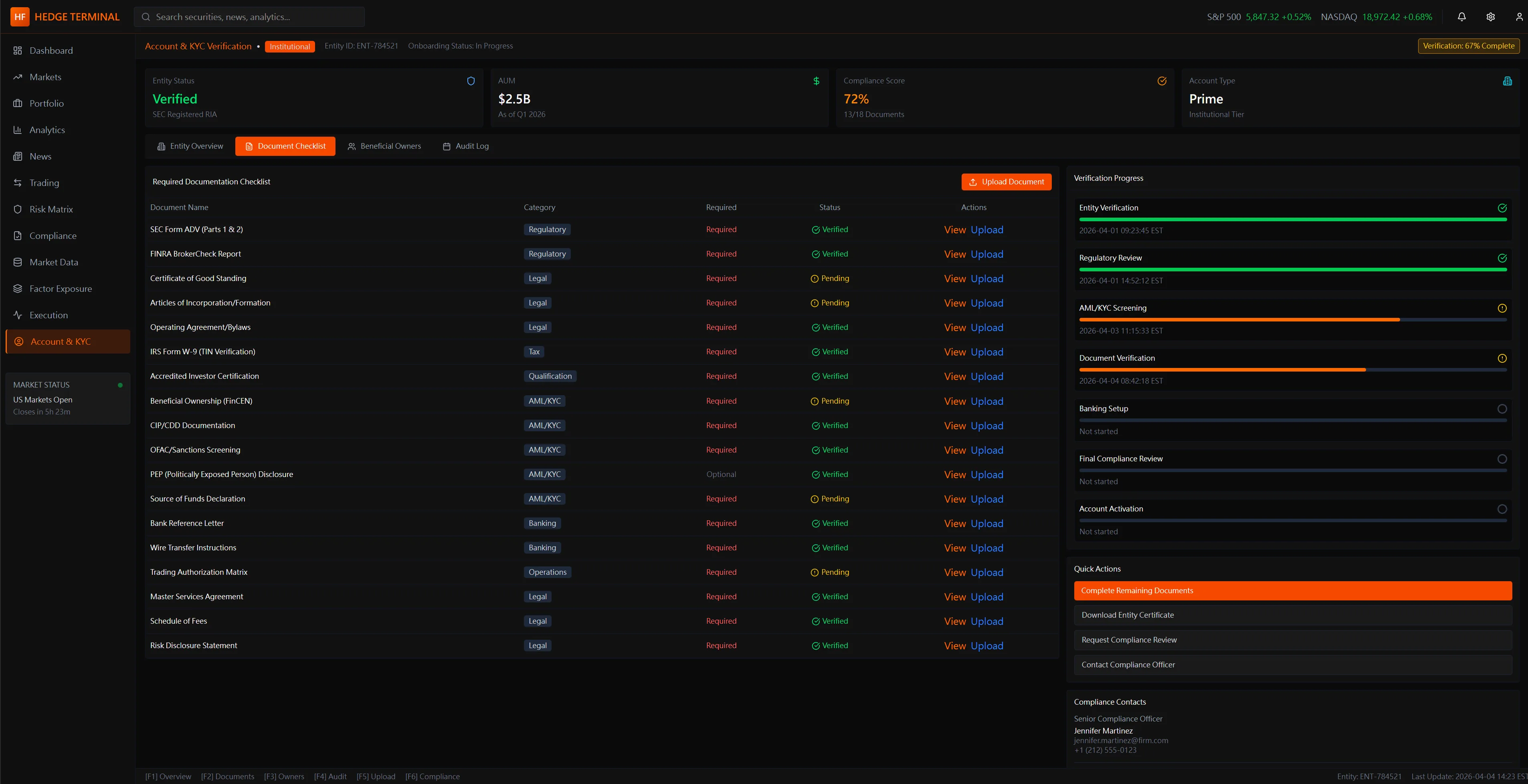
tracking, document status, and a direct audit trail for regulatory review.
SCREEN
12 · TAB 1
KYC Core Overview — Firm Profile,
Status & Verification Progress
The Failure Mode
Institutional KYC at the RIA/prime
broker level is managed across disconnected email chains, PDF submissions, and
manual compliance officer checklists. The firm has no single view of where their
account stands across the 7 verification stages — status is opaque until a human
responds, creating onboarding timelines measured in weeks, not days.
The Design Decision
A persistent right-panel
Verification Progress tracker surfaces real-time status across all 7 stages
simultaneously — Entity Verification through Account Activation. The firm
identity (RIA registration, ADA, CRD, jurisdiction) anchors the left panel. The
compliance officer and the fund manager share the same source of truth,
eliminating the "what's the status?" email loop entirely.
TAB
2Document
Checklist
Live status per document (Approved / Review / Pending / Completed) — ADV Parts 1&2,
FINRA registration, Certificate of Good Standing, Articles of Incorporation, and 20+
regulatory documents tracked in one view. Quick Actions panel enables direct
escalation to compliance officer without leaving the interface.
TAB
3Business
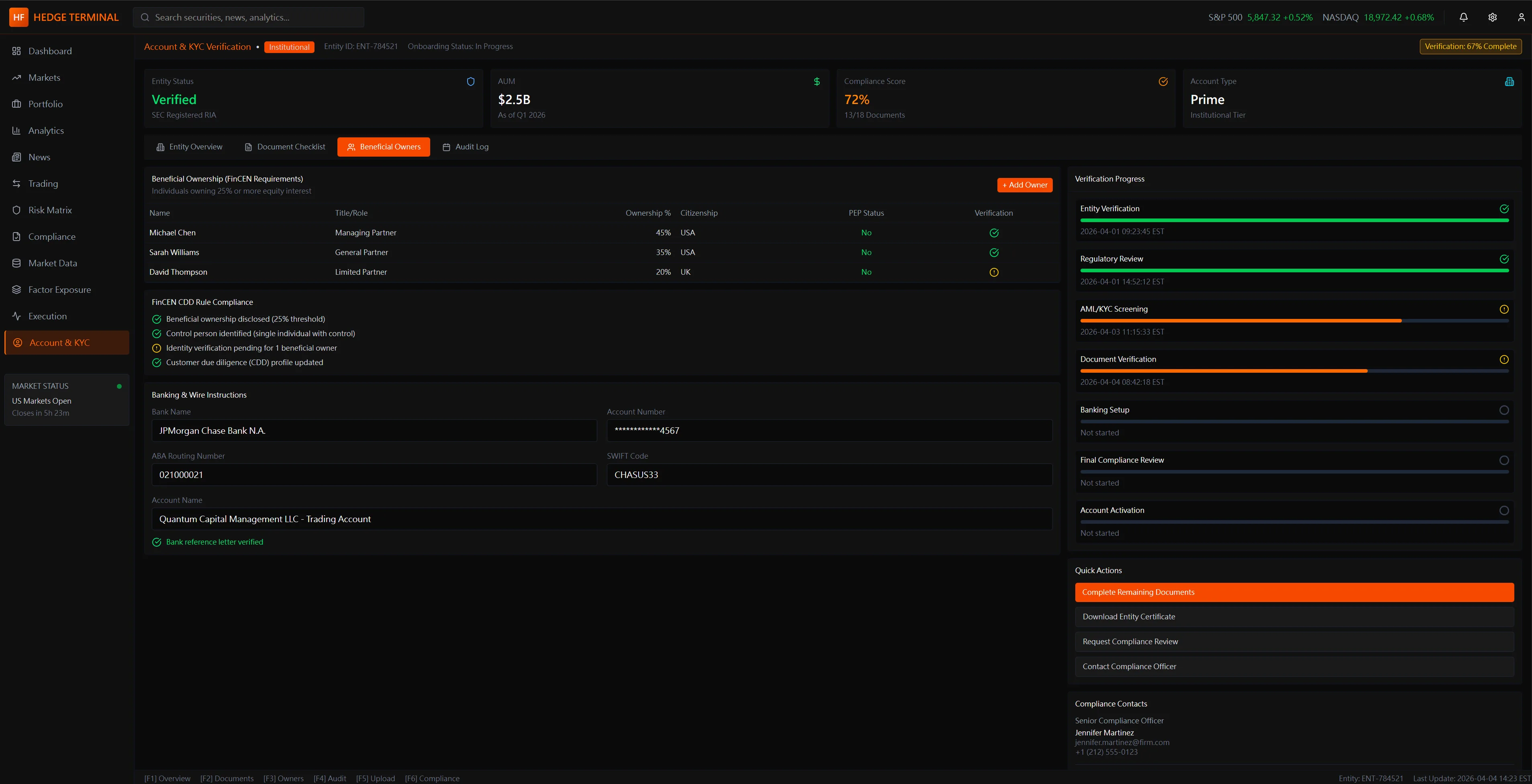
Details & AML Compliance
FinCEN CDD AML compliance status per entity relationship type (Managed / Licensed /
Limited Partners). Banking & wire institution linkage (JPMorgan Chase, ABA routing)
with legal entity chain. The tab ensures AML compliance is entity-level, not
account-level — a structural requirement at the prime broker tier.
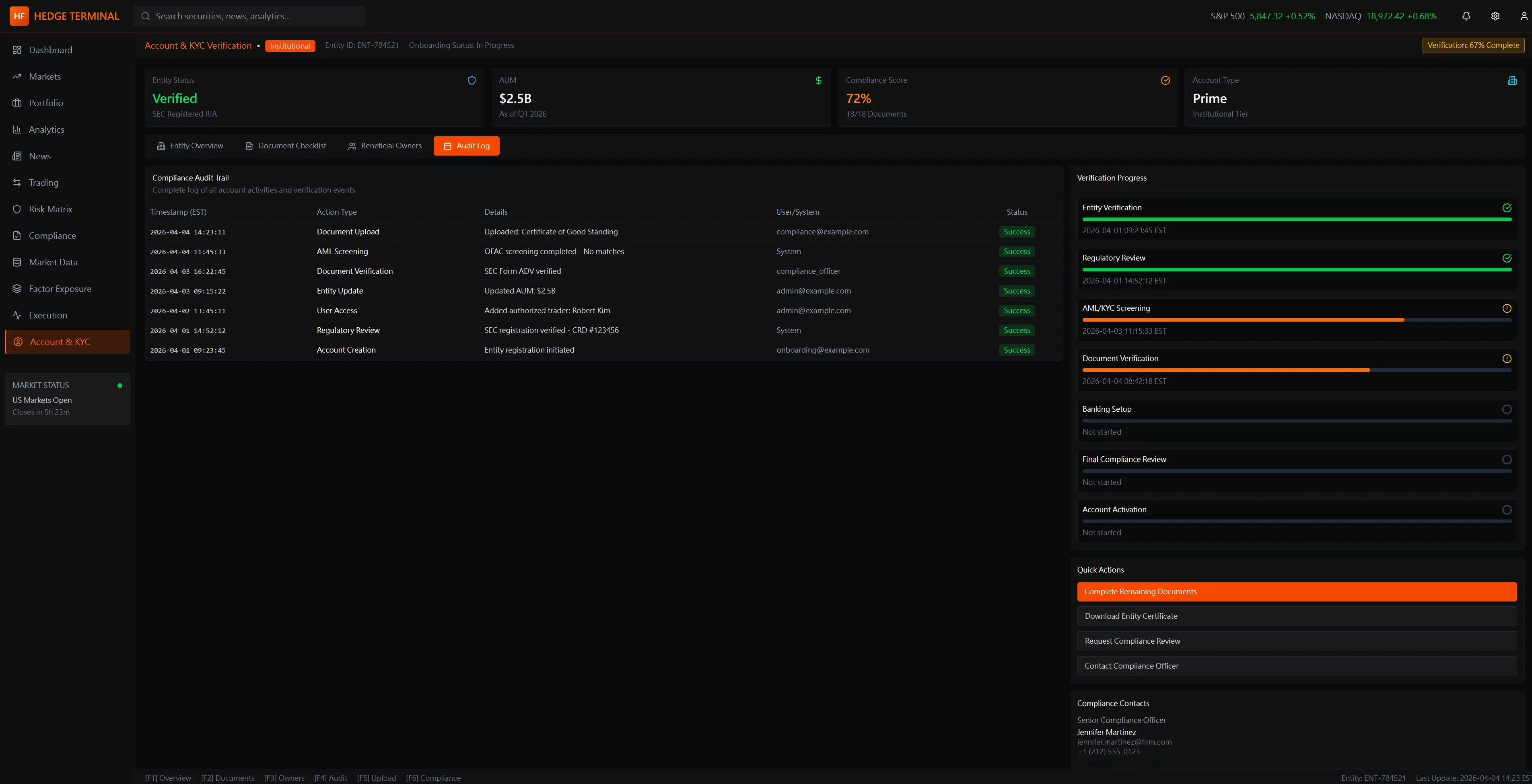
The audit trail is not a log — it's
the evidence chain. Every compliance event (account opening
authorization via LYNX, CPA accounting certification, entity system verification via
Quantum Grid S75) is timestamped with actor, document type, and status. The Document
Editor panel enables in-platform certificate scanning and update without email
attachment workflows. Designed to be forensically defensible: if a regulator pulls
the AML file, every step has a traceable record with no gaps.
6. Three Principles That Unify the System
Across all five views, three design commitments repeat consistently — each a direct inversion
of how current institutional tools are built:
Conclusions Before Evidence
Every view surfaces what the system has
concluded before presenting the data that supports it. The manager's job is to
challenge the system's synthesis — not to perform the synthesis themselves. This
inverts the default model of institutional tools, which present raw data and leave
the assembly entirely to the user.
Explainability Over Efficiency
Every AI recommendation includes a
reasoning path the manager can interrogate. When the system flags concentration risk
in AI infrastructure, it shows which positions, which exposure metrics, and which
market conditions are driving the flag. At no AUM level is "the model said so" a
complete or sufficient answer.
Decision and Action in One Space
The cost of context-switching between
analysis and execution is invisible in normal conditions and catastrophic under
stress. TradeX minimizes the number of cognitive transitions between forming a view
and acting on it — each screen connects directly to the execution pathway it
naturally leads to.
7. The Hardest Design Decision: How Much Should the AI Proactively Surface?
Every feature in Section 1 — causal maps, liquidity stress, alpha attribution, stress tests —
presupposes that the AI will surface these things automatically. But that creates
the single most difficult design tension in the entire system:
The problem:
If the AI surfaces everything it detects → alert fatigue. A
manager who receives 40 flags before 9am will stop reading them. The very system
designed to direct attention starts creating noise. Worse: when a real crisis flag
appears alongside 39 routine ones, it carries the same visual weight as the noise. The
design has failed at its core job.
Option: Full Proactive Surfacing
REJECTED
Surface
every AI-detected anomaly across all positions in real time. Maximally thorough — and
exactly why it fails. Alert fatigue sets in within days. Managers learn to ignore the
system. Trust degrades, and the AI's real signal capability is squandered.
Option: Pure Query Mode
REJECTED
AI answers
when asked, never initiates. Eliminates alert fatigue — but defeats the core
premise. A manager who must query for causal chains, liquidity stress, and
attribution provides no cognitive advantage over existing tools.
TradeX Answer: One Prioritized Signal Per View
Context
CHOSEN
Each
view surfaces exactly one AI-prioritized conclusion — the single highest-significance
signal for that view's context. A "See all detected signals" expand is available but
collapsed by default. This imposes curation on the AI: it must rank before it can
surface, which means the interface's usability depends on the quality of the ranking
model.
The trade-off accepted: A high-significance
event ranked below another signal in the same view could be missed during the first
glance. This is the cost of preventing alert fatigue. The design assumes ranking
quality; if ranking fails, curation fails. This is the open hypothesis that real-world
testing would need to validate.
8. Visual Language as Functional Communication
The TradeX visual system makes three decisions that are often dismissed as aesthetic but are
structurally load-bearing:
Deep Dark
Backgrounds (#0a0a0a range)
Not a
style trend. A fund manager may spend 12+ continuous hours in front of this
interface across multiple monitors. High-contrast bright UIs cause progressive
eye strain and increase cortisol during already-stressful sessions. Dark reduces
photonic load to the content itself — the data becomes the only light source the
eye needs to attend to. This is why professional trading terminals have been
dark since before dark mode was fashionable.
●
Orange Accent, Not
Red
Red
is reserved for loss, error, and danger in every financial interface a manager
uses. If TradeX used red as its primary accent, the color's semantic meaning
would collide with its branding function — every time the manager saw
orange-that-should-be-red, they'd experience a half-second of mis-read alarm.
Orange carries urgency and priority without the adrenaline trigger that red
produces. Under cognitive stress, the half-second saved matters.
⊞
Organized Density,
Not Reduced Density
Consumer UX often treats density as the problem — the solution is to simplify.
For expert users, density is not the problem. Control is. A fund manager wants
all the data — they simply want it organized so they can extract meaning without
assembly. TradeX doesn't reduce what's on screen; it organizes it into a
hierarchy that routes the eye from conclusion to evidence rather than from raw
number to interpretation. Density organized is not the same problem as density
reduced.
Expert Density:
The "Bloomberg Bar" Principle
For Principal roles at firms like BlackRock or Goldman, "clean design" is a
secondary requirement to Information Throughput. I architected the TradeX
grid to support 500+ data points per viewport through:
Micro-Visuals: Using cell-level sparklines and heatmaps
instead of raw text, allowing for instant pattern recognition across 80+
tickers.
Adaptive Padding: A "Power User" mode that reduces UI
chrome to <5% of screen real estate, maximizing the data-to-pixel ratio.
Information Tiering: Critical execution data (Bid/Ask/Size)
uses high-contrast typography, while historical context (1D Change/Avg Vol)
uses lower-luminance tones.
⚠️
Stateful Data
Health: The UX of "Stale Data"
In high-frequency environments, "No Data" is safer than "Old Data." I designed a
specialized state machine for data trust visualization:
Luminance Decay: Price labels automatically dim if the
heartbeat from the Liquidity Provider exceeds 250ms, signaling "stale"
status before the connection is officially lost.
Trust Indicators: A millisecond-precision "Heartbeat
Monitor" next to high-stakes execution buttons, preventing traders from
hitting "Confirm" on ghost liquidity.
Fail-Safe UI: If latency exceeds 500ms, "Market Order"
buttons transition to a warning state, requiring a manual override to
acknowledge the execution risk.
9. What I Would Test with Real Fund Managers
Intellectual honesty in concept design means knowing what you've assumed and what you've
validated. These are the three open hypotheses that real research sessions would need to
address before any of TradeX's design decisions should be treated as confirmed:
Hypothesis 1: Alert
Fatigue Threshold
TradeX surfaces one prioritized signal per view. The assumption is that one is the
right number — not zero (useless) and not many (fatigue). But what is an experienced
fund manager's actual saturation point? Does it vary by cognitive state (pre-market
vs. live event)? Does it vary by strategy type (quant vs. discretionary)?
Research method: Session
observation across three different managers, three days each. Count unprompted
signal interactions vs. ignored signals. Map ignoring patterns to time of day and
market conditions.
Hypothesis 2: Mode
Switching vs. Unified Layout
TradeX uses one visual layout across all cognitive states. The assumption is that a
well-organized interface works for both morning strategic review and live crisis
response. But State 01 and State 02 may require fundamentally different information
hierarchies — perhaps an explicit "Crisis Mode" that reconfigures the layout
entirely is worth the cognitive cost of mode-switching.
Research method: Simulated market
event during a session. Observe whether managers navigate to different views or
attempt to get everything from their current screen. Map eye-tracking (if available)
against the layout hierarchy.
Hypothesis 3: Minimum
Explainability for Execution Trust
TradeX assumes that showing a reasoning chain (not just a conclusion) is sufficient
for a manager to act on an AI recommendation without independent verification. But
the threshold may be higher than designed. At what depth of explanation does a
manager feel confident enough to execute without checking the AI's work manually?
Research method: Present identical
AI recommendations with varying levels of explainability (conclusion only / one-step
reasoning / full chain). Measure time to execution decision and rate of independent
verification behavior.
10. How This Connects to the Wider Body of Work
TradeX doesn't exist in isolation. It's the institutional-scale expression of design problems
I've been working through across multiple projects — each developing a component of the same
underlying challenge:
Competitive Analysis:Legacy
terminals, modern web platforms, AI-driven research tools — failure mode mapping
across all three categories
Cognitive Modeling:Three-state user
model (Strategic / Crisis / Narrative) derived from professional trading session
patterns
Cross-Project Research:Nova AI trust
patterns · Finlogix density architecture · TrueWorth visualization hierarchy ·
TradingAgents arXiv:2412.20138 (multi-agent trading firm architecture) ·
Fincept Terminal (37-agent investor committee in production)
Key Outcomes
Failure Mode Library:4
persistent unmet needs documented across institutional terminal category — each
mapped to a specific cognitive cost in the manager's workflow
Three-State User Model:Defined
Strategic / Crisis / Narrative cognitive states as the architectural basis for view
hierarchy — a framework applicable beyond this project
Design Tension Resolved:Alert
fatigue vs. exhaustive surfacing — one prioritized signal per view context, with
documented trade-off and open hypothesis for validation
Cross-Portfolio
Synthesis:Identified three transferable design principles
(explainability architecture, organized density, conclusions-first hierarchy)
consistent across Nova, Finlogix, TrueWorth, and TradeX
This is a research-driven design exploration, not a production product. Every decision
documents a real failure mode in existing tools and a defensible design response.
Section 9 explicitly lists what remains unvalidated — because intellectual honesty is
part of the design work.
Live Demo · Intraday Factor Attribution
Where did today's P&L actually come from?
LPs under fee pressure need real answers — not end-of-month reports. This panel decomposes intraday P&L in real time: how much is genuine alpha, how much is market beta, and which factor exposures (momentum, value, quality, low-vol, size) account for the rest. The information hierarchy puts the LP's primary question — are we generating alpha? — at the top.
Data simulated · Updates every 3 seconds · Same decomposition structure used in institutional attribution systems (Axioma, Barra)
P&L Attribution EngineBarra-style decomposition
LIVE
Total P&L
+$0.0M
+0.00%
Alpha
+$0.0M
Skill-based return
Beta
+$0.0M
Market exposure
Factor
+$0.0M
Style tilts
Contribution Waterfall
Factor Decomposition
Intraday Attribution Curve — Alpha vs Total
Total P&L
Alpha only
Gap = beta + factor exposure
Design principle: alpha is surfaced first because that is the LP's primary question. Beta and factor decomposition follow — they provide context, not the headline. When alpha is negative, the colour encoding changes immediately so the PM sees the situation before reading any number.
Live Demo · Multi-Agent Signal Consensus
When models disagree, that's the signal
Six independent agents — trend, mean-reversion, momentum, volatility regime, sentiment, macro — vote on direction. The weighted ensemble consensus is what a PM trades on. Disagreement between models flags regime uncertainty before price confirms it.
Inspired by MiroFish (multi-agent swarm prediction) · AI-Trader (agent reputation scoring) · All data simulated.
Signal Aggregation EngineSPX · S&P 500
LIVE SIM
Weighted Ensembleconfidence-weighted · 6 agents
Bullish
—
Bearish
—
Agreement
—
Regime
—
Design note: this panel surfaces agreement and disagreement equally. High model disagreement signals regime uncertainty — often more actionable than consensus. The tug-of-war bar makes conviction balance immediately readable without requiring the PM to count votes.
Portfolio Construction · Quantitative Analysis
The Efficient Frontier — where risk earns return
Markowitz mean-variance optimization underlies every serious institutional allocation decision. Each point is a portfolio of the six fund strategies. The frontier is the set of portfolios delivering maximum return for each unit of risk. The Capital Market Line (gold) stretches from the risk-free rate through the max-Sharpe portfolio — every portfolio above the line is unachievable; everything below leaves return on the table.
500 randomly sampled portfolio weights · Hover any point for details · Frontier recalculates on Resimulate
Efficient FrontierAnnualised Risk vs Return · 6-Strategy Universe
Feasible portfolios
Efficient frontier
Capital Market Line
Max Sharpe portfolio
Max Sharpe Portfolio
Risk MetricsLIVE
Strategy Allocation
What this case study evidences · and what it doesn’t
For a Senior PD or Design Lead interview panel.
This concept evidences PM-cognition design at the institutional hedge-fund tier: 11 screens
across 3 cognitive states (rapid scan / deep investigation / execution decision), 4 unmet demands
from research, 5-screen KYC flow, AI autonomy tiers framing (humans hold the commit, AI surfaces
options). Built from 4 research sources including 3 informal practitioner conversations + public
architecture analysis. Production foundations (ACY Connect FIX 4.4 institutional API)
ground the protocol literacy; the buy-side PM cognition layer is the explicit concept
extension.
What this concept deliberately does not claim. Not in production — concept
artifact, no live data feed, no real FIX execution path, no validated quant models. Not n-participant
user research — n = 3 informal practitioner conversations, supplemented by public-source
architecture analysis. No certified WCAG 2.1 AA conformance — full disclosure at the
accessibility audit
disclosure. No paired-within-subjects statistical claim — the parallel methodology
rigor for any future measured claim would follow the
Finlogix methodology
disclosure. No post-launch iteration data because there is no launch — the parallel
pattern is documented at the
ACY RG 268
iteration arc. The institutional adoption pattern (verification surface as adoption
mechanism) is documented at the
ACY Connect
political-skill note.
The disclosure register. The four 2026-05-18 field notes are the canonical voice
this concept inherits from. The TradeX Hedge Fund concept maps the PM-cognition layer; alongside
Praxis Prime (operational lifecycle) and TradeX Institutional Terminal (execution microstructure)
it completes the institutional workflow triple under one disclosure discipline.
Every problem we solve for clients has multiple valid approaches — different costs, different ROI, different risk profiles. These threads show how the approach on this page compares to others in the portfolio.
Thread
Concentration, Risk & Agents
Portfolio-level math primitives — HHI, beta, VaR, regime — rendered into UI defaults and AI-assisted decision surfaces.
Index Weights · SPX + NDXConcentration math exposedLow eng cost · 503+101 slices · HHI 230.6 / 638.2
Macro Signal NetworkRegime classifier feeding routingLow eng cost · 4 prints → 14 surfaces