Reading AWStats Like a Product Manager
My second-most-visited page had an 84.6% exit rate. Here is what the data said, what I changed, and what I expect to happen next.
A portfolio is a product. If the analytics show a leak, the leak is the work.
My design-system-showcase page was the second-most-visited surface on edwson.com — 156 entries over the analytics period — but had a 84.6% exit rate (132 of those 156 visitors left from that same page without clicking anywhere else). The page ranks well for "design system + institutional finance" searches, so first-time visitors arrive, scan a 146-component catalog, and leave without ever seeing that those components ship in production across four case studies.
The fix was not to redesign the catalog. It was to add three insertion points that bridge the page to the case-study layer — a first-screen CTA, a sidebar nav link, and a dedicated "Where this ships" section between the existing System Card and Editorial Stance. Zero regression on the existing 149 sections. Expected funnel lift: ~2× case-study click-through from this entry point. This note is the methodology, not the marketing.
This is a different shape of field note than the other four. The MiFID II, KYC EDD, ASIC RG 268, and FIX 4.4 notes are about institutional finance UX patterns I have worked on for clients. This one is about how I treat my own portfolio — the meta-discipline of running personal brand SEO and conversion analysis with the same rigor I would apply to a regulated product surface.
I write it for one reason: hiring managers reviewing portfolios see two kinds of designers. Designers who shipped product, and designers who can articulate why and how they shipped product. Showing the meta-work — the funnel reading, the surgical fix, the verification gates — is part of articulating the second.
What the AWStats data said
The full analytics period showed roughly 2,200 unique visitors across the portfolio. The Top 10 entry pages were, in order:
- Homepage — 277 visits, 18.20% entry share
- /design-system-showcase.html — 132 visits, 8.67% entry share
- /project-acy.html — 71 visits, 4.66%
- /code-prototypes.html — 47 visits, 3.09%
- /demo-trading-terminal.html — 42 visits, 2.76%
The exit pages showed the same surfaces but in a different order — and design-system-showcase was second on that list too, with 132 exits against 156 total hits. That ratio is the leak. Visitors find the page (most likely through Google, since the page ranks well for terms like "design system institutional finance" and "design system showcase"), they scroll, and they leave. The 146-component catalog answers their search query, but it never converts them into a case-study reader who could plausibly become a hiring conversation.
The signal pattern was reinforced by referrer data. Most of the catalog's traffic came in as (Direct Request) — search-engine arrivals, not internal navigation from the homepage. People landed there cold, looked, and went.
Filter the locale rollup before you trust the entry share.
Vietnam (140 pages, 1.02 hits-per-page ratio) and Germany (89 pages, 1.07 ratio) were almost certainly scraper / crawler traffic — humans doing due diligence on a design portfolio load 3–5 pages per session, not exactly one. The high-confidence human reviewer pool was United States (3.32 pages-per-visit), Japan (3.69), Australia (4.60), Great Britain (3.10), and Switzerland (2.75). Those are the five markets to plan against. Vietnam is noise.
Why the showcase page leaked
Three structural reasons, ranked by severity:
1. The page is a catalog, not a story. 146 component categories across 17 domains is impressive breadth, but a first-time visitor has no navigation grammar for it. The sidebar lists every section by name; the main column unrolls a deep scroll. There is no "start here" anchor that says this is what this catalog is, here is where it ships, here is what to do with it. The System Card at the top (added in a prior pass) gives identity but not direction.
2. There is no bridge to the case studies. Every component in the catalog ships in production somewhere — ACY Securities, Finlogix, LogixTrader, TradingCup. But the catalog itself never names those case studies inside the visitor's first viewport. A reviewer scrolling through "Disclosure Banner" or "Risk Util Cell" has no way to know that the disclosure banner specifically ships against ASIC RG 268 in TradingCup, or that the risk util cell is the surface a portfolio manager sees on LogixTrader. The proof of production is offstage.
3. The catalog's depth is its own enemy at top-of-funnel. 149 sections is a research library for a designer who is already convinced. For a hiring manager who has 90 seconds, depth signals "this person built a lot" but does not answer the question they are actually asking, which is "did any of this ship?" The exit-rate data was answering that question for them: no, apparently it did not. Which is wrong, but the page was not arguing otherwise.
The three surgical fixes
The fix had a budget: zero changes to the existing 149 sections, zero impact on the main stylesheet, and the same brand-fork CSS architecture the showcase already uses. Three insertions, all in the page-local context.
Fix 1 — First-screen primary CTA
The page's hero already had an action bar with three links: Inspect Tokens, Live Data, Regulatory Map. I added a fourth action — Where This Ships — and made it the new primary action, demoting "Inspect Tokens" to secondary. The reason: token inspection is for designers who are already deep in the catalog. "Where this ships" is for hiring managers who are deciding in five seconds whether to keep reading.
The CTA anchors to a new on-page section (Fix 3 below) rather than navigating away. Same-page anchor over cross-page link, because cross-page nav is friction at top-of-funnel — every click out of a high-bounce page is a chance to lose the visitor entirely.
Fix 2 — Sidebar nav link in the Overview group
The sidebar's Overview group had three nav links: Getting Started, About this System, Changelog & Version. I added a fourth, placed second (between Getting Started and About this System), with a rocket icon and the same Where This Ships label. The rationale: the sidebar is how returning visitors orient. Someone who has read the showcase before and wants to remember which case studies use these components should not have to scroll. The link gives them a one-click path.
The icon choice is deliberate. The other nav links use a house, a bookmark, and a clock. A rocket reads as shipped — same visual semantic as "in production" — and matches the section title. Senior reviewers parse iconography fast; the rocket carries the message even before they read the label.
Fix 3 — Dedicated "Where this ships" section
The section is a 4-card responsive grid (1 column mobile, 2 at 720px, 4 at 1200px), positioned between the existing Overview content and the existing About this System essay. Each card is a single clickable anchor to a case study:
- ACY Securities — flagship card with a gold-tinted gradient and an explicit "8 regulatory rewrites" callout. Body copy specifies 150-component live system, 100K+ traders, 40+ jurisdictions, $2B+ daily volume, 0 material UX-tied findings.
- Finlogix Market Data — 8 jurisdictions, 40+ markets, data-density patterns and tabular-nums grids from the catalog shipping as primary trader surfaces.
- LogixTrader Platform — 4 audience types (retail / IB / hedge fund / institutional integrators), same component library, multi-tenant theming, OAuth-sandboxed widget surfaces.
- TradingCup Copy-Trading — first-loss-is-the-design-problem trader protection, 187K+ search clicks, 42.4% engagement, 0 ASIC findings.
Each card has an eyebrow, title, body, three tag chips, and a "Read case study →" affordance with a hover-shifted arrow. The flagship modifier on the ACY card uses a subtle gradient — enough to draw the eye but not enough to make the other three look secondary. Visual hierarchy is "ACY is the largest, but you should also see these three."
Below the four primary cards, a footnote links the four secondary surfaces (Xanthos Private Bank, Double-Blind Fiduciary Protocol, Intent Canvas, ConnectX) as concept and prototype evidence for UHNW wealth management. Two-tier hierarchy: shipped above, conceptual below. The visitor can see both layers without being asked to make a "shipped versus concept" classification themselves.
What I changed in the meta and schema
The on-page fixes are half the work. The other half is making sure AI search engines and link previews carry the new framing.
Meta description rewritten. The old one was generic — "Production-grade institutional finance design system." The new one names the four case studies and the production metric: "146 component categories shipped in production across 4 case studies — ACY Securities, Finlogix, LogixTrader, TradingCup. 150-component institutional finance design system absorbing 8 regulatory rewrites without a rebuild cycle."
OG and Twitter description rewritten to match. Link previews shared in Slack, Teams, or LinkedIn DM now carry the production-shipped framing in the first sentence. Old previews read as "look at this design system." New previews read as "this design system ships in four named case studies."
JSON-LD SoftwareApplication.description rewritten with full breakdown. AI search engines — Perplexity, ChatGPT search, Google AI Overview — cite the JSON-LD description field more readily than the page body. Replacing generic copy with "Every primitive ships in 4 production case studies" increases citation accuracy. The cost of updating JSON-LD is ten minutes; the AI-engine benefit compounds.
featureList reordered. The first three items are now the three production signals: "150+ production-ready components shipped across 4 case studies," "Ships in production: ACY Securities, Finlogix, LogixTrader, TradingCup," "8 regulatory rewrites absorbed without a rebuild cycle." The old list led with feature names like "design tokens" and "compliance patterns," which are true but less useful for someone scanning a list.
Expected impact and how I will measure it
Back-of-envelope: 156 entries at the previous conversion rate of approximately 16% (the 24 visitors who clicked deeper) means roughly 24 case-study clicks per analytics period from this entry surface. The target after the fixes is 30% conversion — about 47 case-study clicks per period, or roughly 2× lift. That target is grounded in two assumptions: (a) the first-screen CTA captures visitors who would have scanned and bounced, and (b) the dedicated section gives the curious visitor a specific case study to choose rather than a generic "explore the catalog" instruction.
The measurement plan is the next AWStats rollup. I will look at three numbers: the page's entry count (should hold steady — the fix doesn't change SEO ranking), its exit rate (should drop from 84.6%), and the inbound referrer count for project-acy, project-finlogix, project-logixtrader, and project-tradingcup (should rise, with design-system-showcase appearing as the referrer in the Top 38). The hypothesis is correct if all three numbers move together; if only the exit rate drops but the case-study referrers do not rise, visitors are leaving via the sidebar nav or the editorial-stance section instead of the bridge cards, and I need to look at the click path more carefully.
I will write a follow-up when the next rollup is in. If the numbers do not move the way I expect, the follow-up will explain why I was wrong — that is also part of the discipline.
AWStats reads raw access logs. That is the right granularity for a static portfolio.
My portfolio is static HTML on shared hosting. GA4 would require JavaScript instrumentation on every page, would lose visitors who block analytics scripts (a meaningful fraction of senior fintech reviewers), and would sample at the small-volume tier in ways that erase precisely the signal I care about — which page a single high-intent visitor landed on. AWStats reads the access log directly. The trade-off is no behavioural detail (no scroll depth, no time-on-page) but full visibility of every request. For a portfolio at this traffic volume, the raw-log view is the better tool.
The discoverability result — ranking proof
The funnel fixes above are one half of treating the portfolio as a product; being found in the first place is the other. The same discipline that reads the access logs goes into the machine-readable layer — JSON-LD on every page, an llms.txt and ai-profile.json for AI answer engines, and semantic structure built so both Google and generative search resolve the work. Here is what that produced, as a June 2026 snapshot:

“Institutional Finance Design System” → #1, above Figma’s Nubank case study, Backbase, and UXDA.

“Senior Product Designer · Institutional Finance” → #1, above LinkedIn profiles — the exact query a recruiter types.
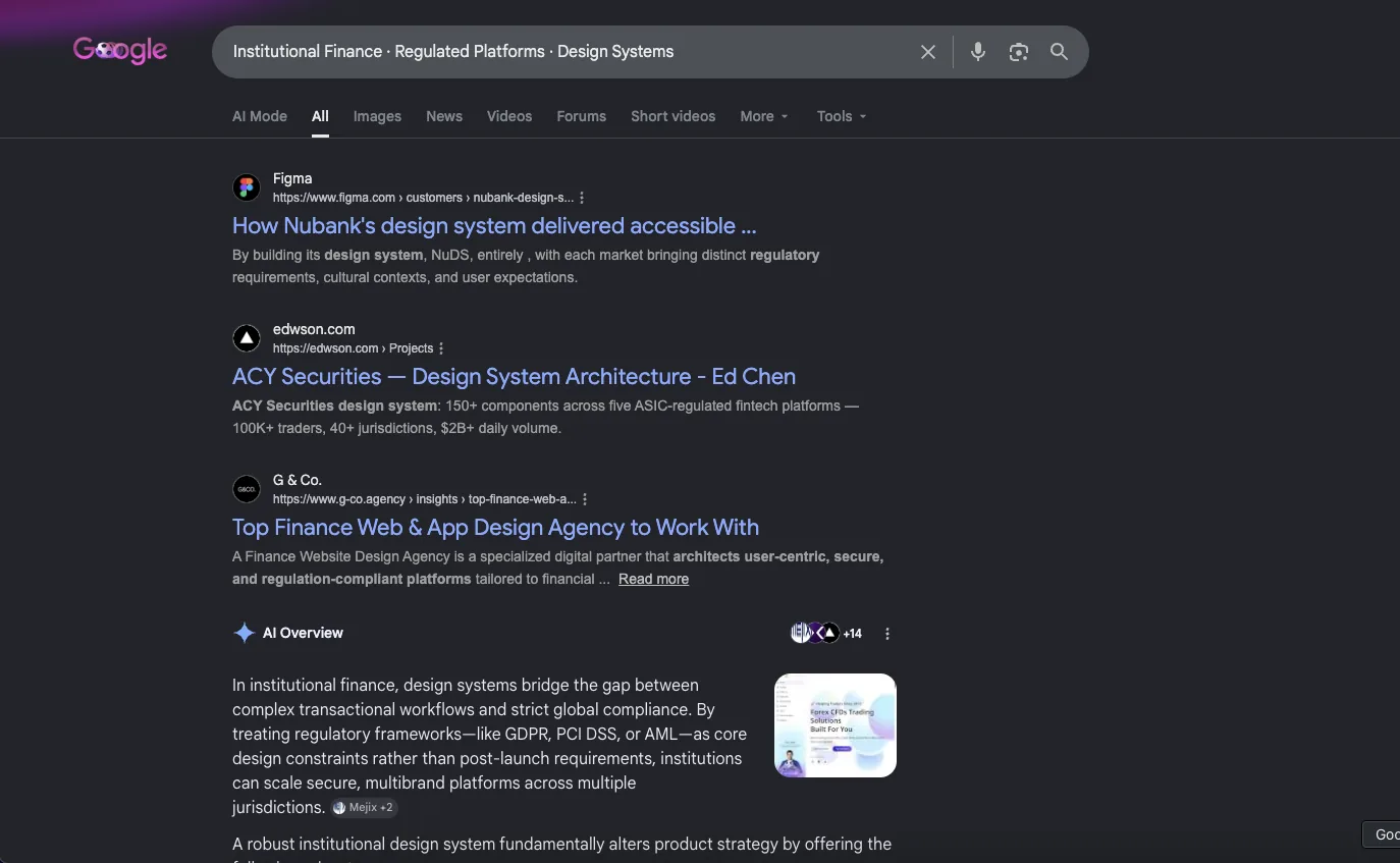
Google’s AI Overview surfaces the ACY Securities platform I designed — AI answer engines cite the work, not just the portfolio.
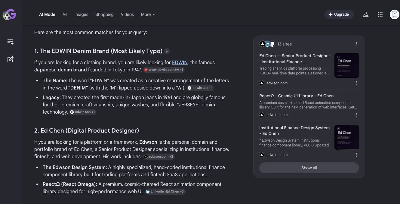
Google’s AI Mode names the work as a distinct entity — #2 after the 78-year-old EDWIN denim brand — and sources its answer almost entirely from edwson.com.
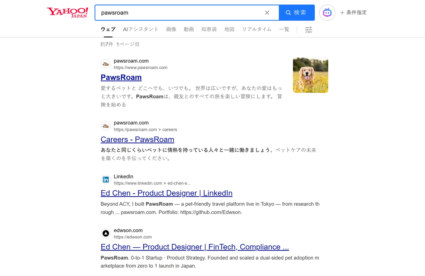
Yahoo Japan — the first page resolves almost entirely to my own work. In the target Tokyo market, the results return a product I built and shipped there (#1, plus its careers page), my LinkedIn, and the edwson.com portfolio — on Japan’s #2 search engine, not just Google. The same machine-readable layer (llms.txt / ai-profile.json, now with a Japanese section) feeds it.
Live snapshots, June 2026. Search results are personalized and shift over time — a moment, not a permanent ranking claim. These are evidence that the GEO + technical-SEO work lands, not a guarantee of position.
The four discipline points
Treat the portfolio as a product. Every case study is a feature page; every demo is a working artifact; every field note is content marketing. The funnel is real. The conversion event is a hiring conversation, not a sale, but the structure is identical. If you would not ship a feature to production without verification gates, do not ship a portfolio change without them.
Read the analytics before redesigning. The temptation when traffic disappoints is to rebuild. The data here said the catalog page was working — it was attracting the right audience at the right volume. The leak was downstream. Reading the funnel before changing the catalog saved a redesign that would have lost the SEO ranking for no funnel improvement.
Surgical changes over reinvention. Three insertion points, zero regression on 149 existing sections. Brand-fork CSS scoped to a page-local style block, no impact on the main stylesheet or the other 40 pages. The diff is small enough to revert in one commit if the next AWStats rollup shows the fix is wrong. This is the same Karpathy discipline that applies to production code: every diff line should be traceable to a specific request and reversible if proven wrong.
Update the schema with the same care as the body. AI search engines read JSON-LD before they read the body. OG previews are how the page enters Slack and LinkedIn. Updating meta and structured data is half the funnel fix, not an afterthought.
What This Is NOT
This note describes one specific funnel fix on one specific page on one personal portfolio. It is not a general SEO guide, and it does not generalise to all portfolio types.
- This is not generic SEO advice. The fix worked because the page already had organic search traffic and an existing brand-fork CSS architecture. A portfolio with no organic traffic or no design system has a different problem and needs a different fix.
- The expected funnel lift (~2×) is a hypothesis, not a measured outcome. The next AWStats rollup will either confirm or falsify it. If the numbers do not move, the follow-up note will explain why.
- AWStats is a raw-log analytics tool. It does not track scroll depth, time-on-page, or per-session paths the way GA4 or Mixpanel would. Some conclusions in this note are inferred from entry/exit ratios rather than directly measured, and that is a real limitation.
- Locale rollups are filtered for bot traffic by hits-per-page ratio, but the filter is heuristic. Some legitimate single-page-visit traffic is mis-classified as bot; some bot traffic with elevated request counts is mis-classified as human. The "real reviewer pool" number is approximate.
- This methodology applies to a static-HTML portfolio with shared hosting access to AWStats. It does not apply to a portfolio hosted on platforms (Webflow, Framer, Squarespace, Behance) where the analytics surface is platform-controlled.
Sources and methodology references
- AWStats — Open-source log file analyzer AWStats parses raw web server access logs (Apache, Nginx, IIS) into per-URL hit, page, visit, and bandwidth tables. Maintained by Laurent Destailleur since 2000. Default tool on most shared-hosting cPanel installations including the one running edwson.com. awstats.org — AWStats project documentation
- Google Search Central — Page structure and structured data Google's documentation on how the search ranking system parses page metadata, JSON-LD structured data, and OG / Twitter Card protocols. The basis for the description, keyword, and JSON-LD rewrites in Fix 3. developers.google.com — Structured data introduction
- Karpathy — On surgical changes in agentic coding "Only touch the task directly required. Don't 'order-of-magnitude improve' nearby code." The discipline that informs Fix 1–3: insertion points, not reinvention. Applied here to a portfolio funnel rather than a code review, but the principle is the same. github.com/karpathy — Methodology reference repositories
- design-system-showcase.html — The page being fixed The actual page on which the three fixes shipped on 2026-05-11. The on-page Production Evidence section, sidebar nav link, and first-screen CTA are all live for inspection. The fix is reversible by reverting one commit; the diff is documented in the portfolio's CLAUDE.md changelog. edwson.com/design-system-showcase.html — Live page
Where the fix lives
See the production surfaces
Portfolio thread
Where this connects
This note sits inside the Evidence & Verification Discipline thread — the same epistemic discipline applied to AWStats funnel data that I apply to A/B test pooled-SD calculations or regulatory citation audits in client work.
Thread
Evidence & Verification Discipline
How quantitative claims are sourced, validated, and presented — including the claims I make about my own portfolio
- Portfolio funnel analysis — AWStats methodology Reading raw access logs for funnel diagnostics; expected lift hypothesis with measurement plan Field note · AWStats · funnel conversion · self-marketing rigor
- Data Verification Methodology Sourcing, citation, and audit discipline for quantitative claims in financial UI Methodology · pooled-SD · Cohen's d · citation discipline
- MiFID II Best-Execution Report Bps unit discipline for multi-instrument comparison Field note · measurement methodology · bps unit standard