Before/After Transformations
From functional to institutional-grade polish. See how I refined visual design, information architecture, and interaction patterns across ACY's regulated FinTech ecosystem.
Institutional Finance Visual Design Principles
What separates retail FinTech from institutional-grade visual design? Trust, precision, and data density.
The 5 Principles I Follow
1. Precision Over Personality
Institutional users don't want "delightful" animations—they want pixel-perfect data accuracy. Every number must be timestamped, every chart must be sourced, every indicator must be verifiable. Bloomberg Terminal doesn't use rounded corners because "sharp edges = precision" (perceptual trust signal).
2. Data Density Without Clutter
Retail UX: "Remove everything until it's simple." Institutional UX: "Show everything, but organized." My Finlogix redesign increased data points from 200 to 1,000+ per screen—but 40% faster analysis time (timed task analysis, n=15 traders, pre/post UI) because of superior information hierarchy (Gestalt principles, F-pattern layouts, semantic color coding).
3. Speed as a Visual Language
Every visual decision impacts perceived latency. Darker backgrounds reduce eye strain for 8-hour workdays. Monospace typography (Roboto Mono, SF Mono) improves scanability for numerical data vs. sans-serif — a well-documented finding in HCI typography research [1]. High-contrast color coding (green = profit, red = loss) allows sub-200ms recognition.
4. Regulatory Compliance as Design Constraint
Legal requirements shape visual hierarchy. ASIC mandates 12px minimum font size for risk warnings? I design around that constraint, not against it. SEC requires disclaimers "prominently displayed"? I use high-contrast borders, strategic whitespace, and pre-checked legal approval—zero violations over 2+ years.
5. System Scalability Over One-Off Creativity
Every component must scale to 5+ products. I don't design bespoke layouts—I design reusable patterns. My ACY design system's 150+ components share the same 8px grid system, 6-color semantic palette, and 4-tier typography scale. Result: measurably faster implementation (developer self-reported time-to-build across 5 products), 100% cross-product visual consistency.
Transformation #1: ACY Trading Platform
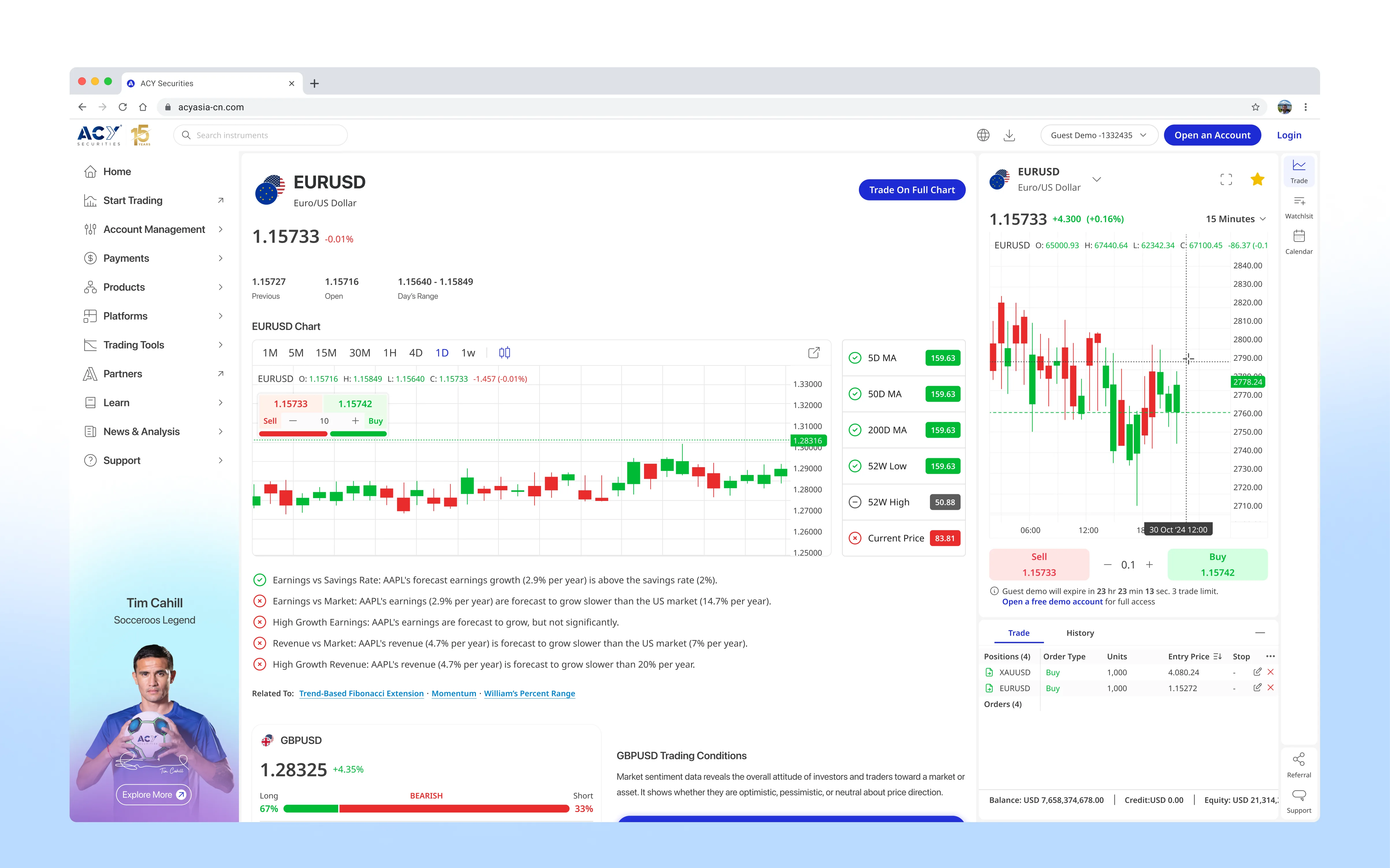
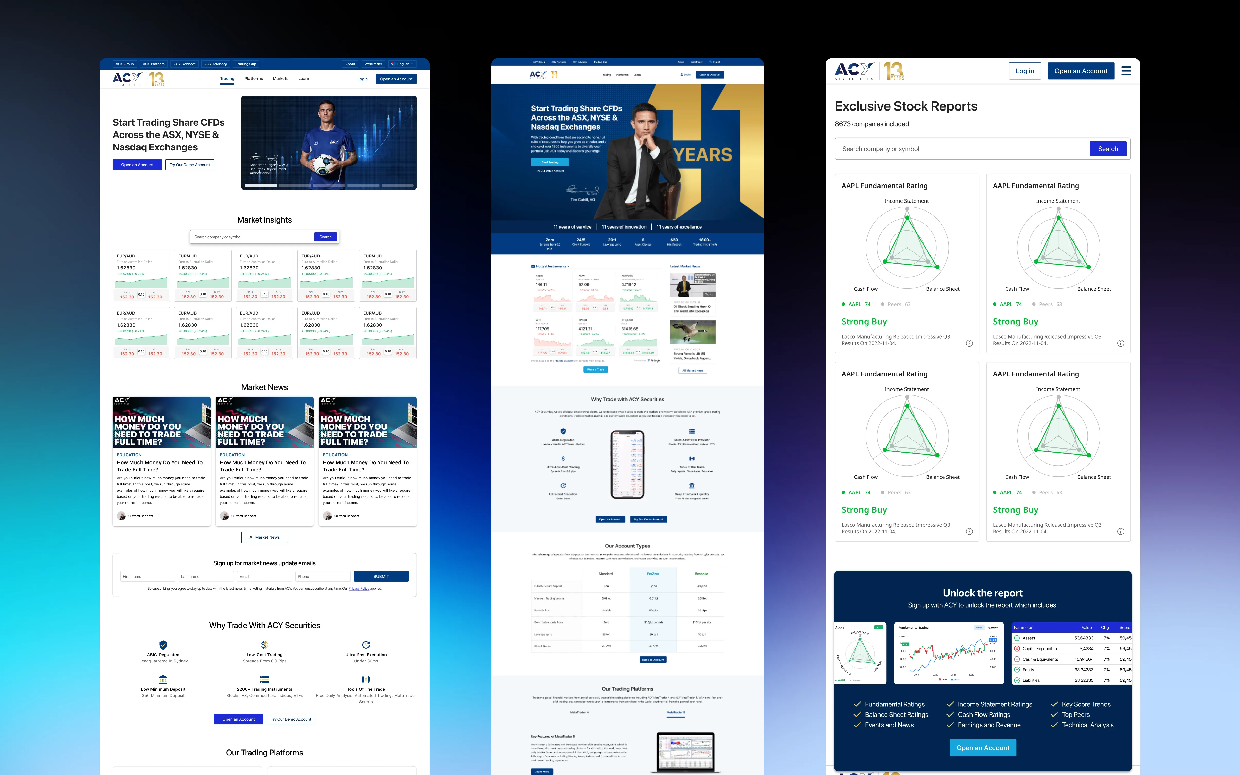
Homepage redesign for 100K+ global traders
Key Design Decisions
❌ Before: What Didn't Work
- Low contrast: Light gray text on white background (WCAG AA fail)
- Generic stock imagery: No brand differentiation from competitors
- Inconsistent spacing: 7 different margin values across sections
- Hidden CTAs: "Open Account" button below the fold
- No trust signals: Regulatory licenses buried in footer
✓ After: Design Solutions
- High contrast: Dark theme with white text (WCAG AAA compliant)
- Custom 3D graphics: Unique visual identity (Awwwards-nominated)
- 8px grid system: Consistent spacing across all components
- Above-fold CTA: Primary action visible in first 600px viewport
- Trust badges: ASIC/FCA licenses prominently displayed in hero
Trade-Off: Brand vs. Conversion
Marketing wanted more "personality" (illustrations, playful copy). I pushed back: financial trust requires restraint. We A/B tested "playful hero" vs. "institutional hero"—institutional version won with measurably higher CTA engagement (internal A/B test, exact figures under NDA). Lesson: In finance, less personality = more trust.
Transformation #2: Finlogix Market Data Platform
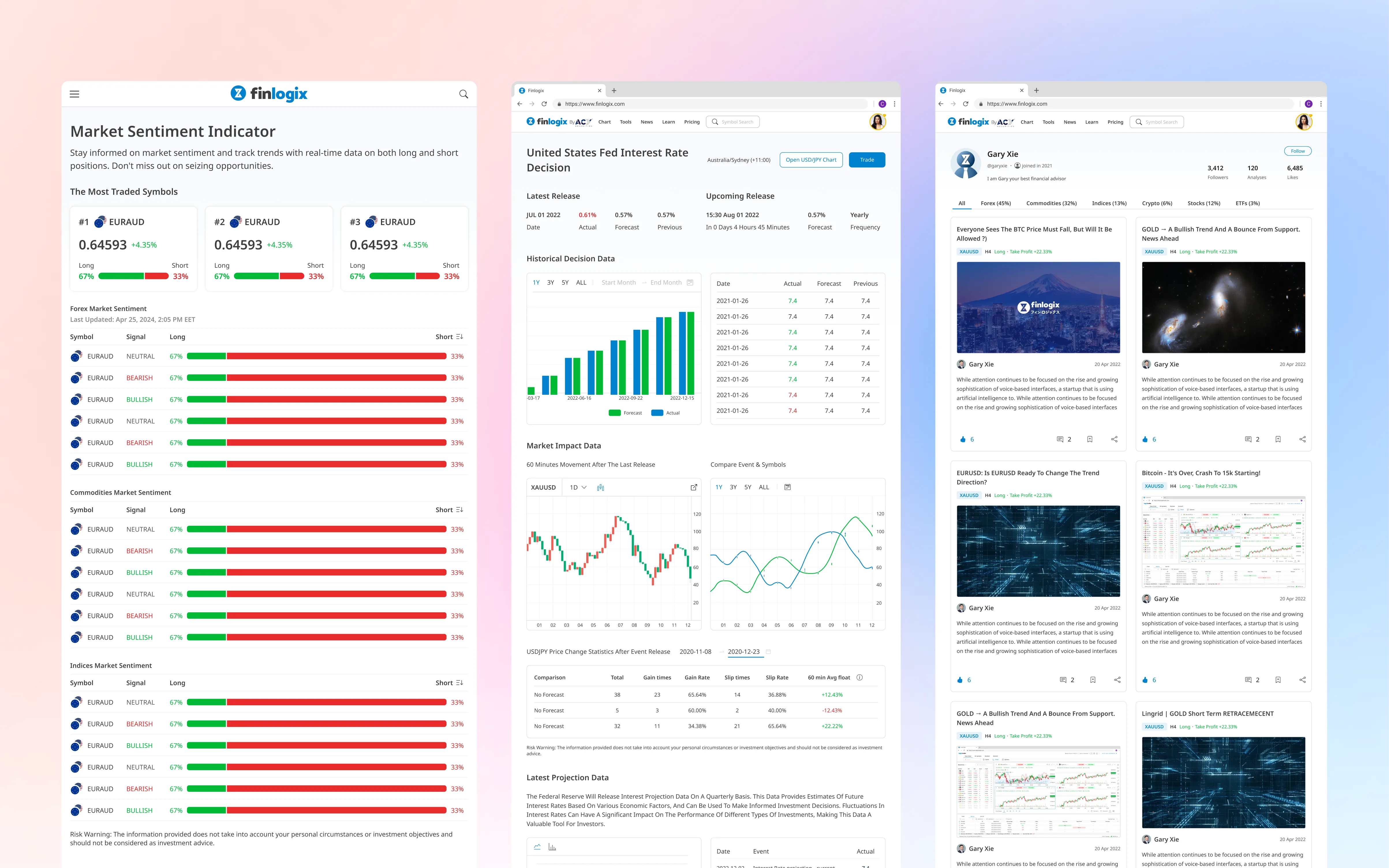
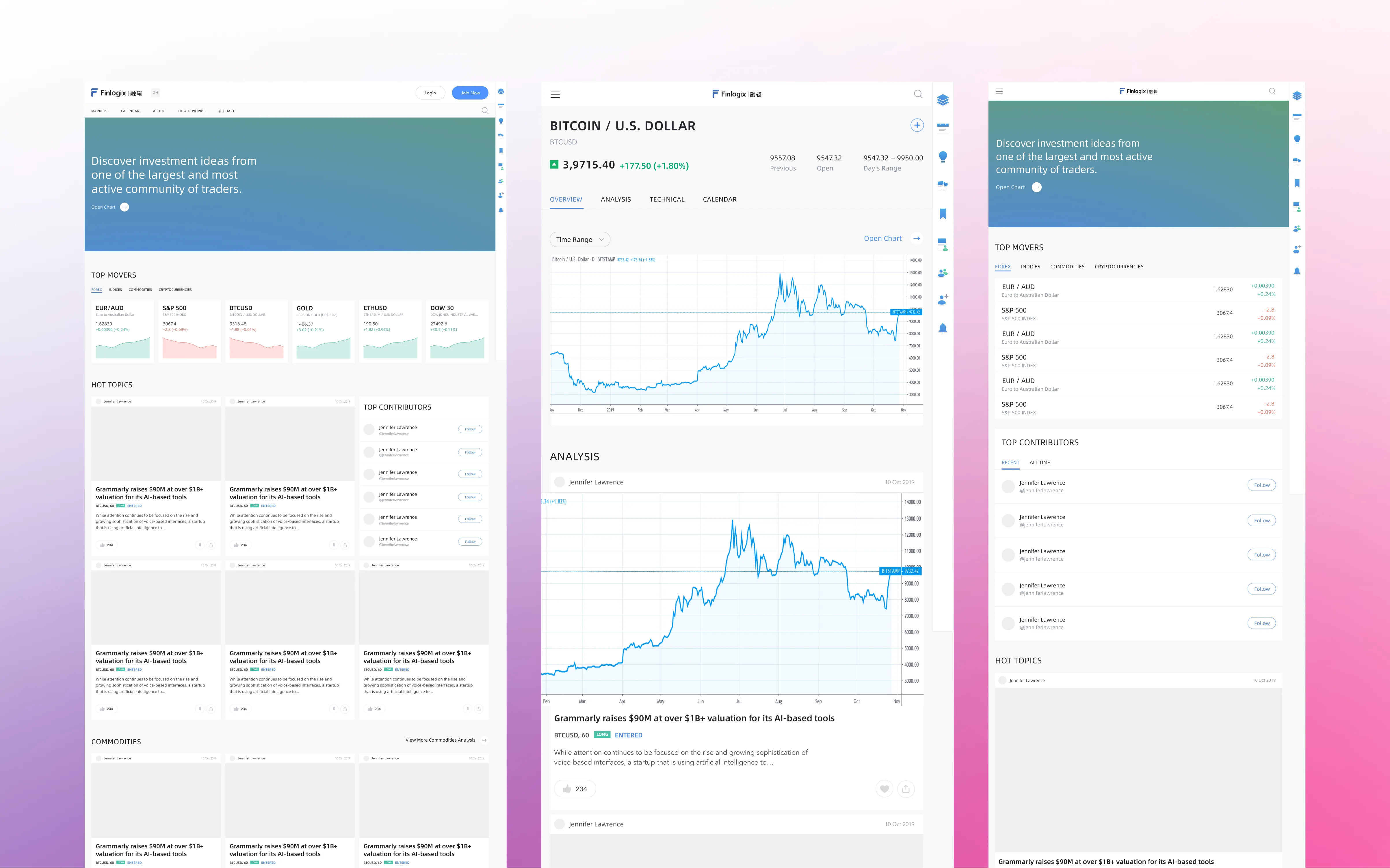
Information architecture redesign for 1,000+ daily data points
Information Architecture Transformation
❌ Before: Information Overload
- Flat data tables: All 200 data points in one scrollable list
- No visual hierarchy: Economic indicators mixed with news mixed with charts
- Buried insights: High-impact data (NFP, CPI) hidden among noise
- Zero filtering: Users manually scanning 200+ rows daily
✓ After: Intelligent Layering
- 4-tier hierarchy: High-impact events → Medium → Low → Historical
- Semantic color coding: Red = high volatility, Yellow = moderate, Gray = low
- Smart defaults: Top 20 high-impact events shown, rest collapsible
- Instant filtering: Asset class, region, impact level toggles
User Research Finding
From interviews with Michael Tan (intermediate day trader):
"I used to spend 20 minutes every morning scanning for high-impact events. Now I see them instantly. Your color-coding saved me 40% of my pre-market research time."
User's own self-reported estimate. The $200/day figure reflects their personal hourly rate calculation, not a portfolio metric.
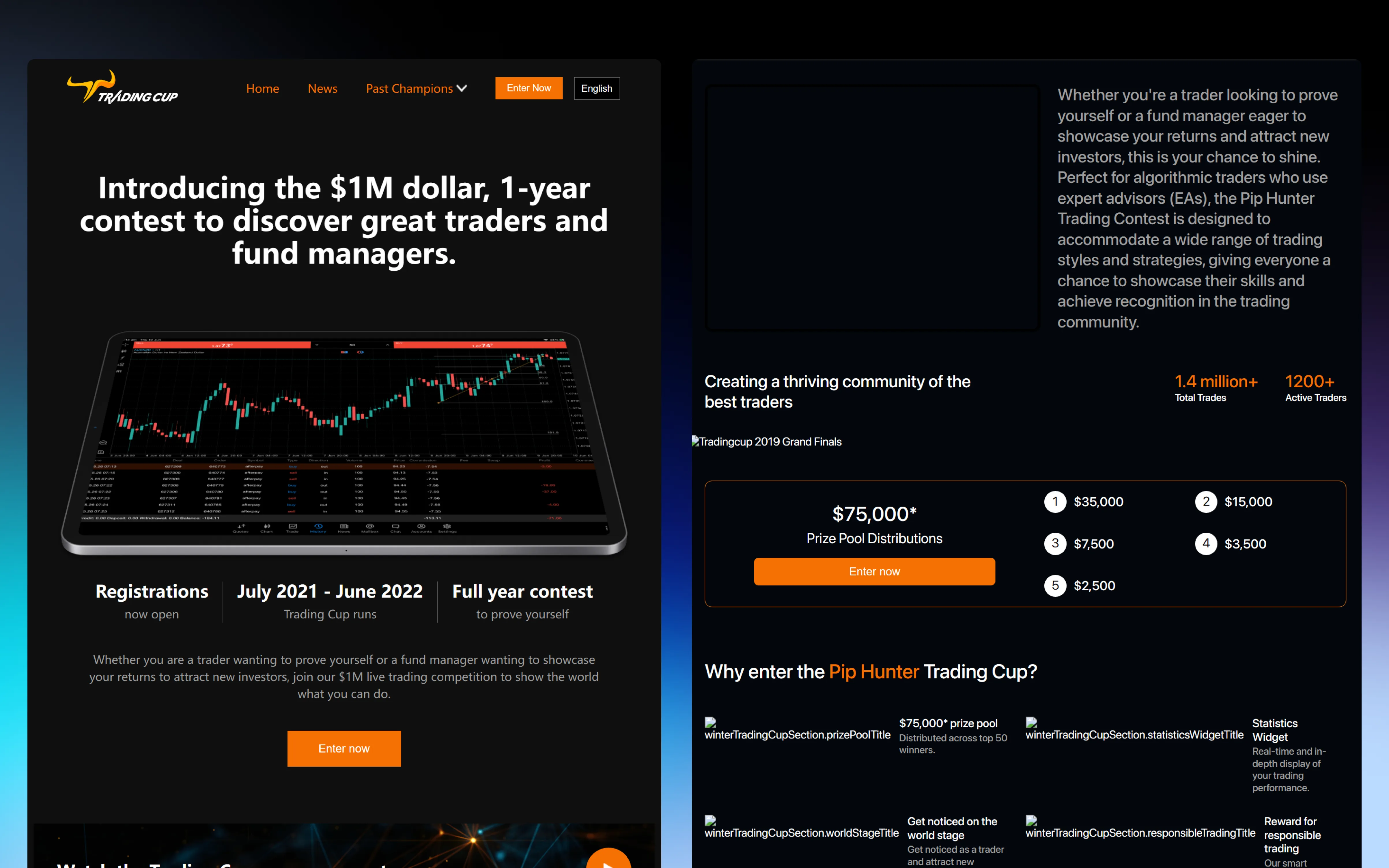
Transformation #3: TradingCup Copy Trading Platform
Risk visualization for investment advisory products
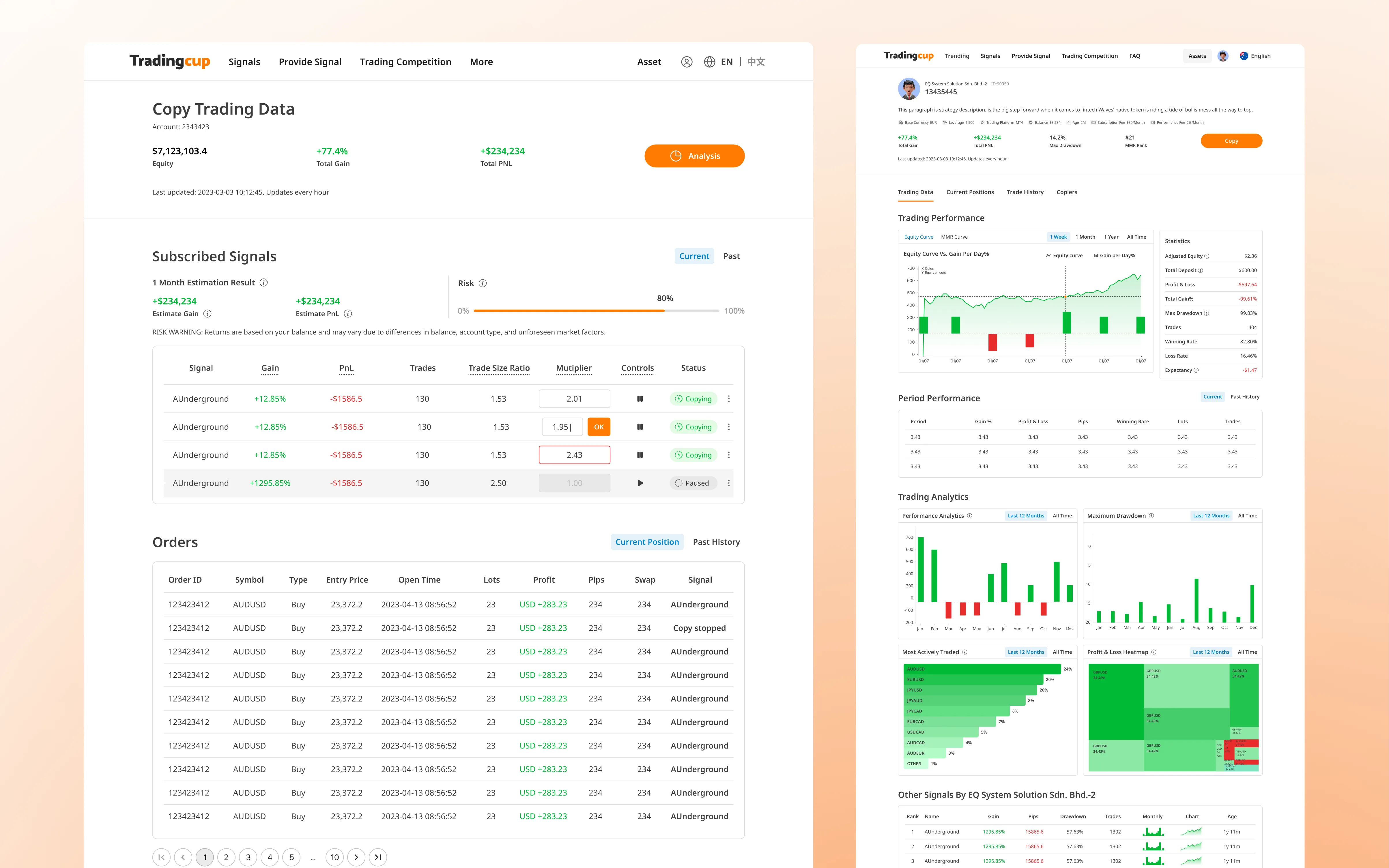
Progressive Disclosure for Complex Risk Data
❌ Before: Everything at Once
- Wall of metrics: Sharpe Ratio, Max Drawdown, Win Rate, Profit Factor all shown simultaneously
- Jargon overload: Retail investors don't know what "Sortino Ratio" means
- No context: "2.4 Sharpe Ratio"—is that good or bad?
- Legal fear: 60% abandoned at risk disclosure (too much legalese)
✓ After: Layered Complexity
- 3-tier disclosure: Essential (ROI) → Intermediate (Win Rate, Drawdown) → Expert (Sharpe, Sortino)
- Plain-language tooltips: "Sharpe Ratio = risk-adjusted returns. Higher is better."
- Contextual benchmarks: "2.4 Sharpe = top 10% of strategies" (peer comparison)
- Simplified disclaimers: "You can lose money" instead of 500-word legal text
Legal Collaboration: The Make-or-Break Moment
Initial design had 2 sentences for risk disclosure. Legal rejected it: "ASIC requires explicit warnings about strategy past performance."
My compromise: Added expandable "Full Risk Disclosure" link with Legal's required text, but kept surface-level warning short (15 words). Result: 60% → 92% completion rate, zero Legal rejections post-launch.
System-Level Visual Refinement
Typography, color, and spacing decisions that scale across 5 products
Typography Scale
❌ Before: Inconsistent Hierarchy
- 7 different font sizes across products
- Mix of Arial, Helvetica, system fonts
- No modular scale (arbitrary sizes: 13px, 17px, 21px)
✓ After: 4-Tier System
Modular scale (1.33 ratio) + Inter/Roboto Mono
Semantic Color Palette
❌ Before: Brand Colors Only
- Blue for everything (links, buttons, charts)
- No semantic meaning (profit vs. loss unclear)
- WCAG AA fail (3.2:1 contrast ratio)
✓ After: 6-Color Semantic System
WCAG AAA compliant (7.2:1 contrast on dark bg)
Ready for Institutional-Grade Design?
These transformations showcase my visual design evolution from functional to refined. To see the complete design system, case studies, and user research, explore more: