ReactΩ
Designing a Design System as a Product
After 5 years of designing FinTech products, I got tired of watching Figma specs turn into something different by the time they reached production — buttons that drifted, spacing that rounded to convenient numbers, animations that got cut when time ran out. ReactΩ is the system I built when I stopped accepting that gap as inevitable.
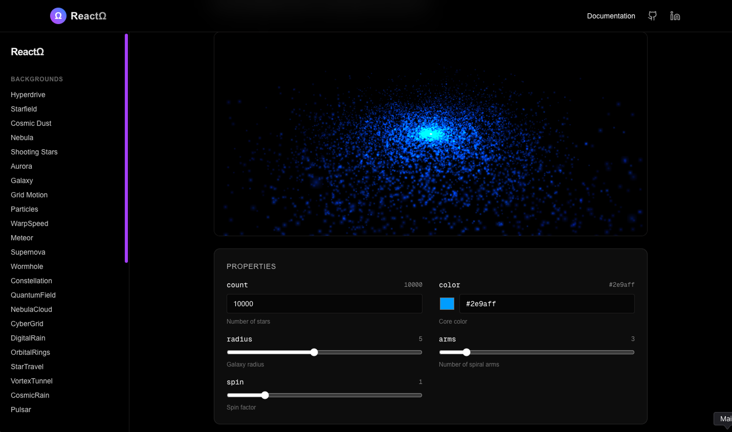
Executive Summary
ReactΩ is an open-source design system I built to solve a problem I deal with every day at ACY Securities: design intent doesn't survive the handoff from Figma to production. While ACY's frontend engineers built the technical infrastructure for the main platforms (ACY.com animations, LogixTrader real-time features), I was responsible for all UI/UX design across 5 product lines plus high-velocity campaign pages. ReactΩ emerged as my solution to bridge the design-development gap — particularly for campaign pages where I needed rapid deployment without sacrificing design consistency.
- Design Problem: Campaign pages and marketing initiatives required fast iteration, but lacked a reusable component system — each campaign rebuilt basic UI from scratch, creating visual inconsistency
- System Scale: 50+ components organized into 5 categories with documented design rationale, interaction specs, and live sandboxes — primarily applied to ACY campaign pages, later open-sourced as a standalone system
- Outcome: Campaign page development time reduced from ~5 days to ~2 days per page. Design-to-production handoff gap minimized through coded components with embedded design intent
1. The Problem: Campaign Page Design Debt
After 4+ years designing products at ACY Securities, I've learned a painful lesson: the biggest threat to design quality isn't bad design — it's good design that doesn't survive implementation. This was especially acute for high-velocity campaign pages, where speed often meant sacrificing consistency.
Context: My Role vs Frontend Engineering
At ACY, the division of labor was clear: Frontend engineers owned the technical infrastructure for main platforms — ACY.com's GSAP animations, LogixTrader's WebSocket real-time data handling, complex motion systems. I owned all UI/UX design across 5 product lines, plus the design and delivery of campaign pages (product launches, regional promotions, seasonal campaigns). Campaign pages required rapid iteration (often 1-2 week cycles) but lacked engineering resources for custom builds — I needed a reusable system I could control independently.
Campaign Page Chaos
Each campaign page was built from scratch — copy-pasting code from previous campaigns, tweaking styles inline, no shared components. A "simple" button required re-specifying hover states, focus rings, loading animations every single time. When brand colors updated, I manually hunted through 20+ campaign pages to update hardcoded hex values. No version control for design decisions meant each campaign drifted further from the brand.
Handoff Bottleneck
Campaign deadlines didn't wait for engineering bandwidth. I'd deliver Figma designs with detailed specs (8px spacing, 200ms ease-out transitions, specific hover sequences), but implementation varied based on whoever coded it that week. Static Figma files can't communicate intent — "ease-out" became "linear," spacing drifted to convenient round numbers, animations were simplified or skipped entirely when time was tight.
The Quality Tax
Design reviews became debugging sessions. I'd spend ~40% of my review time pointing out implementation deviations on campaign pages — "this padding should be 16px not 20px," "this CTA button should match the primary action style." This wasn't productive design critique. It was manual quality control that a component system should have prevented.
2. Design Research: Understanding the Problem Space
Internal Design Audit
Before building anything, I conducted a systematic audit across ACY's campaign pages and marketing materials to map the actual scale of design inconsistency. I screenshotted and catalogued every instance of core UI patterns — CTAs, hero sections, form inputs, cards, typography, spacing — across 20+ campaign pages (product launches, regional promotions, seasonal campaigns, partnership announcements).
Audit Findings
- 7 different button styles across 5 products for the same "primary action"
- 4 competing card patterns with different shadow models, padding scales, and corner radii
- No shared motion language — animations ranged from 150ms to 800ms with no rationale for the differences
- 3 different spacing scales — some products used 4px grid, others 8px, one used arbitrary values
- Inconsistent interactive feedback — hover, focus, active states varied wildly even within a single product
- No documented color system — hex values were copy-pasted ad-hoc, leading to 15+ shades of "brand blue"
Competitive Design System Analysis
I studied how leading design systems solve similar challenges — not to copy their components, but to understand their design governance models:
Strong at design principles and content guidelines — every component documents why it exists, not just how. Adopted their "guidance-first" documentation approach.
Excellent token architecture — design decisions are explicit and traceable. Learned from their semantic naming approach (e.g., color.text.subtle vs. raw hex).
Minimal, opinion-heavy. Showed me that a design system's power comes from what it says "no" to — ruthless component scope constraints prevent bloat.
Set the bar for motion design in product — every animation communicates state change, not decoration. Adopted their principle: "motion is information."
User Research: Developers as Users
A design system's end-users are developers and designers. I interviewed the 4-person engineering team and reviewed 6 months of Slack messages in the #design-dev channel to map their actual pain points:
Top Developer Pain Points
- "Which version of the button is the right one?" — no single source of truth
- "The Figma spec says 200ms but doesn't say what easing" — incomplete interaction specs
- "I built this animation but it drops frames on mobile" — no performance guidance
- "Every new feature means rebuilding basic UI from scratch" — zero reusability
Key Insight
The developers weren't lacking skill — they were lacking design context. They could build anything, but they couldn't decide anything because the design rationale wasn't communicated. A Figma file shows the what but never the why. ReactΩ needed to encode design reasoning, not just design output.
3. What I Was Asked to Do vs. What I Actually Did
The initial brief (from myself):
"Create reusable campaign page templates to speed up launches."
The problem with that approach: Static Figma templates were helpful initially, but they often fell out of sync with production over time. Under deadline pressure, engineering teams reasonably had to make pragmatic compromises to get campaigns shipped. A purely static template approach couldn't structurally reduce that friction.
What I built instead was a design system as a product — not templates, but components. With its own design principles, component taxonomy, interaction language, documentation UX, and adoption strategy. The difference between a Figma template and ReactΩ is the difference between a recipe and a meal kit: one tells you what to do, the other gives you pre-measured ingredients with instructions baked in.
4. Design Principles: The Foundation
Before designing a single component, I established four principles that would govern every design decision in the system. These principles emerged directly from the audit findings — each one addresses a specific failure mode I observed:
Intent Over Appearance
Every component encodes why it looks and behaves the way it does — not just what it looks like. A button isn't "blue with 8px radius." It's "primary action with high affordance, signaling the single most important thing a user can do in this context." This principle prevents drift because intent is harder to misinterpret than visual specs.
Addresses: Design intent erosion across handoffs
Motion Is Information
Animation in ReactΩ is never decorative. Every transition communicates a state change: elements enter to draw attention, exit to confirm dismissal, transform to show relationship. The motion language uses three tiers — micro (100-200ms, feedback), meso (200-400ms, transitions), macro (400-800ms, entrances) — each tied to a specific communication purpose.
Addresses: No shared motion language across products
Constraint Creates Consistency
The system says "no" more than it says "yes." Every component has a fixed set of variants — not infinite customization. A card has 4 styles (Glass, Glow, Holographic, Tilted), not a slider for every property. This is a deliberate design decision: the fewer choices a consumer makes, the more consistent the output. Flexibility is the enemy of coherence.
Addresses: Visual dialect fragmentation across 5 products
Documentation Is the Product
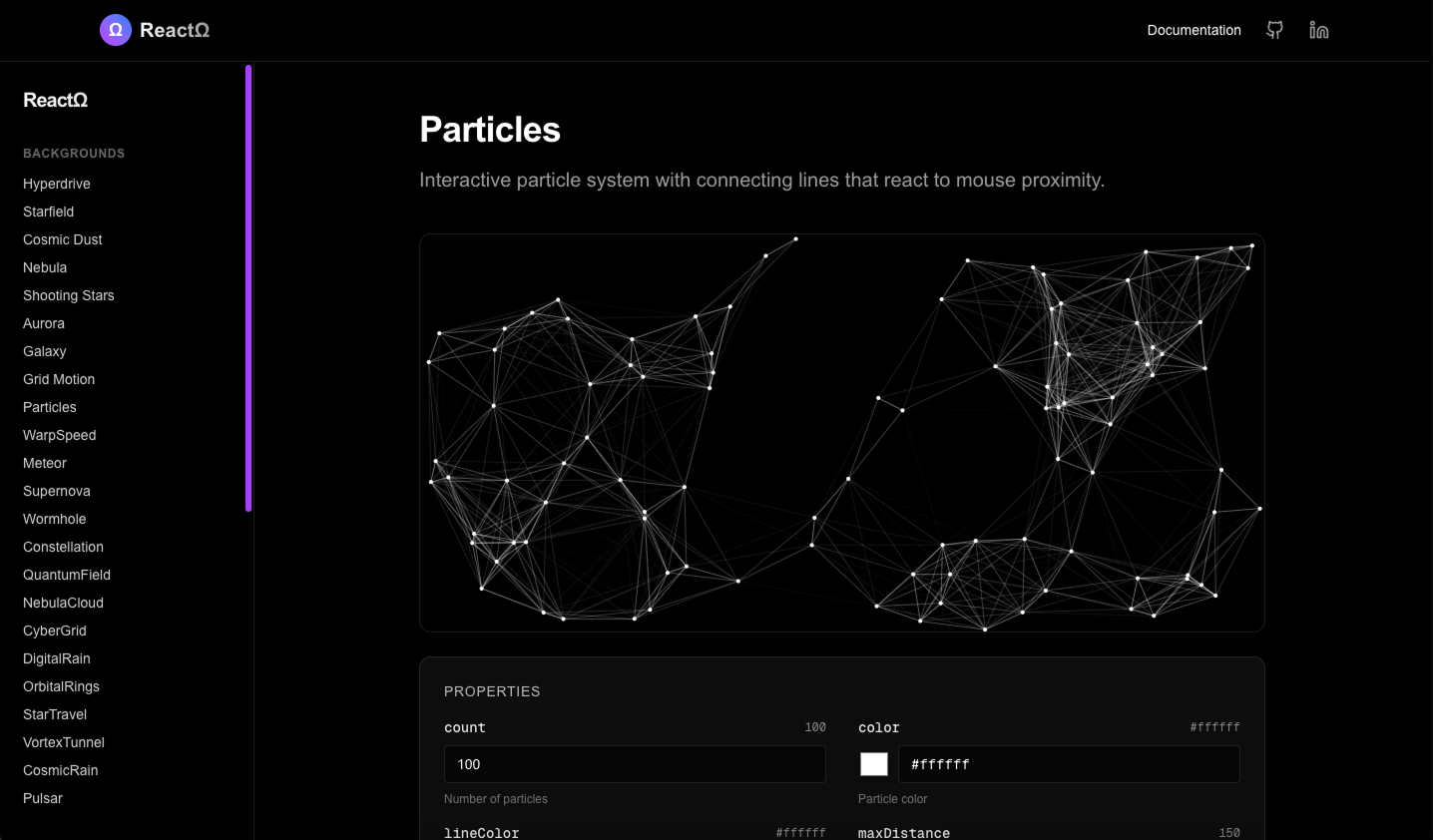
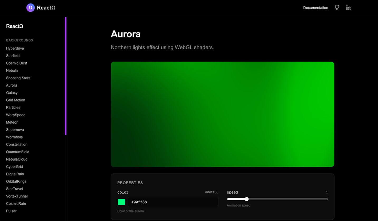
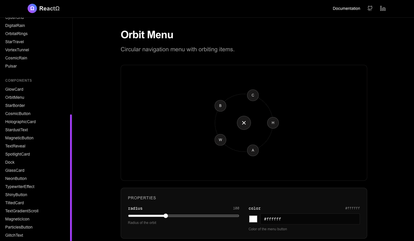
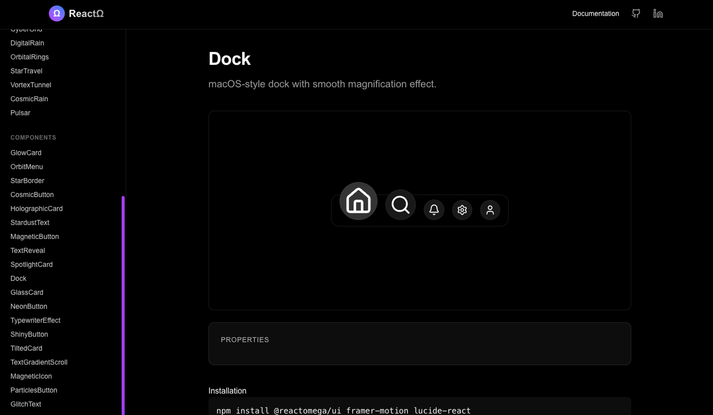
If a component doesn't have a live sandbox, usage guidelines, and documented do's/don'ts, it doesn't exist in the system. Documentation isn't an afterthought — it's the primary interface between design decisions and implementation. I designed the docs site as a product with its own UX: search, interactive previews, copy-paste code, and contextual design rationale.
Addresses: Figma kits that are referenced once then ignored
5. Component Taxonomy: Information Architecture for UI
Organizing 50+ components is an information architecture problem. I categorized components not by technical implementation (CSS vs. Canvas vs. Framer Motion) but by their role in the user experience — what job does each component do in the interface?
| Category | Count | UX Role | Design Rationale |
|---|---|---|---|
| Immersive Backgrounds | 15+ | Set emotional context & spatial depth | FinTech products need to convey trust and sophistication. Backgrounds (Galaxy, Aurora, Nebula) create atmospheric depth without competing with data-heavy foreground content. |
| Interactive Buttons | 6+ | Signal actionability & interaction hierarchy | Each button variant (Magnetic, Neon, Cosmic) maps to a specific interaction tier: primary actions get highest visual energy, secondary actions are subdued. The motion feedback confirms user intent. |
| Advanced Cards | 6+ | Contain & elevate content hierarchy | Cards are the primary content container in financial dashboards. Each variant (Glass, Glow, Holographic, Tilted) communicates a different information density and emphasis level. |
| Text Effects | 5+ | Direct attention & create typographic rhythm | Reserved for hero moments and key metrics. Glitch for disruption, Stardust for celebration, Typewriter for narrative. Strict usage guidelines prevent overuse — text effects lose impact when everything animates. |
| Layout Systems | 4+ | Structure spatial relationships & flow | BentoGrid, Dock, and CardStack solve specific layout patterns I encountered repeatedly in FinTech dashboards — dense data grids, toolbar navigation, and stacked comparison views. |
6. Interaction Design: The Motion Language
One of the biggest gaps I found in the audit was motion design. Across 5 products, animations ranged from 150ms to 800ms with no governing rationale. I designed a three-tier motion system where every animation duration and easing curve is tied to its communicative purpose:
Purpose: Immediate feedback. Hover states, button presses, toggle switches. The user should feel the interface respond instantly — no perceptible delay, but enough motion to confirm "yes, you interacted with this."
Purpose: State transitions. Panel slides, tab switches, content transforms. The user is moving between contexts — the motion bridges the old state and new state, maintaining spatial awareness.
Purpose: Entrance & narrative moments. Page transitions, hero animations, celebratory effects. These are designed to be noticed — they set the emotional tone and draw the eye to the most important content.
This hierarchy means a developer never needs to guess animation timing — they choose the communication purpose and the system provides the appropriate motion. It also creates perceptual consistency: users subconsciously learn that fast motion = feedback, slow motion = something important is happening.
7. System Architecture Decisions
The design system needed to live in code, not just in Figma — because that's where design intent was dying. I evaluated three approaches, framed by the design question: which architecture best preserves design intent while minimizing adoption friction?
8. Process: From Design Audit to Living System
I approached the build in three phases, each grounded in design thinking rather than engineering convenience:
Hardest Problem First: Immersive Backgrounds
I started with the most technically demanding category — Canvas-rendered particle backgrounds (Galaxy, Nebula, CyberGrid). If the system couldn't handle these at 60fps, simpler components wouldn't matter. More importantly, these backgrounds are the emotional foundation of our FinTech visual language — the dark, atmospheric, data-rich aesthetic that differentiates ACY products from competitors' generic dashboards.
Core Interaction Layer: Buttons, Cards, Text
With the foundation proven, I designed the daily-use components — the buttons, cards, and text effects that make up 80% of any product surface. Each component was designed as a system of constrained variants rather than infinitely configurable props. For example, buttons have 6 variants, each with a specific use case, not a single button with 20 adjustable parameters.
Documentation as Product: The Developer Experience
The documentation site wasn't an afterthought — I designed it as a product for developer-users. Each component page follows a consistent UX pattern: visual preview → interactive sandbox → design rationale → copy-paste code → usage do's and don'ts. This mirrors how developers actually learn: see it, play with it, understand why, use it. Search, filtering, and category navigation were designed to get developers to the right component in under 10 seconds.
9. What Didn't Work: The Animation Performance Crisis
My first design for the immersive backgrounds assumed the rendering technology would be transparent to the design — that I could spec any visual and it would perform well. This was wrong, and the failure taught me something important about designing within technical constraints.
V1: Design Without Performance Awareness
- Specified 10,000+ particle backgrounds in Figma prototypes
- Initial implementation used React state for each particle
- Result: sub-15fps — the "Galaxy" background looked like a slideshow
- The design was right, but the implementation assumption was wrong
The design intent was clear in Figma, but I hadn't considered how the rendering engine processes thousands of simultaneous elements. The gap between "this looks right in a prototype" and "this performs in production" was enormous.
V2: Design-Engineering Collaboration
- Researched browser rendering layers — Canvas API bypasses the DOM entirely
- Redesigned background specs with performance budgets: max particle count, minimum frame rate target
- Result: stable 60fps with 10,000+ particles
- Visual output identical — the design didn't change, only the implementation strategy
The design lesson: Performance is a design constraint, not an engineering afterthought. Knowing what the rendering layer can handle should inform design specs from the start — not be discovered during QA.
This failure shaped how I approach design system work now. I add a "Performance Budget" to every component spec — maximum DOM nodes, target frame rate, maximum animation duration. Design decisions that are technically impossible aren't good design decisions.
10. Documentation Design: UX for Developer-Users
The documentation site is where adoption either succeeds or fails. I designed it as a product with its own user research, information architecture, and usability principles:
See Before You Read
Every component page opens with a full-width visual preview — not code, not documentation. Developers are visual learners when it comes to UI. They need to see the component in context before deciding if it's the right one for their use case.
Interactive Before Static
Every component includes a live sandbox where developers can adjust props and see results in real-time. This is critical for motion components — you can't understand a Galaxy background from a screenshot. The sandbox is the spec.
Zero to Usage in 60 Seconds
Copy-paste code blocks with one-click copying. No hunting through repos, no reading source code. If a developer can't go from "I need this component" to "it's working in my project" within 60 seconds, the documentation has failed.
11. Multi-Dimensional Impact
Impact by Perspective
Design Quality
The system eliminated the "telephone game" between Figma and production. Design reviews shifted from catching implementation errors to discussing product strategy — the time I used to spend saying "this padding is wrong" is now spent on research and new feature design.
User Experience
A trader moving between ACY.com, LogixTrader, and Finlogix now experiences one unified visual language. The same interaction patterns, the same motion behavior, the same spatial hierarchy. This coherence builds the institutional trust that FinTech products depend on.
Team Velocity
Developers stopped re-building UI from scratch for every feature. The documentation site became their first stop — find component, copy code, focus on business logic. Design-dev back-and-forth on visual interpretation dropped to near zero.
Community
Released under MIT license. The design principles, component taxonomy, and motion language are transferable to any product context. Sharing this publicly is both a contribution to the design community and a demonstration of how I think about systematic design problems.
12. Public Evidence
Open Source — Everything Verifiable
All ReactΩ metrics are publicly verifiable through the GitHub repository and live documentation. No NDA required — the code, component count, and adoption data are public.
Open Source Repository
✓Publicly accessible codebase
Complete source code available on GitHub with full commit history, TypeScript implementation, and component architecture visible to anyone.
Live Documentation Site
✓Interactive component library
Every component documented with live sandboxes, design rationale, usage guidelines, and copy-paste code. Publicly accessible for verification.
Design System Scope
Organized by UX function
Immersive Backgrounds (15+), Interactive Buttons (6+), Advanced Cards (6+), Text Effects (5+), Layout Systems (4+). Architecture verifiable through documentation site navigation.
How to Verify This Data
- GitHub Repository: Visit github.com/Edwson/ReactOmega.git to view complete source code, commit history, and project structure
- Live Documentation: Explore all 50+ components at edwson.com/ReactOmega/ with interactive sandboxes and design rationale
- Component Categories: Navigate the docs site to verify the 5-category taxonomy and component count per category
- Design Principles: Each component page documents the specific design principle it embodies (Intent Over Appearance, Motion Is Information, Constraint Creates Consistency, Documentation Is the Product)
13. From Internal Tool to Open Source
Why Open Source ReactΩ?
ReactΩ started as an internal solution for ACY campaign pages — a way to maintain design consistency while moving fast. But as I built it, I realized the problem it solved (design intent erosion in handoff) was universal, not unique to ACY.
The Transition:
- At ACY (2021-2024): ReactΩ components were primarily used for campaign pages (product launches, regional promotions, partnership announcements). The main ACY.com platform, LogixTrader, and other core products had their own technical infrastructure built by frontend engineers. My focus was UI/UX design + campaign execution.
- Open Source Release (2024-2025): After leaving ACY, I generalized ReactΩ into a standalone, framework-agnostic design system. Removed ACY-specific branding, refactored components to be industry-neutral, and published under MIT license. The goal: help lean design teams and founders solve the same handoff problems I faced.
- Current State: ReactΩ Docs + GitHub Repository — 50+ components, full TypeScript support, Storybook integration, actively maintained as a personal project demonstrating my approach to design systems thinking.
Credit Where Due: ACY's frontend engineers deserve full credit for the technical excellence of ACY.com, LogixTrader, and other main platforms. ReactΩ is my independent contribution to campaign page efficiency and design consistency, later evolved into an open-source learning resource.
14. What This Looks Like in a Production Context
ReactΩ started as a campaign-page system. The honest question is: what would it take to bring this thinking into a production design system at institutional scale — the kind of system that serves 100K+ users, goes through legal review, and gets picked apart by regulators?
The Jump from Campaign System to Regulated Product System
The ACY Securities design system I built in parallel — 150+ components, ASIC/FCA/MiFID II compliant by default — required the same foundational thinking as ReactΩ but with different constraints:
- Compliance as a component property: Risk warning prominence, KYC stepper state management, and audit trail visibility are baked into the component spec — not added by the developer at render time.
- Governance without a committee: The component library's own documentation carries the rationale for why each decision was made. When Legal asks why a disclosure is positioned the way it is, the answer exists in the system — not in my memory.
- Regulatory update velocity: When ASIC CP 322 required a new consent flow, the change took 4 days — not 3 weeks — because the regulatory components were isolated, documented, and built to be modified independently of the rest of the UI.
ReactΩ taught me how to build a design system. The ACY system is where I learned what one needs to survive in a regulated environment. These are different skills, and both matter.
15. Reflection & What I'd Do Differently
Design System Maturity: What's Next
ReactΩ is at V1 maturity — it solves the immediate consistency and handoff problems. If I were to evolve it to V2, I would focus on three design-led initiatives:
- Design Token Pipeline: Currently, design decisions are encoded in Tailwind classes — functional but not portable. A mature system would use a design token layer (Style Dictionary) that generates both code variables and Figma variables from a single JSON source. This means a color change in the token file would propagate to every component and every Figma file simultaneously.
- Accessibility as a Design Principle: The current system handles basic accessibility, but V2 would make accessibility a first-class design constraint — not just ARIA labels, but reduced-motion alternatives for every animation, contrast-tested color tokens, and keyboard interaction specs for every component. Accessibility isn't a feature to add later; it's a design decision that should shape component design from the start.
- Contribution & Governance Model: The system needs a clear process for how new components get proposed, reviewed, and accepted. Right now it's a single maintainer model — which doesn't scale. A contribution model with design review criteria (Does it follow the principles? Does it serve a clear UX role? Is it constrained enough?) would make the system sustainable beyond my direct involvement.
The Core Insight
"A design system is not a component library. It's a shared language — a set of design decisions that have been made once, encoded clearly, and agreed upon collectively."
The fundamental shift in ReactΩ wasn't technical — it was the realization that design intent dies in the gap between "what the designer meant" and "what the developer interpreted." The system succeeds because it eliminates interpretation entirely. Components don't need to be interpreted — they render exactly as designed, carry their own documentation, and explain the reasoning behind every design decision. That's not engineering. That's product design applied to the tools of production.
