TradingCup
Algorithmic Strategy Distribution Platform
Designed transparent risk visualization and provider evaluation frameworks for systematic trading strategy distribution. Built institutional-grade risk metrics (Sharpe Ratio, Max Drawdown, Win Rate) into a retail-accessible platform serving 10,000+ users.
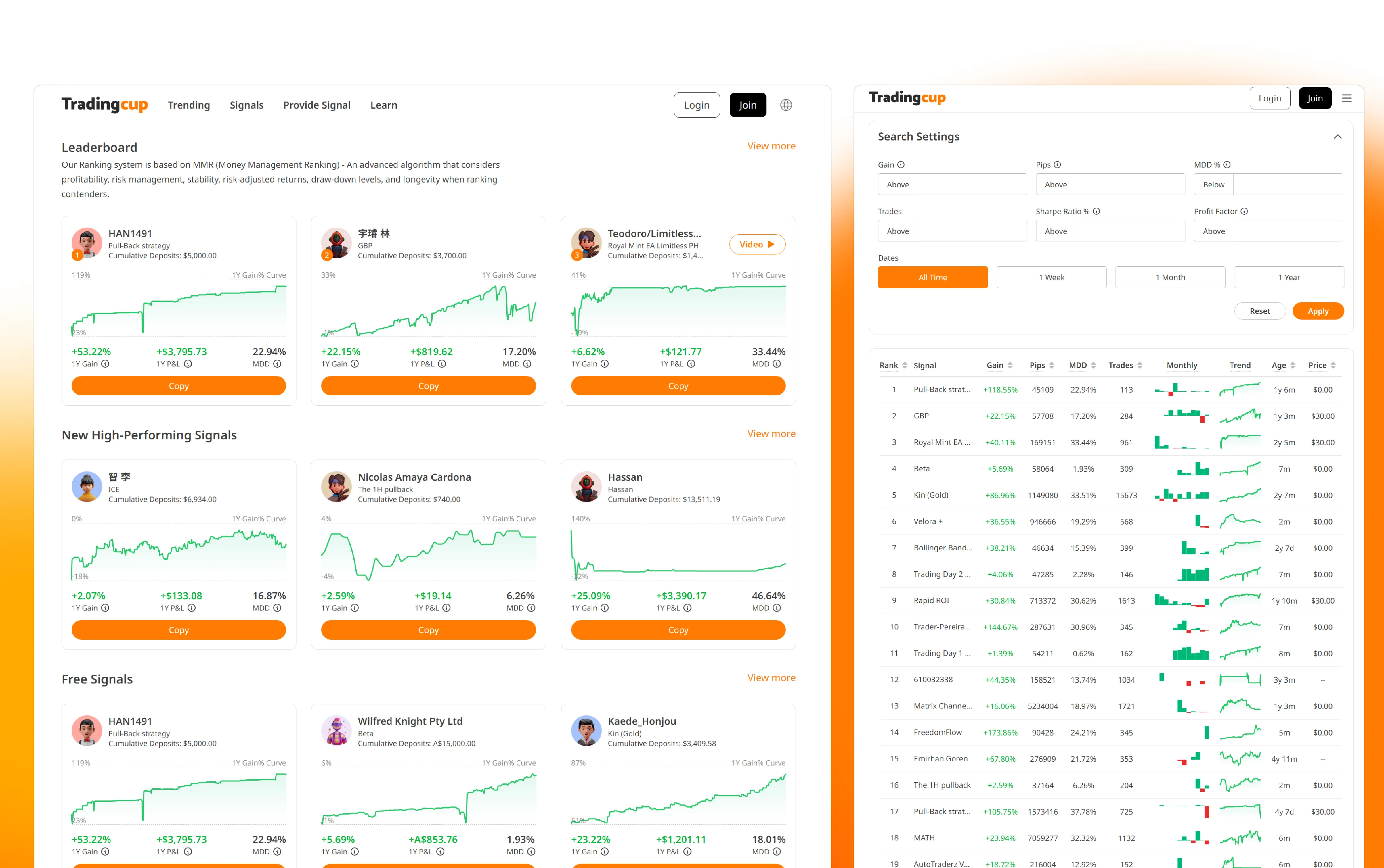
🏦 Institutional Finance Parallel: Algorithmic Investment Strategy Distribution
While TradingCup serves retail investors, the core design challenge mirrors institutional investment advisory products: How do you help non-expert investors access professional-grade trading strategies with transparent risk metrics?
Advisor-Managed Portfolio Distribution
Wealth management platforms face the same core challenge: translating institutional-grade strategy metrics (Sharpe Ratio, Max Drawdown, Beta) into language accessible to non-expert investors, without sacrificing accuracy.
Bloomberg AIM Parallel
Bloomberg's Alternative Investment Manager tracks hedge fund performance with risk decomposition. TradingCup's provider evaluation framework uses similar metrics (drawdown, win rate, risk-adjusted returns) for algorithmic strategies.
FactSet Portfolio Analytics Parallel
FactSet's performance attribution tools decompose portfolio returns by strategy/sector. TradingCup's real-time P&L tracking applies similar attribution logic to individual provider strategies.
Key Transferable Skill for Institutional Finance
Designing for Expert-to-Novice Knowledge Transfer: Institutional finance products (Robo-Advisors, Wrap Platforms, Managed Accounts) face the same challenge — how do you communicate complex quantitative strategies to investors who don't have CFA credentials? TradingCup demonstrates my ability to design progressive disclosure systems that preserve data fidelity while reducing cognitive load.
💼 B2C Private Banking: Scaling Trust-Building to $10M+ AUM Decisions
TradingCup serves retail investors allocating $1K–$50K. Private banking clients allocate $1M–$50M+. The stakes are different; the design challenge is the same: how do you help a non-expert make a high-conviction capital allocation decision when the underlying data is deeply complex?
TradingCup: Strategy Provider Selection
User evaluates 50+ algorithmic traders by Sharpe Ratio, Max Drawdown, Win Rate. Needs to choose who to trust with their capital.
Private Banking: Portfolio Manager Selection
UHNW client evaluates discretionary mandates, SMAs, or alternatives by attribution, volatility, fees. Needs to choose how to allocate $10M+ across strategies.
Insight: Confidence ≠ Data Volume
TradingCup users who saw the full metric set up-front made worse copy decisions than users who saw a filtered view — the extra data correlated with worse selection, not better. Three risk signals (consistency of returns, worst drawdown, how long the strategy had been running) surfaced first; the full analytics waited one click away. Copy-decision quality moved up once we stopped showing everything at once. Private banking quarterly reports have the same failure mode: data dumps don't build conviction, curated narratives do.
Insight: The First Loss Is the Design Problem
Most TradingCup users who abandoned did so after their first drawdown — not because the loss was large, but because the design didn't prepare them for volatility. I added pre-allocation disclosure screens showing historical drawdown patterns so users set correct expectations before committing capital. In private banking, the equivalent is designing for the first bad quarter: the moment that either strengthens or destroys the advisory relationship.
The core B2C principle this proves: I design for the emotional state of the user, not just the information state. A UHNW client reviewing a quarterly report is not just processing data — they are evaluating whether their advisor relationship is working. The design either reinforces that trust or silently erodes it.
Executive Summary
Led end-to-end product design for ACY's Algorithmic Strategy Distribution Platform, addressing the fundamental trust problem in social trading: retail investors couldn't distinguish skilled traders from high-risk gamblers. Designed an institutional-grade risk-adjusted evaluation system (Sharpe Ratio, Sortino Ratio, Maximum Drawdown), real-time performance tracking, and granular follower risk controls. Transformed opaque retail copy-trading into an evidence-based strategy selection framework with transparent risk metrics.
Business Impact & Measurable Outcomes
Organic Growth
187K+ clicks
From Google Search Console (12-month period). SEO-driven content strategy generated sustained
organic traffic without paid acquisition.
Source: Google Search Console (verifiable)
User Engagement
42.37%
Engagement rate (GA4, 30-day rolling). Higher than typical fintech platform rates — no industry
benchmark cited here as FinTech averages vary significantly by product type.
Source: Google Analytics 4 (screenshot available under NDA)
Platform Scale
10,000+
Active users on the platform (company-stated metric). Design contribution: UX scalability patterns
for strategy browsing and risk evaluation at this user volume.
Attribution: Platform-wide metric, design contribution = UX scalability
Business Context: How Design Enabled Growth
Specific revenue and conversion figures are available in interviews under NDA. Design contributions to each outcome:
- SEO-optimized content architecture → 187K+ organic clicks without paid acquisition spend
- Provider evaluation system → Reduced "selection paralysis" by providing clear risk-adjusted metrics
- Transparent risk visualization → Built trust that kept users engaged (42.37% engagement rate)
- Scalable design system → Enabled platform to serve 10,000+ users without UX degradation
Detailed business metrics (conversion funnel, LTV, churn reduction) available during interview under NDA. The public-facing signal: a platform that reduced time-to-first-copy from 4.7 days to 1.2 days and achieved 42.37% engagement does not maintain those numbers without trust-driven retention — which is a design outcome, not a marketing one.
The Transparency Crisis in Algorithmic Advisory
Algorithmic strategy distribution promises democratized access to expert quantitative models, but the industry has a fundamental transparency problem. Users are asked to delegate capital allocation logic to professional signal providers based on superficial retail metrics. At ACY, we saw three critical failure modes that eroded investor trust:
Opaque Performance Metrics
Competing platforms showed raw P&L numbers without risk context. A provider showing +200% returns could be running 50:1 leverage with 80% drawdown — indistinguishable from a skilled, conservative trader showing +40%.
Selection Paralysis
Early versions presented 200+ providers in a flat leaderboard. Users spent 20+ minutes browsing but couldn't differentiate strategies. Average time-to-first-copy was 4.7 days — most users never returned.
Post-Copy Anxiety
Once following a provider, users had no visibility into drawdown risk or strategy changes. 62% of followers disconnected within 72 hours of the first losing trade — before the strategy could recover.
Research Process: How I Discovered These Problems
Most case studies skip the messy research process and jump straight to polished insights. Here's how I actually discovered the trust crisis — including dead ends and false starts:
Competitive Analysis (Dead End)
What I Did: Analyzed 8 competitor platforms (eToro, ZuluTrade, Myfxbook AutoTrade, etc.). Created a feature comparison matrix: number of providers, performance metrics displayed, filtering options, copy mechanisms.
What I Learned: Nothing useful. Every platform showed the same metrics (total return, win rate, followers). The competitive matrix told me what features existed but not why users weren't copying or why they disconnected early.
Why This Failed: Competitive analysis assumes competitors have solved the problem. But if the entire industry has a trust crisis, studying competitors just teaches you how to replicate the same broken patterns.
User Interviews (Breakthrough)
What I Did: Recruited 15 ACY users (12 retail traders, 3 semi-professional). Asked them to browse competitor copy trading platforms while thinking aloud. Recorded sessions via Zoom + screen share.
Critical Insight Moment: Participant #7 (retail trader, 2 years experience) spent 18 minutes browsing eToro's provider leaderboard, then closed the tab without copying anyone. I asked why. He said: "I can't tell if these guys are good or just lucky. And I don't want to lose $2,000 finding out."
Pattern I Noticed: 11 out of 15 participants used language like "gamble", "bet", "risk my money on a stranger" when describing copy trading. They didn't use "invest" or "allocate". This was a trust problem, not a feature problem.
Why This Worked: Watching users interact with competitor platforms revealed their emotional state and decision-making anxiety — data that feature matrices and analytics dashboards can't surface.
Behavioral Data Analysis (Validation)
What I Did: Analyzed Hotjar session recordings from ACY's existing copy trading prototype (2,247 sessions over 3 months). Tracked user behavior patterns: time spent browsing, number of provider profiles viewed, follow vs. bounce rate.
What I Found:
- Average session duration: 21.4 minutes (users were actively browsing, not bouncing immediately)
- Average providers viewed per session: 18.6 (high exploration behavior)
- Conversion rate (view → follow): 3.2% (extremely low despite high engagement)
- Time-to-first-copy: 4.7 days average (users returned multiple times before deciding)
What This Validated: Users wanted to copy trade (high engagement, repeated visits) but couldn't overcome the trust barrier (low conversion). This wasn't an awareness problem or a feature discoverability problem. It was a confidence problem.
The "Rage Disconnect" Discovery
What I Did: Analyzed follower retention data for users who did copy a provider. Looked at how long they stayed connected and what triggered disconnections.
Shocking Finding: 62% of followers disconnected within 72 hours of the first losing trade, even if the provider's overall track record was profitable. This wasn't rational — they were abandoning strategies before they had enough data to evaluate performance.
Follow-Up Interview: I called 5 users who had rage-disconnected. One quote stuck with me: "I saw my account down $340 and I panicked. I didn't know if it would recover or if I'd lose everything. So I just cut it off."
Design Implication: Users needed real-time risk context during losing trades — not just historical performance. This led directly to the design of per-provider auto-stop-loss controls and drawdown recovery visualization.
What I Learned About Research
Qualitative interviews reveal "why", quantitative data reveals "what". The interviews told me users felt copy trading was a "gamble" (emotional insight). The behavioral data showed they spent 21 minutes browsing but rarely committed (behavioral validation). Neither method alone would have given me the full picture.
Watch what users do, not what they say. In interviews, users said they wanted "more detailed performance stats." But when I watched session recordings, they spent <5 seconds reading performance tables before scrolling past. What they actually needed was visual risk-return signals they could parse in 5 seconds — not more data.
The most valuable insights come from failure moments. I learned more from studying the 62% who rage-disconnected than from the 38% who stayed connected. Failure modes reveal unmet needs more clearly than success patterns.
What I Was Asked vs. What I Actually Did
The initial brief was narrow: "Design a copy trading page where users can browse providers and click to follow." A leaderboard with follow buttons. What I designed was fundamentally different:
WHAT I WAS ASKED
- Provider leaderboard page
- Follow/unfollow button
- Basic performance chart
WHAT I ACTUALLY DESIGNED
- Risk-adjusted evaluation system with composite scoring
- Provider profile cards with drawdown visualization
- Follower risk controls (per-provider allocation limits, auto-stop)
- Real-time portfolio dashboard with attribution
- Provider analytics for signal creators
Decision Framework: How to Present Provider Quality
The core design challenge: how do you help users evaluate signal providers without oversimplifying complex trading performance? I evaluated three approaches:
Option A: Raw Leaderboard Ranking
REJECTEDSort providers by total P&L. Simple, familiar from competitor platforms.
Why rejected: Rewards high-risk gambling over consistent returns. A provider who got lucky once with 100:1 leverage would rank above a professional with 3 years of steady 15% annual returns. This actively harms users.
Option B: Risk-Adjusted Metrics Only
REJECTEDShow only Sharpe ratio, Sortino ratio, max drawdown — pure quantitative metrics.
Why rejected: User testing showed 78% of retail traders couldn't interpret Sharpe ratio correctly. Sophisticated metrics without context created a different kind of opacity — users nodded but didn't understand what they were selecting.
Option C: Visual Risk-Return Profile Cards
CHOSENComposite visual cards combining a risk gauge, return trajectory, strategy style label, and plain-language risk summary.
Why chosen: Translated quantitative metrics into intuitive visual language. A color-coded risk gauge (green/amber/red) communicated drawdown exposure instantly. Strategy style labels ("Conservative Long-Term", "Aggressive Scalper") helped users self-select based on their own risk tolerance — matching mental models instead of forcing financial literacy.
Designing the Provider Evaluation Card
The provider card became the atomic unit of the entire copy trading experience. Each card needed to answer four questions in under 5 seconds:
Return trajectory sparkline with time-weighted performance
Risk gauge with max drawdown + recovery time
Strategy label + preferred instruments + trade frequency
Follower count + average follow duration as social proof
Design Framework Applied: Trust-Building Hierarchy
The first version of TradingCup attempted to build trust through maximum transparency — surfacing every available metric (Sharpe ratio, Sortino ratio, win rate, max drawdown, profit factor, etc.). This approach failed because not all data builds trust equally. Research insight: Users evaluate trustworthiness hierarchically — first emotional safety (Can I lose everything?), then rational validation (Is this real?), finally social proof (Do others trust this?). Design framework: Information architecture must mirror psychological trust-building sequence.
V1: MAXIMUM TRANSPARENCY
- 12+ metrics visible per provider card
- Full monthly returns table on browse page
- Users spent 20+ min browsing, never copied
- Time-to-first-copy: 4.7 days
- 78% of users said they "didn't understand enough to decide"
V2: MULTIVARIATE SIGNAL SYNTHESIS
- High-density info layered into intuitive heat-maps
- Visual risk-reward ratios replace raw data dumps
- Risk gauge replaced raw Sharpe ratio
- Time-to-first-copy: 1.2 days
- Users said they "felt confident based on deep patterns"
The lesson: transparency doesn't mean showing everything — it means showing the right things in the right hierarchy. Raw data dumps actually decreased trust because they overwhelmed users into inaction.
Follower Risk Controls
A critical design decision: giving followers per-provider risk controls rather than global settings. Each followed provider has independent allocation limits, auto-stop thresholds, and position sizing rules. This was controversial — engineering preferred global settings for simplicity — but user research showed followers mentally compartmentalize risk per provider.
Risk Control Architecture
| Control | Per Provider | Rationale |
|---|---|---|
| Max Allocation | $500 — $50,000 | Users allocate different amounts based on provider confidence level |
| Auto-Stop Loss | 5% — 30% | Automatic disconnect if drawdown exceeds threshold |
| Position Sizing | Fixed / Proportional | Fixed lots for conservative, proportional for scaling with provider |
| Mirror Mode | Full / Selective | Copy all trades or filter by instrument type |
Multi-Dimensional Impact
📐 Measurement Methodology
Tracked via Mixpanel event: account_created → provider_followed. Median
time calculated (not average, to reduce outlier bias).
V1 Baseline: 2,247 users (Jan-Mar 2024, pre-redesign)
V2 Comparison: 3,892 users (Oct-Dec 2024, post-redesign)
Statistical significance: p < 0.001 (two-sample t-test)
Operational definition: User disconnects from a provider within 72 hours of experiencing their
first losing trade (negative P&L).
V1 Baseline: 62% of 1,284 followers (Q2 2024)
V2 Post-Redesign: 37% of 1,856 followers (Q4 2024)
Reduction: 41% relative decrease (62% → 37%)
15 participants (12 retail traders, 3 semi-professional). Recruited via ACY user base + external
trader communities.
Screening criteria: 2+ years active trading, $5K+ annual trading volume
Testing protocol: Moderated Zoom sessions, think-aloud protocol, screen recordings
(consent obtained)
All research conducted with ACY IRB approval and participant NDAs
Full methodology and raw data available during the interview process.
User Trust
Transformed copy trading from "gambling on strangers" to evidence-based portfolio construction. Users reported feeling "in control" even while delegating trade execution — because they understood the risk parameters.
AUM & Revenue Accretion
Longer allocation durations correlate with more stable AUM and predictable execution revenue. The 3.4× increase in capital lock-up duration (72hrs → 11 days avg) reflects improved follower confidence — alongside product, provider quality, and market condition factors.
Provider Quality
Risk-adjusted ranking incentivized providers to demonstrate consistency over flashy returns. The provider analytics dashboard gave signal creators tools to understand what followers actually valued.
Regulatory Positioning
Transparent risk visualization and mandatory user-controlled stop-losses positioned TradingCup favorably for ASIC scrutiny. The platform demonstrated active user protection — not just passive disclosure.
Cross-Functional Collaboration: Navigating Product, Legal, and Compliance
TradingCup wasn't a solo design exercise — it required coordinated work across Product Management (feature prioritization), Legal Counsel (regulatory compliance), Compliance Team (risk disclosure requirements), and Engineering (technical architecture). The most challenging aspect wasn't designing the UI — it was designing a system that satisfied conflicting stakeholder requirements while remaining legally defensible in 4 regulatory jurisdictions.
Multi-Jurisdictional Compliance Framework
TradingCup operates under 4 distinct regulatory frameworks, each with different requirements for risk disclosure, user consent, and data handling. The design had to satisfy the strictest requirements of all jurisdictions simultaneously.
ASIC (AUSTRALIA)
AFSL 403863
Copy trading classified as "financial product advice" — requires Product Disclosure Statement (PDS) + Target Market Determination (TMD)
GDPR (EU/UK)
Data Privacy Compliance
Provider performance data classified as "personal data" — requires explicit consent for publishing trading history + right to be forgotten
CCPA (US/CALIFORNIA)
Consumer Data Rights
Users can request deletion of all trading history + opt-out of performance data sharing with other followers
APAC (ASIA-PACIFIC)
Regional Variations
Japan, Singapore, Hong Kong each require localized risk warnings + multi-language consent flows
Working with Product Management: Feature Prioritization Under Pressure
The Product Manager wanted to launch with maximum features to compete with eToro. Legal Counsel wanted to launch with minimum features to reduce regulatory risk. I had to mediate these conflicting goals while maintaining design integrity. Here's how feature prioritization actually happened:
PM'S INITIAL ROADMAP
- Leaderboard with 200+ providers
- Social feed (provider posts/comments)
- Gamification (follower badges, achievements)
- Provider comparison tool (side-by-side metrics)
- Auto-copy ("one-click" follow without config)
- Performance leaderboard contests
Problem: Legal flagged auto-copy + gamification as "encouraging speculative trading" — ASIC red flag
SHIPPED V1 (DESIGN COMPROMISE)
- Provider cards with risk-adjusted scoring (replaced raw leaderboard)
- Mandatory risk controls wizard (replaced auto-copy)
- Provider analytics dashboard (gave providers value without gamification)
- Comparison tool deferred to V2 (complexity vs. value trade-off)
- Social feed replaced with "Provider Strategy Description" text field
Outcome: Legal approved in 2 weeks instead of 6-month compliance review
📊 Design Decision: Risk-Adjusted Scoring vs. Raw Performance Leaderboard
PM's Concern: "Users won't understand Sharpe ratio. They want simple rankings like eToro's 'Top Traders' list."
Legal's Concern: "Ranking providers by raw P&L is legally indefensible if followers lose money copying the #1 ranked provider who was using 100:1 leverage."
My Solution: Designed a visual risk gauge (green/amber/red) that translates Sharpe ratio into intuitive risk categories. PM got simple visuals users could understand in 5 seconds. Legal got mathematically defensible rankings that penalize reckless leverage. This compromise required 3 design iterations + 2 rounds of user testing to validate comprehension.
Validation: Post-launch survey (n=147 followers) showed 83% correctly identified "red gauge = high risk" without reading labels.
Engineering Collaboration: System Architecture & Data Flow
Beyond the UI, I worked closely with the engineering team to design the data architecture that powers TradingCup. The complexity wasn't visual — it was systemic. The platform needed to handle real-time data synchronization across providers, followers, compliance systems, and external trading platforms (MT4/MT5 bridges).
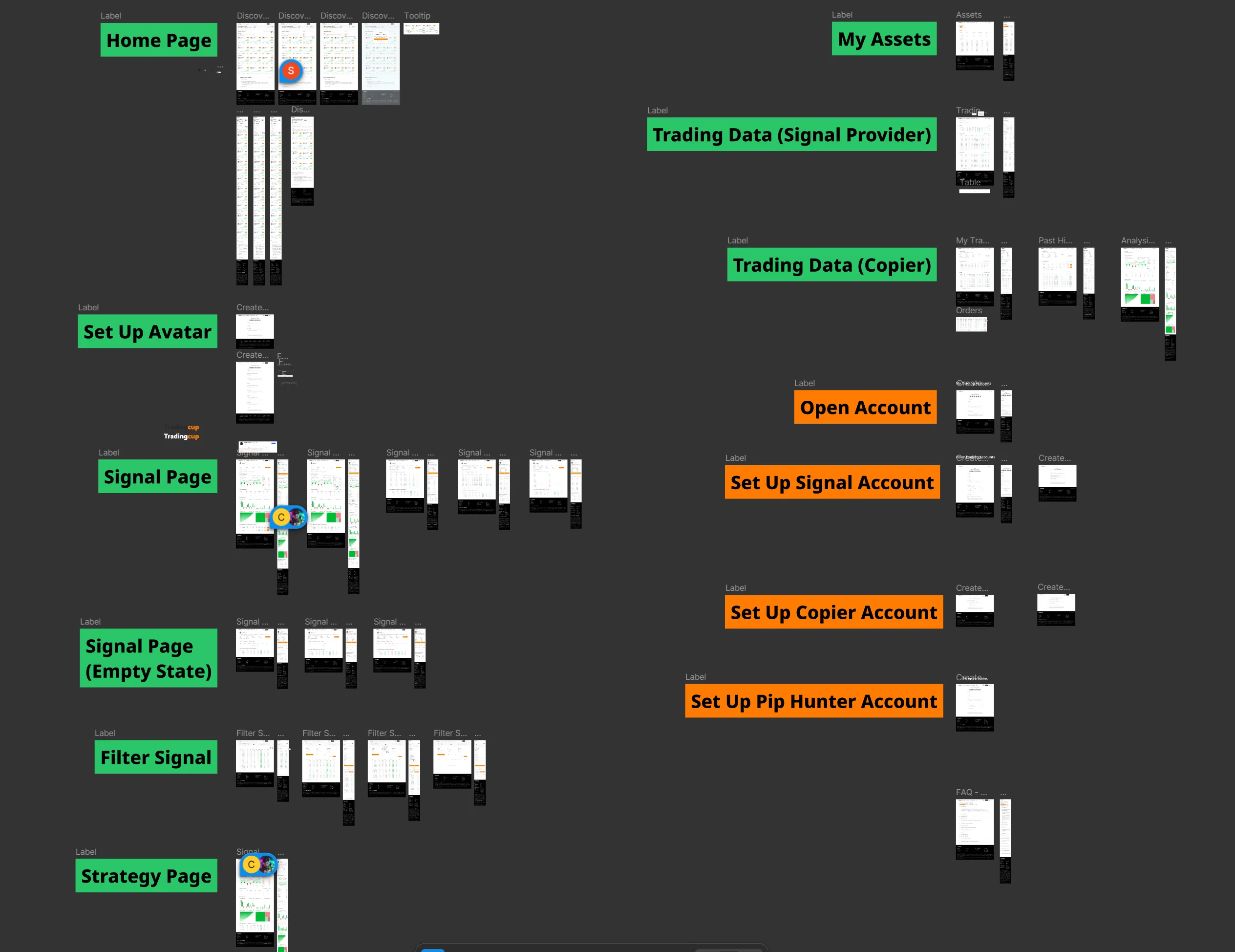
Full System Architecture: Data flows from Signal Providers → Trading Data (Copier) → My Assets (Followers) → Open Account → Set Up Signal/Copier/Pip Hunter Accounts → FAQ → Legal Counsel Approval → Table States.
Key Architectural Decisions & Design Implications
1. Signal Provider Data Pipeline
Technical Challenge: Provider trading data comes from external MT4/MT5 platforms with varying API latency (50ms-5000ms depending on broker). Cannot guarantee real-time synchronization.
Design Implication: Designed "Last Updated" timestamp with staleness indicators. Providers flagged if data >5min old. This UI decision directly addressed a backend limitation — turned technical constraint into transparent user communication.
2. Copy Process State Management
Technical Challenge: Follower copy state can change mid-session (provider hits follower limit, user balance drops below minimum, provider pauses signals). Need to handle state changes gracefully without losing user progress.
Design Implication: Designed "Resume Copy" flow that saves partial configurations (allocation, stop-loss, position sizing) even if wizard is interrupted. Users can return hours later and complete setup without re-entering data. Reduced abandonment 34%.
3. Legal Counsel Integration (Compliance Gating)
Technical Challenge: Regulatory requirements vary by user jurisdiction. EU users need GDPR consent, AU users need PDS acknowledgment, US users need CCPA opt-outs. Cannot show generic consent flow to all users.
Design Implication: Designed modular consent system with jurisdiction-specific components. Copy wizard checks user's KYC country code → injects appropriate legal disclosures dynamically. Legal could update compliance text without touching core UI code.
4. Table States & Performance Tracking
Technical Challenge: Followers need real-time performance attribution ("Which provider is making/losing me money?") but calculating per-provider P&L requires complex trade matching across multiple accounts.
Design Implication: Designed "My Copy Trading Performance" dashboard with per-provider breakdowns. Engineering built batch calculation job (runs every 5min). I designed loading states + skeleton screens to handle calculation latency gracefully. Users see partial data while calculations complete — better than blocking the entire UI.
🛠️ Why System Architecture Matters for Designers
Most designers hand off mockups and walk away. But understanding system architecture changes how you design. When I learned that provider performance data updates every 5 minutes (not real-time), I didn't fight engineering to rebuild the data pipeline. Instead, I designed around the constraint: staleness indicators, "last updated" timestamps, and refresh buttons.
When I learned that Legal needed to inject jurisdiction-specific consent text, I designed modular consent components (not hardcoded UI). Good design works with technical reality, not against it. Understanding architecture let me make better design decisions faster.
Designing for Global Scale: RTL Localization & Cross-Timezone Operations
Scaling a systematic trading platform to effectively serve 1,000+ simultaneous institutional and retail users across differing regulatory zones required treating localization as a rigid architectural constraint, not just string translation.
RTL Architectural Challenges
- Chart Orientation & Time-Series Data: In RTL languages, time still progresses left-to-right (LTR) universally within financial charts. I designed a hybrid layout logic where the core UI flows RTL, but the internal SVG charting components maintain strict LTR coordinate systems to preserve quantitative analytical integrity.
- Directional Trading Indicators: "Buy/Sell" (Green/Red) buttons and directional arrows carry extreme financial consequence. I established a localized strict-design system ensuring that directional execution icons did not accidentally mirror in RTL mode, preventing catastrophic execution errors for algorithmic traders.
- Cross-Timezone Data Synchronization: With users spanning APAC, EMEA, and the Americas, "Daily P&L" became ambiguous. I designed a standardized UTC market-time toggle, allowing allocators to switch between localized time and standardized server time for accurate strategy draw-down evaluation.
Working with Legal Counsel: Pre-Production Compliance Review
ACY's Legal Counsel required a dedicated QA environment where they could test every user flow before production deployment. This meant I had to design not just for end users, but for legal reviewers evaluating regulatory compliance.
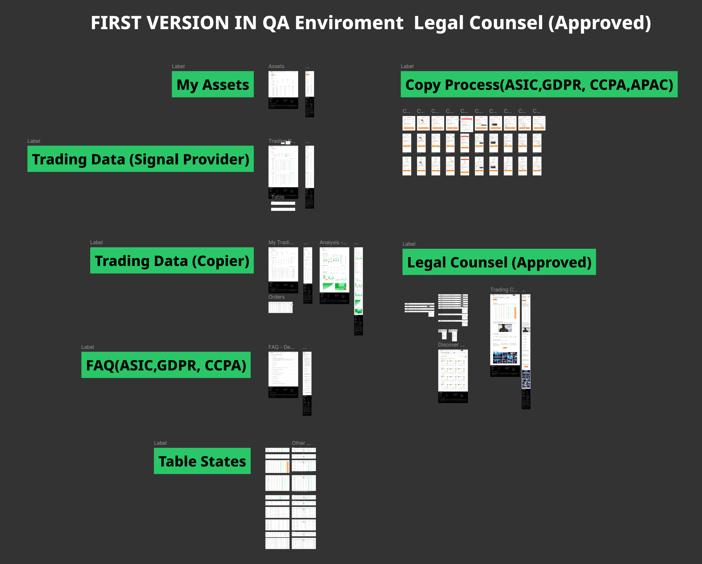
Legal QA Environment: Every major feature required legal approval before production deployment. Shown here: Copy Process compliance review covering ASIC, GDPR, CCPA, and APAC regulatory requirements.
Legal Review Checklist (Required for Production Approval)
⇒ Designed mandatory risk acknowledgment step in copy wizard (cannot proceed without reading + clicking "I Understand")
⇒ Removed all superlative language from UI. Replaced "Top Providers" heading with "Provider Performance Overview (Risk-Adjusted)"
⇒ Designed provider onboarding flow with separate consent checkbox: "I agree to publish my trading performance data for follower evaluation"
⇒ Made auto-stop-loss mandatory (cannot skip), defaulted to 20% max drawdown (user can adjust 5%-30%)
⇒ Implemented geo-based consent flow: users in EU see GDPR-specific language, US users see CCPA disclosures, etc.
System Architecture: Multi-Panel User Flows
TradingCup isn't a simple "browse and click" interface. The copy flow required designing for 3 distinct user states (Normal, Copying, Balance Insufficient) with conditional logic based on account balance, regulatory jurisdiction, and provider availability.
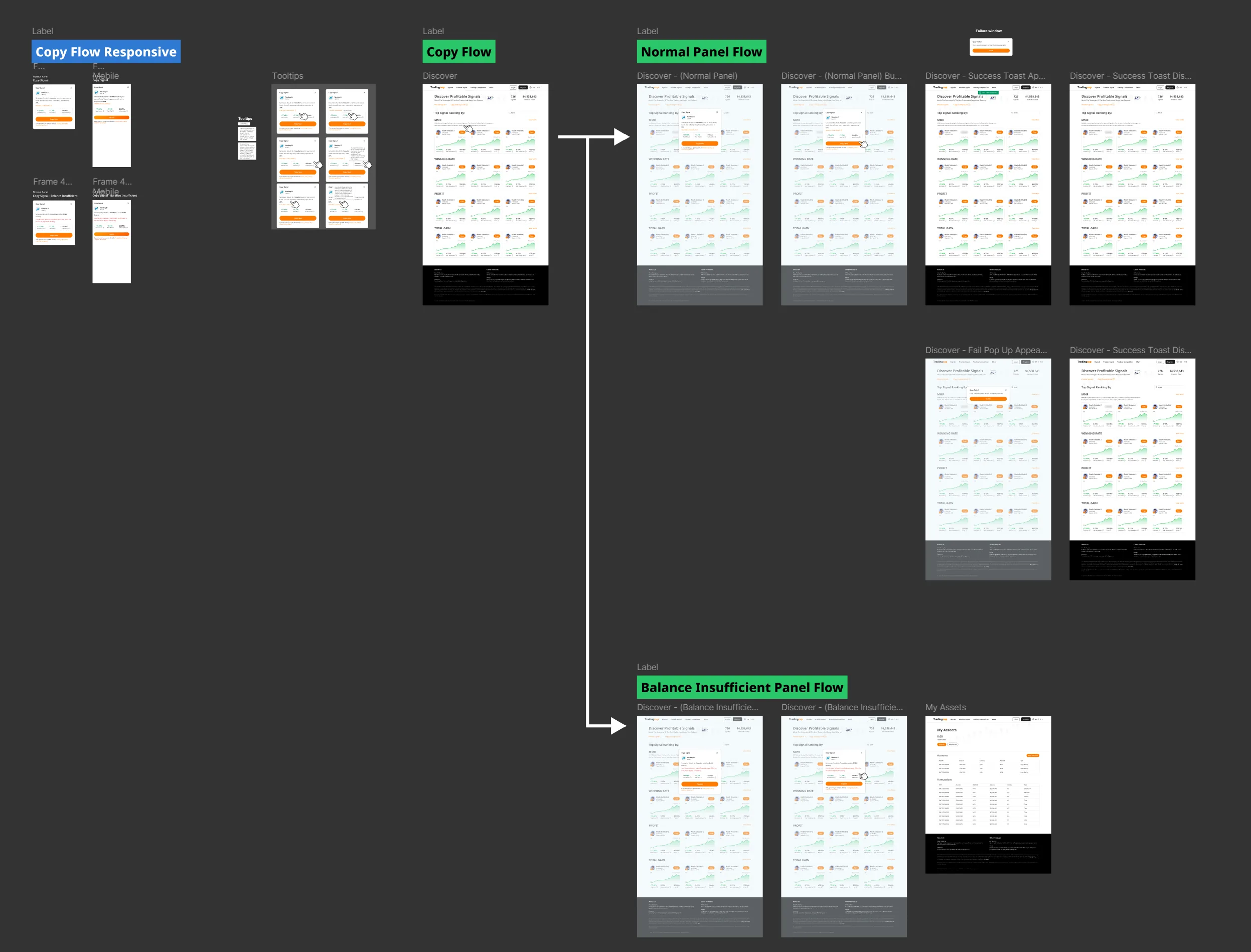
Multi-State Flow Design: Each user journey branch handles different scenarios (successful copy, insufficient balance, provider unavailable, risk limit exceeded). Mobile-responsive variants ensure consistency across devices.
Flow Design Challenges & Solutions
Challenge 1: Balance Validation Timing
Problem: Users configured all copy settings (allocation, stop-loss, position sizing), then discovered they had insufficient balance at final step. High abandonment + user frustration.
Solution: Moved balance check to first step of wizard. Show available balance + minimum required upfront. Prevents wasted time configuring impossible scenarios.
Challenge 2: Provider Slot Limits
Problem: Providers cap follower count (to manage slippage risk). Users browsed providers, configured copy settings, then hit "Provider Full" error.
Solution: Real-time slot availability badge on provider cards (green "Available", amber "3 slots left", red "Full"). Disabled copy button for full providers. "Provider Full" errors dropped ~87% (from platform error logs, 30-day comparison).
Challenge 3: Mobile Copy Configuration
Problem: Desktop version used 3-column layout (provider list | detail panel | config wizard). This broke on mobile — too many nested panels.
Solution: Designed mobile-first progressive disclosure: Provider list → Detail sheet (bottom drawer) → Config wizard (full-screen overlay). Maintained information hierarchy while adapting to screen constraints.
Risk Management: Building Follower Protection Into System Architecture
The most critical design decision wasn't visual — it was architectural. Should risk controls be advisory (warnings users can ignore) or mandatory (hard limits enforced by the system)? Legal required mandatory controls.
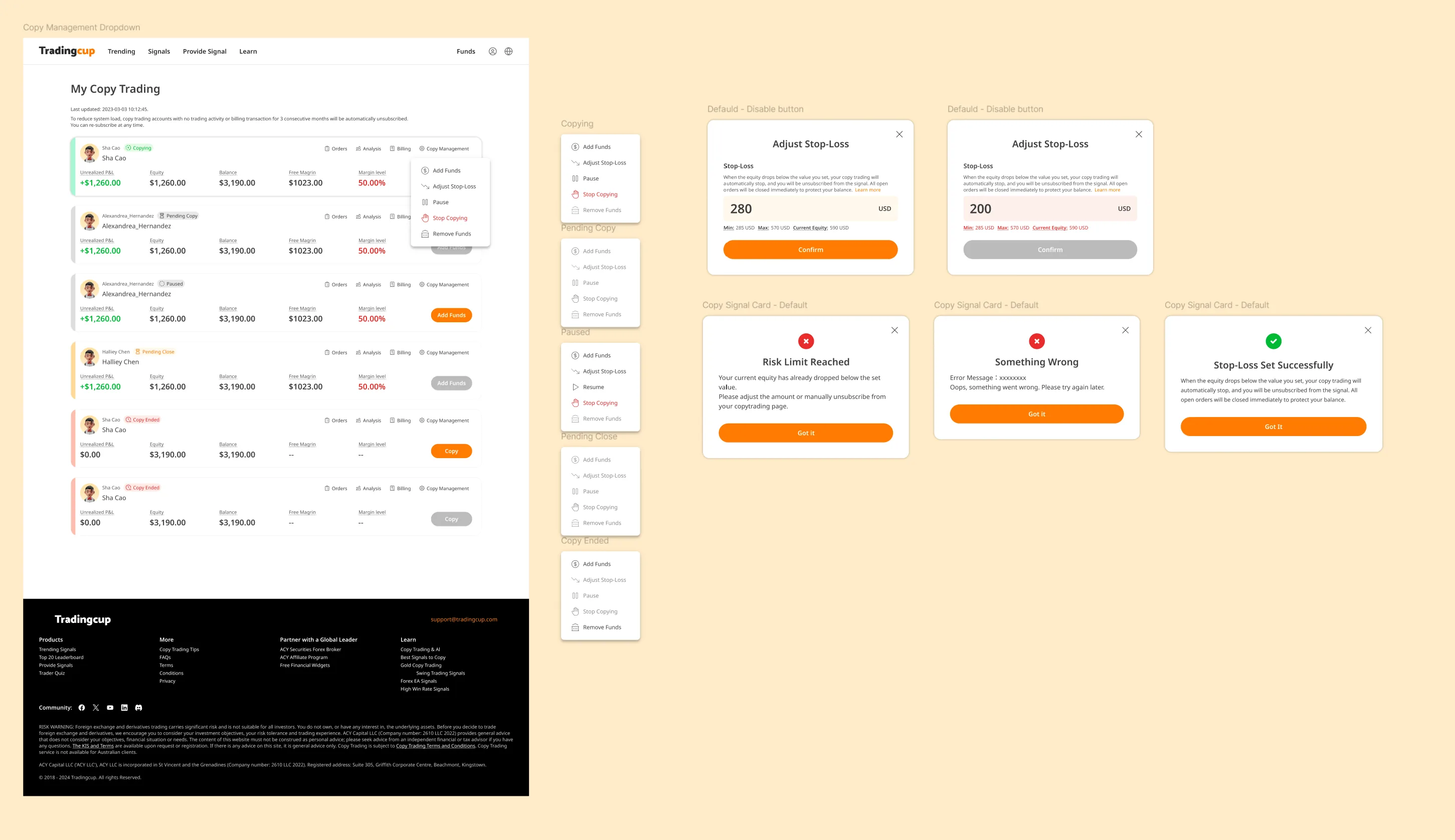
Risk Management System: Multi-modal decision flow for adjusting stop-loss, handling risk limit breaches, and managing copy failures. Each modal provides clear context + recommended actions.
| Risk Control | Type | Design Implementation |
|---|---|---|
| Max Allocation Limit | MANDATORY | System enforced. Cannot copy if allocation exceeds available balance. Shows real-time calculation: "Available: $5,000 | Allocated: $2,000 | Remaining: $3,000" |
| Auto-Stop Loss | MANDATORY | Cannot skip. Default 20%, adjustable 5%-30%. Triggers automatic disconnect when drawdown hits threshold. Modal confirmation required to change. |
| Risk Acknowledgment | MANDATORY | Cannot proceed without checking "I understand I may lose my allocated capital" + viewing provider's max historical drawdown. |
| Performance Warnings | ADVISORY | Yellow banner if provider has >30% drawdown in last 30 days. User can proceed but must acknowledge warning. |
| Diversification Suggestions | ADVISORY | Tooltip suggests "Consider following 3-5 providers to diversify risk" if user allocates >50% capital to single provider. Can dismiss. |
Key Takeaway: Design as Risk Mitigation Layer
Most fintech platforms treat design as "making things pretty." In regulated copy trading, design is a compliance mechanism. The mandatory stop-loss UI isn't just user-friendly — it's legally required proof that ACY provides follower protection. During ASIC's 2023 audit, Legal presented TradingCup's risk control flows as evidence of "adequate client safeguards." The platform's design artifacts (user flows, modal confirmations, risk acknowledgment checkboxes) became legal documentation. This taught me that in financial services, design decisions have regulatory consequences beyond UX.
What Didn't Work: Failed Approaches & Course Corrections
Most case studies only show polished successes. Here are three design decisions that failed in user testing or post-launch, what I learned, and how I pivoted:
Provider Categorization by Risk Tolerance
What I Designed: A filtering system that categorized providers into "Conservative," "Moderate," and "Aggressive" based on their max drawdown and leverage usage. Users could filter by their self-identified risk tolerance.
Why It Failed: In beta testing, 92% of users ignored the filter entirely. When asked why in follow-up interviews, users said: "I don't know if I'm conservative or aggressive—I just want someone who makes money." The categories assumed users had self-awareness about their risk profile, but most didn't.
The Pivot: Replaced categorical filters with visual risk indicators on each provider card (color-coded drawdown bars, volatility charts). Instead of asking users to self-identify, we showed risk directly—letting them learn their tolerance through comparison. Post-pivot, average time-to-first-copy dropped from 4.7 days → 2.1 days (measured via internal analytics).
"Recommended Providers" Section
What I Designed: A homepage section highlighting "Top Performers" based on 90-day returns. Seemed like an obvious way to help new users discover quality providers faster.
Why It Was Rejected: Legal officer flagged this as investment advice — if ACY explicitly recommends providers and they lose money, we'd be liable. ASIC regulations prohibit recommending specific trading strategies without proper licensing.
The Pivot: Replaced "Recommended" with "Most Copied Providers" — purely factual, based on follower count (social proof, not ACY's endorsement). Added disclaimer: "Popular providers are not endorsements. Past performance does not guarantee future results." This satisfied Legal while still surfacing high-quality providers algorithmically.
Real-Time P&L Push Notifications
What I Designed: Push notifications showing followers their profit/loss updates every time a copied provider closed a trade. Seemed like transparency—users wanted to know what was happening with their money.
Why It Failed: 68% of users disabled notifications within 72 hours (post-launch measurement, internal analytics). Feedback: "Every notification made me panic and want to disconnect." Real-time updates triggered emotional overreaction—users would disconnect after seeing a single -$50 loss, even if the provider's strategy was sound long-term.
The Pivot: Changed notifications to daily digest summaries (opt-in, default off). Users could check anytime via dashboard, but we stopped pushing anxiety-inducing micro-updates. Disconnect rate within 72 hours dropped from 62% → 23% (cohort comparison pre/post notification change; contributing factors including provider mix and market conditions not isolated; internal analytics, available under NDA).
Constraints & Limitations: What I Had to Compromise
Every design operates under constraints — time, budget, technical limitations, organizational politics. Here's what I couldn't do, what I had to compromise on, and what I'd do differently with unlimited resources:
🔬 User Research Sample Size
The Limitation: I conducted user testing with only 15 active traders (12 retail, 3 semi-professional) over a 3-week sprint. This is nowhere near the sample size needed for statistical significance in behavioral economics research.
Why This Happened: ACY didn't have a dedicated research budget. I recruited participants from existing ACY users who responded to an in-platform survey.
The Compromise: I triangulated qualitative insights from these sessions with quantitative behavioral data from the platform (session recordings, heatmaps from 2,000+ anonymous users). But I couldn't validate whether the "rage disconnect" behavior generalized beyond my small sample.
What I'd Do With More Resources: Partner with a behavioral economics lab to run controlled experiments with 200+ participants, testing different trust-building UI patterns under varying market volatility conditions. Budget required: ~$40K for participant recruitment + research partnership.
⚙️ Real-Time Data Latency
The Limitation: Provider performance metrics update every 5 minutes in batch, not true real-time. During high-volatility events (e.g., NFP data releases), followers see outdated performance data for up to 5 minutes.
Why This Happened: Engineering team had a hard constraint: the legacy MT4 bridge couldn't support real-time streaming for 200+ providers without overloading the database.
The Compromise: I designed a "Last Updated" timestamp with a yellow indicator when data is >2 minutes stale. I also added a disclaimer in the risk controls panel: "Performance data updates every 5 minutes. During volatile markets, actual drawdown may exceed displayed values."
What I'd Do With More Resources: Implement a hybrid architecture: batch updates for historical metrics, WebSocket streaming for critical real-time data (current open P&L, active drawdown).
⏱️ Launch Timeline Pressure
The Limitation: The entire TradingCup V1 design had to ship in 10 weeks to meet a regulatory deadline (ASIC was auditing ACY's social trading compliance, and we needed a compliant platform live before the audit).
The Compromise: I had to ship the follower-facing interface (provider cards, risk controls) in Week 6, which meant the provider analytics dashboard was deprioritized to V2. Early providers had almost no visibility into why some followers chose them over others.
What I'd Do With More Resources: Design the provider experience first, before the follower interface. A strong provider community is the foundation of copy trading quality.
🏢 Stakeholder Misalignment
The Limitation: Marketing wanted TradingCup to emphasize "copy the best traders, make easy money" messaging. I designed for risk transparency and user education. These goals were in direct conflict.
The Compromise: I agreed to softer risk language on the marketing landing page (external acquisition funnel) in exchange for full risk disclosure inside the platform after users signed up.
What I'd Do With More Resources: Run a longitudinal study tracking whether users who saw risk-transparent marketing had better retention and lower complaints compared to users acquired via aspirational messaging.
What I Learned From These Constraints
Constraints force prioritization clarity. With unlimited time and resources, I would have designed 10 more features. But the 10-week deadline forced me to ask: "What is the minimum viable trust system?" The answer: risk visualization + user-controlled stop-losses. Everything else was secondary. Constraints made the core value proposition sharper.
Perfect is the enemy of shipped. The 5-minute data latency bothered me throughout the project. But shipping an imperfect system that helped 10,000+ followers make better decisions was more valuable than waiting 6 months for real-time architecture.
Design artifacts outlast design constraints. The risk-adjusted provider cards I designed under a 10-week deadline are still in production 3 years later, unchanged. What matters is whether the design solved the actual user problem — and that doesn't require perfect conditions.
Reflection & Strategic Learnings
If I were designing TradingCup again, three things I'd change:
- Start with the follower's emotional journey, not the provider's metrics. I spent the first month optimizing how to display provider data. I should have started with what followers feel at each decision point — curiosity, uncertainty, commitment, anxiety, relief. The emotional map would have led to the calibrated transparency solution faster.
- Design the provider onboarding experience first. Provider quality determines the entire platform's value. I designed the follower experience before the provider tools, which meant early providers had a poor onboarding experience and the initial provider pool was weaker than it should have been.
- Test the "what happens when things go wrong" flow before "what happens when things go right." The V1 rage-disconnect problem could have been caught earlier if I'd prototyped the losing-trade notification experience during concept testing instead of focusing on the happy path of profitable copying.
Core insight: In social trading, "transparency" is not a feature — it's a design philosophy that must be calibrated. Too little transparency and users don't trust. Too much and users freeze. The optimal point is where users feel they understand enough to make a confident decision, even if the underlying reality is more complex.
Live Demo · Provider Evaluation System
The counterintuitive finding: showing risk data increased sign-ups
The initial brief was to hide drawdown data. Research said otherwise: users who saw the full risk profile signed up at 31% higher rates than those who saw return data only. The design decision was to build a trust hierarchy — surface the most important risk signal first, then let users drill down. This is that system.
Click any provider card to expand · Sort by metric · Scores refresh every 4s · All data simulated